Monday 27 February 2017

Extended Practice: Experimenting With Character Colour

I had never drawn the characters for myself, so I took the opportunity to practice drawing the characters in Photoshop. Here I was able to experiment with line quality, as well as potential watercolour brushes/colours for the characters. 

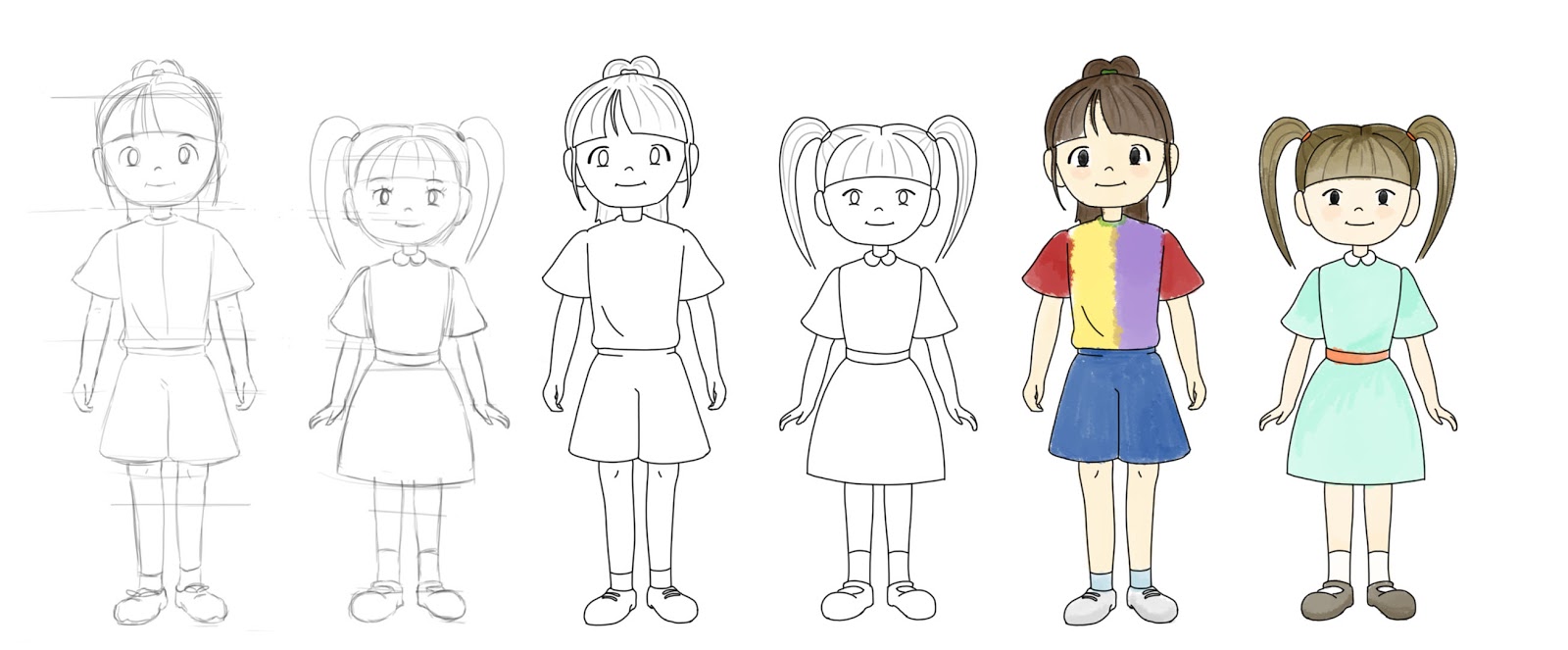
Photoshop Character Progress

I placed the coloured characters on top of a watercolour background I had previously produced, to see if I thought they worked well in the space. I like that even though the linework in the background is fineliner, the digital line of the characters fits seamlessly. I also like that the colour has a similar effect; the style is consistent due to the type of brush used, but the colours aren't as washed out as the background, yet not as harsh/bold as the regular brushes in Photoshop I am used to using. 

Characters In The Environment Test

I also practiced drawing the characters on paper, and I coloured them with watercolour paints to compare the different results. I'm drawn more towards the digital colouring of the characters as I like the contrast between them and the background.


Watercolour Characters

Now I have a greater understanding of how the film is going to look, which I am happy with. This means that I'll be able to progress with animation tests. I first want to try looking at layering up background components in After Effects to try and give the background more depth, so I shall have to produce larger watercolour pieces, so I can also explore using the camera tool.

Thursday 9 February 2017

Extended Practice: Kites - Pre-Production Art Book

Extended Practice: Meeting With My Music Collaborators 08/02

Since my first visit to LCoM, I have decided who I would like to collaborate with; Nathan McGill, Sam Davies and Jinny Finkill. They seemed to be really enthusiastic about the project, and had some good ideas about what the score could sound like.

I had arranged to meet up with them so we could discuss my development with the project and story. I made sure to print out the storyboard I had prepared previously (which I let them keep so they could make notes on it/refer to it when working with the music) and I took my animatic on a USB (again, I have left them with a copy). 

I explained to them that the length of the animation is going to be about 2 minutes 10 seconds, and that it won't change much more than that (the end credits maybe longer than what is outlined in the animatic, as I only put a guide in for the time being). I also outlined what I was expecting of the music, and that I thought the music could get more dramatic as the kite gets further into the air. However, I don't really know much about music or sound design, so all I could say was that the tone of the animation is going to be very light-hearted and that it is going to be set during autumn, and that I wanted the music to reflect this. I pointed out that there would be no dialogue, but was hoping to work in some foley sounds. 

They had some good ideas, and we discussed the possibility of different instruments/rhythms to be played to differentiate between who is flying the kite. On paper, I really liked the sound of the ideas they put forward, but I won't know for certain until I hear how it sounds. They are going to get to work soon and keep me posted with any progress or samples, and I said I'd do the same from my end. We also discussed meeting up again once we had some more solid work, which I am very much looking forward to.

Extended Practice: Producing a Storyboard and Animatic

I took the thumbnails I had produced on sticky notes, and worked with them on Photoshop to make my storyboard more presentable/professional, making sure to make the appropriate changes to the story that had been suggested to me in my critique.


Original Sticky Note Panels and Their Changes

I was happy with the changes I had made to the storyboard, especially the middle panel. The close up of the character laughing broke up a series of mid-shots of the character. Not only that but now that it has been pointed out to me, I see that it is a more appropriate shot to show the emotion of the character. 

Once I had finished drawing up the individual panels, I made up a template storyboard layout to neatly organise my story.


Final Storyboard Panels

I took the panels and edited them together in Premiere to make a rough animatic. As I was working out the timings for each action/scene, I timed myself acting out actions/expressions so that I would have a more informed and accurately timed animatic. Watching it back, some of the scenes seem to last too long as the storyboard panel just holds, but this is down to nothing moving on screen, when in the actual animation there would be character movement. So I get a better idea of timings, I may take this into After Effects to incorporate some basic movement.

First Animatic Draft

Even though the storyboard panels were 1280x720, I still made the video file 1920x1080 so that I would be able to slot in completed animation scenes.

Extended Practice: Making a Start on Storyboarding

I had to put designing on hold for the time being, as I had arranged to meet up with the LCoM students that I had agreed to work with on this project. I had made a few decisions on the story since the initial idea brainstorm, but I was yet to decide on what exactly was going to happen in the story, and how it was going to look. I had decided that;

- I wasn't going to have the characters grow up by the end of the film. I couldn't figure out how I was going to make this work without it being confusing to the audience.

- The story was going to end with the kite getting stuck in a tree, and the two sisters walking away together.

- I didn't want the camera angle/shot to remain static, like I had previously contemplated (Sketchy Ice Creams by Birdbox as an example). Instead I wanted to use a variety of shots as I thought this would be better for portraying emotion of the characters, and make for a more interesting, dynamic animation.

I thought the best thing for me to do was to just sit down and thumbnail, so I could make quick, snappy decisions; otherwise I was going to end up spending way too much time stewing over my options. I made up storyboard roughs on sticky notes, and worked out a story that seemed to flow. Once I was happy with the story, I laid out what I had and got fellow students, and Mike, to take a look to see what they thought. They all seemed to understand what was going on, and generally didn't have too much to say about how it was going to look. Only the odd shot/camera angle change was suggested as an improvement.

Extended Practice: Further Concept Art

Here I have produced concept art for other key elements of the story, which were; trees, leaves and benches. I wanted to focus on colour and painting technique, as well as line work.


Extended Practice: Kite Design

A main element of the story is obviously the kite that the two sisters are attempting to fly, so I began coming up with concepts for it.

Digital Kite Concepts

Though I was really happy with all of the designs, I thought some were too complicated to use, i.e the box kites and the ones with tails. The designs - whilst potentially more interesting - just made more work for me in terms of animating (the character animation is enough of a challenge for me, for now). 

Instead I decided to take the simple purple kite further, by experimenting with colour and texture.

Colour and Texture Tests

I'm happy with the simplistic design of the kite, as I think the colour greatly improves the look of the kite, though at this stage I'm not too sure what colour I'm going to go with. However, I'm not going to stress over this too much as it doesn't make THAT much difference. I can decide on this later, or when it comes to actually colouring frames. Though, I can imagine that a majority of the kite scenes will be animated in after effects as apposed to frame-by-frame, as they will consist of simple swaying movements, especially when the camera angle is straight on.

Extended Practice: Initial Research and Inspirations - Japan and Studio Ghibli

Whilst on my trip to Japan in January, I had the pleasure of visiting the Studio Ghibli museum. The experience was one that I'll never forget, and the art work was out of this world. Since I was wanting to experiment with watercolour, I knew that it would be a good idea for me look at Ghibli for reference/inspiration. Their background design is truly phenomenal, and I would like to capture the realism of their environments to a certain extent. I made sure to buy myself an art book that I would be able to refer to during this project (I also just wanted one, because they're gorgeous).

Scans from The Art of 'Howls Moving Castle'

I also wanted to look at Ghibli for reference because the characters that Wing has designed for me are very 'anime'. I've not worked with characters of this style before, so looking at the way Ghibli's characters are animated will definitely be beneficial. Especially as I am looking to animate the characters with naturalistic movements, ones that will capture the personality and liveliness of young sisters; something that Ghibli has been very successful with in their films. For example, Mei in My Neighbor Totoro (1988).

Mei - My Neighbor Totoro (1988)

I was also interested in how their characters worked in the environments. Their backgrounds are so heavily detailed, yet their characters tend to be block colour, with the exception of cel shading, though they don't feel out of place. This is something I am hoping to achieve with my own work...

Still from Howl's Moving Castle (2004) - Example of heavily detailed background


Examples of Detail

...though I haven't gone as detailed as this. Instead the detail I have included in my own work has been loose dots/splashes of colour. 

Extended Practice: Environment Design

As the narrative was already very personal to me, I thought it would be a nice touch to make the setting authentic too. I decided I was going to base my environment design on the field where I remember flying the kites with my sister to begin with.


Initial Sketches of Ackworth

In order to get started with background design, I went out for a walk around where I lived and sketched the environment. I took a drawing I was particularly pleased with, and worked colour into it on Photoshop. As a stand alone piece I was happy with how it looked, but when I placed my characters into the environment to test how it looked, it wasn't what I expected. It felt too bold, and the characters felt lost as a result.

Digital Background Design

Testing Digital Characters Against Background Design - Rough

I had tried digital drawing as I thought it would have been easier for me to work with, but because I wasn't happy with the characters in the space, I started working with watercolour like I had originally set out to do. I made sure to refer to the work in my Studio Ghibli art books for reference when painting, but tried to keep the style my own. I tried the watercolour backgrounds with both a fineliner outline, and without.
I very much prefer the watercolour backgrounds, and they were much quicker to produce and just as pretty and detailed as the digital backgrounds. Though I think I prefer the backgrounds that have the fineliner line work, and in future will be using this style for all of my background design. I think this will suit my characters the best, as they too are going to have a slight outline.


Watercolour Backgrounds

I am going to pursue the watercolour backgrounds, though I am not going to make them as detailed as the last one. Despite it being my favourite out of the pieces I have made, it took too long to produce and I don't think the characters work as well in this environment. I prefer the pieces that are washed out, as this makes the characters stand out, allowing for the audiences attention to be focused on them.

Wednesday 8 February 2017

Extended Practice: Initial Research and Inspirations - Birdbox

Sketchy Ice creams is an animation by Birdbox Studios, which has the general feel/tone that I would like to capture with my own animation. The short depicts a Father struggling to take care of his two children on his own, whilst the Mother goes to get ice creams. It is a light-hearted and lively animation, that focuses on the animation of the characters. I like how the children have been animated with a different energy to the Father, to show the difference in age. This is something I am going to have to consider with my own characters, as they are only young children.

Sketchy Ice Creams

The animations shows the Father's attempts at keeping the children safe and entertained, and how he keeps failing to do so. In that respect, the story is similar to my own, the difference being that my characters are going to be failing at flying a kite. Because of this, it might be a nice idea to have a static camera shot like this. It will be easy to follow the sisters' attempts at flying the kite, and would allow me to focus on the character movement. 

I can also refer to how Birdbox have avoided using dialogue, as I am not going to be using any dialogue myself. Instead, they have used subtle sound effects and noises to help aid the story and the character's emotions. For instance, the Father gasps as the boy is hit by the swing to show he is shocked, and worried for the character's well-being. 

Extended Practice: Initial Research and Inspirations - Pinterest Moodboards

In order for me to gain an understanding of what I wanted my animation to look like, I created a Pinterest board filled with reference images that inspired me. The board includes examples of watercolour techniques, different styles of line drawings/line quality, forests and types of trees, colour (I'm hoping for the animation to be set in autumn), and kites. Pretty much everything that is going to be included in my final animation.


I shall be referring to this board when carrying out my pre-production, as the general theme and style of the board is what I am hoping to achieve.