Friday, 26 February 2016

Responsive Collaboration: Peer Review... Nearing Completion?!

There has been lots of progress made on this project in the last few days. Tyler finished the remaining character components which allowed me to continue with animating and return to scenes that required a character slotting into them. I was able to get a few new scenes worked on in time for our peer review that we had yesterday, and I slotted these into our animatic, which we put on display alongside some art boards showing some animation stills.

Progress up to Now

Peer Feedback

The feedback we got wasn't necessarily constructive, as it only really pointed out how well animated it was and how cute the characters were, which I can only assume means people like our work and think we're doing well. I must point out that the comment about the voice actor's talent was made by the voice actress herself, and we're actually considering re-recording the voice, sadly. We're looking for someone who sounds more enthusiastic to make the overall aesthetic of the animation more cheerful. We also discussed sound design briefly, and having sat through a talk with Jan Meinema I can say that this is practically a MUST. By using subtle sounds (for example, cockerels, tractors and animals) we can really help set the scene, and make it obvious of the space that the characters are in. So if it comes to re-recording our narration, we shall have to consider the pauses we can put into the script to allow for sound effects to come through. 

Prior to the peer review, I was hoping to talk to Tyler about work load as I was beginning to struggle juggling my time, and was feeling a bit overwhelmed with how much animating I had to do on my own. Now having the critique and putting all the completed (or nearly completed) scenes together, I feel much better as there's not too much left to do animating wise. He has offered to take some of the animating, but considering it would be better for us to keep the settings and positions of the characters consistent throughout the scenes, it only makes sense for me to power through with the rest of the animating. If Tyler was to take some of the work load, I would have to send him ALL my components and project files to keep the consistency which would be impractical considering the file sizes. Also, by the time I will have sat down with him to teach him how to use some of the tools I could have got the animation finished myself. If Tyler was wanting to learn how to animate in this way I would have been happy to do this, but we both think it's best to try to get the animation finished in good time so we can concentrate on post-production and get the entry submitted. 

As Tyler isn't going to be taking any of the animating responsibilities, he is going to make the finishing components that I can slot into scenes; Things such as bowls, information bubbles, fences, hay bails. I also pointed out to Tyler what Mike had suggested to me, which was to try and add more depth. In some scenes we had some depth with how the kitchen had been designed for instance, and having buildings on angles, but a lot of the components felt very flat. Now, I'm not massively concerned about this as we were aiming for a paper cut look anyway, and I think this only emphases this, but I suggested that if we wanted to try and work on this, some cows could be drawn up from different angles, such as the front and back rather than just seeing them from side-on. I have left this decision up to Tyler as I would be happy with either outcome, and it makes no difference to me work load wise, as I still have to slot some cows into our existing compositions. 

Friday, 19 February 2016

Responsive Collaboration: Further Animation Progress

As there is not a great deal I can animate without Tyler's finished character components, I thought it would be best to make a start on the scenes that don't require characters, and the first scene that came to mind was the planting of the beans. To get started, I drew the hole in Photoshop - which I had to go back and redraw at a larger size as it was too pixelated when I zoomed in on it in After Effects - and then imported this, and the beans that Tyler had provided, into the project I had made previously for the beanstalk scene. 

Animating the beans was rather straight-forward as it is something that I have tackled before, but it was getting them to appear as though they were landing in the hole that was the issue. I couldn't bring the hole forward as the beans would disappear behind it, and if I brought the grass forward the hole would no longer be visible at all. I figured the best solution would be to mask the beans so that they sat nicely in the hole. This worked well, but I wanted to see whether there would be a quick way of masking the beans, rather than having to adjust the mask path for every frame. The closest I got to not having to do this was creating a tracking matte but the issue with masking in this way meant that the bean's colour and opacity was altered, which is not what I wanted. So in the end I had to animate frame by frame, but I found that if I alt-clicked the mask I had drawn I could move the whole mask rather than individual points, which meant I could simple rotate and move the mask so it lined up perfectly with the hole every time. 

Alt-Clicked Mask

The next thing I addressed was the texture of the beanstalk. In our last meeting it was suggested to us that the beanstalk might look better if the grain of the leaf texture was vertical rather than horizontal, to help create the illusion that it was growing upwards. This was a quick fix and I very much agree with this feedback as I definitely prefer how it looks. I also adjusted the levels of the layers in After Effects as I could only do this frame by frame in Photoshop, in hopes that this would make the beanstalk stand out more from the green background, and I think there is a definite improvement. 

My next step was to extend the beanstalk so that I could create a camera pan up it, leading to the A2 Milk Farm. I thought this would be a simple process, but I realised that enlarging the canvas size in the original Photoshop document, altered the size of the layers in the After Effects project, so I had to go back and re-position everything as I couldn't undo the save. This was a relatively large inconvenience but now I know to avoid doing this in the future, and to make new components in new files. 

Progress With The Bean Scene

I'm really pleased with how far I have come today with this scene, and I don't think it's far off being finished. I think the camera movement could do with some easing in as it seems to move to fast too quickly, and the clouds could potentially do with some looking at, perhaps giving drop shadow to the odd one to give them more of a definitive shape.
When I showed Tyler he said that "it looked cool", so I'm taking that as a go-ahead to continue working in the way that I am, but when I next meet up with him I shall ask him his opinion on my ideas for improvement. 

Monday, 15 February 2016

Responsive Collaboration: Animation Progress

Today I have been working on rigging characters that Tyler has recently completed, in After Effects. I was able to drop the Mother character into my first scene test and scale her according, to see what the composition would now look like with her in it.

Scene One Test

To make sure the timings were correct with our animatic, I imported the audio into the project file so that I could animate the Mother accordingly. I think it works well, but I would like to hold the last pose for a little bit longer before it changes scene, just so it doesn't seem to cut too abruptly. I also think it would also be worth revisiting Jack's arm for this scene. The motion of him waving looks fine, but his arm doesn't rest naturally when he is walking and standing still. 

In our last meeting, it was mentioned that it might be nice to adjust the colour scheme of the kitchen as it seems to dull in comparison to our other scenes. I did just that today, and I also tried out different textures to make the setting more interesting and consistent with the rest of our tests. 

New Kitchen Environment

Test Animation

I imported the scene into After Effects to see how well it could be composed as 3D layers, and also to adjust the proportions of the chairs in comparison to the table. Once I was happy with this, I added the Mother to the composition to see how she would sit at the table. I realised that because of the way the 3D layers were positioned, I could either only have her hands on top of the table or below it. To get around this, I made the character 2D and duplicated the table layer, one of which was positioned above the character's arms. When her hand moved above the edge of the duplicated layer, I changed its opacity to 0%, so it appeared as though she was moving her hand from under the table and resting on it. The only issue with working in this way is when I make any camera movements - because she is a 2D layer - she will not move with the rest of the scene and instead will stay where she is. I will need to either come up with a solution to this problem, or simply reconsider using camera movements in this scene, and I will decide upon this when I am able to import Jack into the scene.

Friday, 12 February 2016

Responsive Collaboration: Puppet Animation Tests

Tyler managed to finalise one of his character designs, which allowed me to get started on testing how they were going to be animated in After Effects. The first style I tested was making the separate layers into a hierarchy, and setting the keyframes for each movement I made. For the second test I tried using the puppet plug-in.

Test One - Layer Hierarchy

Test Two - Puppet Tool

I watched a series of YouTube videos about the plug-in and how to use it as I had no idea; The only reason why I knew it existed is because Oscar had been using it for one of his recent projects, and I thought it could be a good feature to test for my own work. The process itself was relatively easy to do, but I don't think it worked particularly well in this test and I think this is down to the components being on separate layers. I think if this technique was to work well, the different parts of the arm would have to be drawn on one layer, rather than being broken up into several (hand, forearm, shoulder).

I showed the tests to Tyler and explained that if we liked the style of the second test we could easily re-draw/model the character design, but we decided that we prefer the first test anyway. I think it's more fitting to the paper cut out style that we were striving for. So for in the future we are going to have to consider how the components of the character are going to move, and make sure that the edges are rounded/neat so that when they are animated there will be no gaps or 'ugly' edges.

Scene Look Test

I decided to create a look test, considering I have not yet had the chance to so with a character. I really like how it's coming along and the overall aesthetic, and how the character sits nicely in the environment. These tests have made me really eager to get started with animating. 

Tuesday, 9 February 2016

Responsive Collaborative: Testing New Textures

I very quickly tested some different textures as it was suggested in our meeting, and I think I prefer it to my original tests. I like how the textures makes the shapes more interesting and this way gives the subjects more realism.

Texture Test

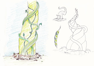
My next step with this project was to carry out a test animation of how the beanstalk would sprout of the ground. I completed some initial sketches before I got started so I knew how it was going to look like and how it was going to form, and once I had a good idea of what I was after, I did a quick sketchy animation in Photoshop.

Beanstalk Designs

Beanstalk Animation Test

I was really pleased with how it formed, and when I showed Tyler he thought it was very nice movement, so I went ahead and coloured in the frames in a similar style to how I had created other components. Once I had done this I experimented with textures once again, as the colours on their own feel too plain now I have seen what other works have looked like with texture. 

Beanstalk Coloured Animation With Texture Test

Carrying out this test animation has made me really excited to get started with the rest of the production. I shall see what Tyler thinks of my work, and see what he has to offer in terms of final character designs and hopefully we can make a start soon. 

Monday, 8 February 2016

Responsive Collaboration: 08/02 Meeting

Once again, myself and Tyler met up to discuss our progress and what we have come up with. I showed him the tests that I had been working on over the past few days and suggested that it would be much quicker to simply add a paper texture to a digital drawing rather than making paper cuts and scanning them in. He was very much on board with this idea, and even took it one step further and suggested that we could even explore different materials/textures for different components. I really like this idea and I have been assigned to do some tests to see whether this is what we want to go with.

Tyler also showed me his character designs, and we decided on elements that we both liked within the variety he had (even though I loved them all) so that he could go away and refine the designs and turn them into digital versions, considering we have now decided to work digitally. Not only do we think that this method will be much quicker and simpler than trying to experiment with paper, but we think it will be easier to work together digitally whilst being in separate rooms/locations.

We also tweaked some of the shots I had sketched in my thumb nailed storyboard, and we are now in a position where we are both happy with the story and direction. Now all that we need to do is find someone suitable to narrate our story, and we shall be able to make an animatic so we can ultimately work out timings and begin animating once pre-production is complete.

Now that our plan of action is clearer, we are both much more comfortable and confident that we can get the work done, and I'm excited to see how we continue to work together.

Applied Animation: Pre-Production Crit

Today was the day of our first critique, and I think I speak for everyone in our group when I say I'm happy with how it went. We presented our slides - that I had put together prior - showing our progress so far, and everyone seemed pleased with how much testing we had done and where we were heading with our project.

Presentation Slides


The main concern was our sound. Obviously we weren't going to use our voices for the final cut and we had just used them so we could time our animatic, but it was stressed that we should try to reach out to voice actors to get a good quality narration, as a sub-standard voice may detract from how beautiful our visuals have potential to be. We have since decided that we are going to aim to get our recording done by the end of next week, and in the mean time we are also going to continue to do testing before we start animating.

Now that we have a list of clear aims to get our animation finished we have been able to plan out the rest of our schedule, with me and Wing taking the majority of the traditional animating, and Oscar taking charge on adding colour. I am much more comfortable now that we have a clearer plan of what needs to be done, and I feel like we are headed very much in the right direction.

Friday, 5 February 2016

Responsive Collaboration: Creating Paper Texture

It was only when I finished my animation tests in After Effects that I got the idea to add a paper texture straight to the original Photoshop file. I saved a few paper textures from Google images and laid them behind the layers I wanted to give the texture. I then changed the drawing layer to 'Multiply' so the texture showed through. This was such a simple answer to 'how do we get a digital drawing to look like it was made out of paper', that I can't believe I hadn't thought of it before. Especially because I'm doing a similar thing for my Applied project at the moment.

Paper Texture Test

I definitely think this has been the most beneficial test I have done so far, and was so quick and easy to do. This method also allows for greater creative control than adding Fractal Noise for instance, as we can simply choose images/create images as subtle or detailed as we want, meaning we can also create a much wider range of styles. 

Responsive Collaboration: Animation Tests

I thought it would be a good idea to create some quick animation tests to see how the paper style animation would look like in After Effects. I quickly made up a scene in Photoshop, consisting of one of the barn designs - which I had tried altering the colour of to make it represent the company's logo - and some fields.

Changing the Colour

Test One - Plain

For the first test, I simply made the components into 3D layers and made up the scene in after effects. I then animated a simple camera pan to see how the scene could work. I quite like how 'clean' it looks, and definitely would be happy to stick to this simple style. If we were going to go ahead and make an animation in this style, I would obviously have to reconsider the size of the original layers as some of the grass layers look pixelated due to being re-sized. It might even be worth creating some vector layers in Illustrator so this issue can be avoided, especially for some of the easier shapes.

 
Test Two - Fractal Noise

The second test shows how the pan will look if Fractal Noise is applied to the composition. I'm still unsure about whether I prefer this added texture; I like that it feels more like paper, but not sure whether I'd chose this over the cleanness of the first test. I shall discuss this with Tyler when we next meet up.

Test Three - Lighting

Test Four - Radial Shadows

I revisited creating shadows using lights. Though I like how I can more easily control where the shadow appears, I don't like that it makes the composition dull in colour, though if I increase the intensity of the light, it begins to shine too brightly on the layers which looks even worse. So I tried a different way of creating the shadows. This time I looked at creating them using the Radial Shadow effect, and very much preferred these results. I was able to easily change the light source position, and the distance and properties of the shadows, but still retained the brightness of the original layers. I think if we go for any shadows, it should be in this way. 

Responsive Collaboration: Experimenting With After Effects

I wanted to carry out some quick tests with after effects to see whether I could make the digital drawings look more like paper cut outs. To do this, I coloured my first kitchen design in Photoshop, making sure that each of the room's components were on separate layers. Once I had got them in the right position in a composition in After Effects, I experimented with the effect 'Fractal Noise'. 

Original Drawing


Fractal Noise Test

I quite like this effect and think it could be a good alternative to scanning in paper components to achieve a realistic paper texture. This method would also mean that we could make quick adjustments to the shapes in Photoshop if we needed to, which would save us time and money (won't have to keep buying paper). We will be able to change the subtlety of the effect too, and choose which components we want to have this texture; Here I gave the background components of the kitchen Fractal Noise as I wanted the dining table and chairs - the main focus of this scene - stand out. 

AE Light Casting Shadows Test

AE Drop Shadow Effect Test

I also experimented briefly with shadows. In my first test I created a light layer, and set the foreground components to cast shadows. In the second test, I simply added a drop shadow effect to each of the components and experimented with the direction and softness of the shadow. I'm not sure what I think of these tests. I quite like that it makes the subjects stand out from the background, almost like they have simply been placed over a 2D backdrop, but I'm not sure whether this is the look we are aiming for. If this is something we want to pursue, I think I prefer the drop shadows to the lighting, as this method doesn't make the rest of the scene duller, yet retains their original colours. 

Thursday, 4 February 2016

Applied Animation: Transition Tests

Here is a quick test I carried out, looking at how colour could be introduced into the animation. I made a few watercolour drops in Photoshop using some brushes I was experimenting with and imported them into After Effects and used masks to make them appear on the 'page'. 

Watercolour Test

When we last met up as a group we talked about wanting to carry out transition tests, both digitally and traditionally to see what medium we wanted to go with. I produced a very quick transition test of our first scene to see how the lines could potentially form the subject, in the case the pregnant lady's belly.

Transition Plan

Traditional Transition Test


When we discussed our progress with Martin and Sara, Martin told us about how he had animated his transitions over the course of 16 frames when working at 24fps, and kept this consistent throughout his work. We decided to test this with our own transitions, and that is what I have done here. The lines form the Mother's stomach 16 frames into the animation. The hands are then animated on 2s. Personally, I thought this seemed a bit too quick, but Oscar and Wing thought this could be down to how quickly the animation ends, and that it will look fine when more of the story is animated afterwards.

I personally thought this test went well, and I like the look of the fine-liner against the digitally made 'watercolour paper'. It was also a nice change from animating digitally and if further tests go well I would love to return to this method. We shall discuss this on Monday's critique and see what others have to say about what we have got so far.

Responsive Collaboration: Designing Elements

So far I have been able to make a start on the designs for the farmhouse and the kitchen interior, the Giant's barn and the A2 Milk containers.

Barn Designs

I started off with the barn design. I made sure to keep the designs quite simple and only add splashes of detail, so that if we came to make them in paper it would be easy to cut out and reproduce. I also tried to keep the amount of colours to a minimum so that we wouldn't have to invest in lots of different shades of paper. It only occurred to me after I had finished that it might have been a nice idea to have parts of the barn in the A2 Milk logo colours, but the colours are something that can easily be adjusted if we decide on it.

Farmhouse Designs

When I was designing the farmhouses, I tried to avoid using purple colours/tones so that it would be easier to differentiate between the normal farm and the A2 Milk farm. I also avoided testing greens as I figured the land surround the house would be mostly green and I wanted the house to stand out. Again, the colours are negotiable and we will be able to decide what style we want to go for when we carry out testing. 

Kitchen Design

Before our meeting, I managed to produce a line drawing of a potential kitchen. We thought it looked too detailed, but thinking about it, when reproduced in block colours I don't think it shall be a big contrast to the rest of our designs. There is also a chance that we won't need to see the kitchen from any other angle other than head-on, and if so we could spend more time on this background as we shall only need to make it the one time. Again, this can be confirmed when we discuss the thumbnails that I produced, but in the mean time I shall continue designing kitchens so we have a variety to choose from. 

A2 Milk Containers

I very quickly considered the milk containers that could be used throughout the animation. They could potentially be on the table at the end of the animation when Jack finds he can drink their milk.

Responsive Collaboration: Moodboards

To help me with my designing process, I produced a number of moodboards for each of the assets I had to design.

Paper Art

For the first moodboard I gathered a series of paper art images looking at the potential styles and techniques we could go for. As much as we liked the way the 3D elements looked, it would be more beneficial for us to go for 2D. We also like the simplicity of some of the characters on the board, and we thought a 2D space would compliment this style the best.

Farmhouses

I then looked at a collection of farmhouses as inspiration for the house that Jack and his Mother are going to live in. I tried to select houses that looked interesting but at the same time were quite basic in terms of shape and detail.

Barns

The same goes for the barns that I gathered. 

Kitchens

For part of the animation, Jack and his Mother will be sat in their kitchen having milk/breakfast. I tried to collect pictures that had a dining table in, and I looked across a range of different styles as I was unsure what the aesthetic of the kitchen should be, whether it be like a cottage, traditional or modern for example. 

At the moment I'm not 100% sure on what else needs to be designed as we are yet to talk through the thumbnails I produced. Once we have done this, I will 'get the go ahead' on what else needs to be designed (for example, if we 'okay' my thumbnails, I won't need to design the inside of the Giant's barn), and from there I will produce more moodboards where appropriate. 

Responsive Collaboration: 04/02 Responsive Session

In today's session we discussed the progress we both had made since last time we met up. I showed Tyler my environment designs and he showed me the start he had made on his character design. I really liked some of the sketches he had done, despite the fact that he wasn't fond of them because they felt rushed due to having deadlines to work around. We picked out the features and faces we liked and Tyler is going to build on these to create more finalized characters for next session. Whilst he is doing this I am going to continue with the environments and make a start on some look tests.

Timetable

We also sat down to put together a schedule for our project, above is my touched up version. We thought it looked quite daunting as we only have 6 weeks to complete our animation and get it submitted, but I assured Tyler that I thought it would be do-able if we keep our designs simple which we both agreed was for the best. I also suggested that we should consider using After Effects to produce our animation as I thought this would be less time consuming than trying to produce a paper stop motion animation. We would have a lot of problems to address such as getting a 2D character to stand in a 3D space, which I don't think we have time to test/resolve. Instead, I suggested creating all of our elements in paper and scanning them in to use as 3D layers in After Effects. This would allow us to keep the hand-made paper aesthetic but hopefully make our lives easier. If this fails we may have to resort to creating assets in Photoshop, but we shall see how the tests turn out.

 Thumbnails

Since the session I have made a start on thumb-nailing our story. I think these help tell the story well, but I shall see what Tyler thinks when we meet on Monday, where we can discuss any potential changes we want to make.

Tuesday, 2 February 2016

Applied Animation: Storyboarding

Now that we had our chosen stories we were able to begin storyboarding and figuring out how we wanted to visually narrate the script. All three of us sat down with sticky notes and sketched out ideas for each scene as we read through our script. For the majority we had very similar ideas in terms of what we wanted to see and from what angle, and even when we didn't necessarily see eye-to-eye we were able to discuss our ideas professionally to work out what option would be best fitting of our narrative. Due to how well we co-operated we were able to get an initial sticky-note storyboard completed relatively quickly.

We discussed our progress with tutors, Martin and Sara. They were happy with our progress and the visuals we provided, but couldn't understand fully what we wanted to happen in our animation. All three of us knew that we wanted the lines to be quite fluid, and have them gradually form different characters or aspects of the animation, but this wasn't presented clearly in our sticky notes. It was suggested that we sit down and re-think some of our shots by thumb-nailing our entire animation. Which we did. We were able to present our ideas more clearly and we even re-worked a few camera angles/movements that originally didn't work as well.

Thumbnails - Drawn by Oscar

Myself and Wing were placed in charge of completing the panels for the final storyboard. I took one story from the animation, while Wing took the remaining two as I was going to get working on environmental/prop design afterwards. Oscar was to create an animatic from our panels when we were done. I was certainly happy with how we had assigned tasks, especially as I'm not particularly fond of making animatics. I also think that the work load is being equally allocated and we're sticking to our schedule very well.

Final Storyboard

Applied Animation: 29/01 Meeting - Character Designs

Last Friday we all sat down to see what kind of visuals we had been able to come up with. It seemed we were all on a similar wave length as the majority of our characters were very simple, and had basic facial features such as dots for eyes.


 My Design Work

We preferred Wing's designs the most and suggested that it might be nice for Wing to come up with the final designs for our characters, whilst me and Oscar take charge of other pre-production jobs. Wing was happy to do this, and was able to produce some beautiful designs that we are all happy to work with.


Wing's Drawings - Final Characters