Thursday 19 March 2015

VL Lecture: Colour Theory

A couple of weeks ago I attended a series (two) of lectures on Colour Theory, and they were easily the most interesting lectures I have been to so far, along with Mike's lecture on the history of animation. Within two hours we had covered Colour Theory in depth, and learned about how we perceive different colours as well as the different dimensions of colour and colour modes.

So how do we know that this apple is red?


We know that this apple is red because of how our eyes perceive colour. The eye is made up of two receptors; rods and cones. The rods are responsible for conveying black, white and grey tones, where as the cones deal with colour, but we can only perceive these colours when light is present. White light is made up of a whole spectrum of colours, and we can perceive these different colours when the different cones in our eyes are stimulated, as there are three different cones that are sensitive to different colours (Red, Green and Blue-Violet). For instance, if the both the red and the green cones are simultaneously stimulated we will perceive the colour yellow. Due to this, the light in which we see colour effects our perception of colour.
But is this apple really red?

We can safely say it IS, because at the moment it is the "reddest" thing we can see. But if we compare this apple to a pure red, it then appears much darker. Like so.

Comparison of Supposed "Red" Apple to Red

This is because there are many different hues, tones and saturations of each colour, other wise known as chromatic values. This is a number that is assigned to each colour in the colour spectrum, so we can distinguish between different tones of colours. We can use chromatic values to print or select the exact same colour as someone else as it is a globally agreed system of labelling colours, but this doesn't mean that we are going to perceive this colour in the same way. So technically speaking "Red" is a concept that doesn't exist.

Wednesday 18 March 2015

Module OUAN404 Evaluation

I have really enjoyed producing work for visual language and I have generally found the briefs to be very interesting. I particularly enjoyed Environmental Storytelling as this gave me the opportunity to travel and explore new places and because I was in an environment that was completely new to me, this encouraged me to work out of my comfort zone. This brief also got me thinking more cinematically, as I was really considering the composition and perspective of the drawings which is going to be a useful mindset that will help when it comes to creating future animations.
I also very much enjoyed Form, Flow and Force as it had been a long while since I had done any life drawing, and despite this I was able to produce some good pieces of work, some obviously better than others. As well as Environmental Storytelling, this brief also made me more open to experimenting with new materials which isn't something I do often. I'm going to make sure I continue to practice doing so as this experimentation lead to the production of some good quality work, and by practicing using different medias I can have a wider range of skills and options for when it comes to creating animations. I also want to continue life drawing, not just because I have enjoyed it but because I think this will come in handy in terms of animating, as it will help me understand the human form in greater detail, which could result in more accurate characters/movements.

My least favourite brief was Take 5. I found it incredibly frustrating as I found it hard to generate more ideas once I had listened to the sound clips and imagined what I thought they would look like. Despite this, I managed to do sufficient planning to create five animations which all received good feedback when they were presented to the class. Not only has this brief provided me with the opportunity to strengthen my presenting skills, but it has made me more open to tackling abstract themes and it was a nice change from having to design characters and try to make them move perfectly. It has also allowed me to explore animating in a number of different ways. For instance I tried Dragon Frame for the first time whilst animating one of my sounds, and I also put my After Effects knowledge to the test with another animation. I think I have greatly improved at using different computer programs during this brief; I have become more comfortable at using Premiere for editing sound and I am getting to grips at using different dimensions and resolutions in my projects, as well as exporting them in the correct format. This was something I struggled with when I had first started the course (that, and getting my scans to line up so that when I played the animation back the image didn't move around like they did in some of my flip book animations.When you compare these to the animations I have produced now you can clearly see an improvement) but because I have been able to practice this quite considerably, I'm getting the hang of it.

Unlike other modules, I think I have been able to manage my time very well during Visual Language. I was able to meet all of my deadlines with very few problems, and I was generally able to keep up to date with my blogging. I blogged about my work and progress as soon as I had finished working on something, which meant I never really fell behind, so I didn't feel as stressed during this brief. If I was given more time to work on this module however, I would have liked to address some of the improvements that were suggested to me during critique sessions as these had the potential to strengthen my work.

Overall I have enjoyed working with these briefs and I think I have been able to produce some good quality work. I have been able to practice my drawing and each brief has given me new skills and strengthened existing qualities which I will continue to build upon and apply to future projects.

Applied Animation: Testing Ideas in After Effects

I thought it would be a good idea to put my new skills in After Effects to the test, and see whether this would be an appropriate programme to use for my animation. In particular I wanted to test the final scene, which is the title of the film. 
To get started, I created the components I was going to need in Photoshop. This included the text, the background and the aim sight. I wanted the overall look to mimic the style of the front cover of the book, so I worked in the three colours that were featured; red, white and black. Not only this but I wanted to keep the text and the general "grunge" aesthetic, so I experimented with different fonts and brushes to try to recreate a similar composition. 

Title Attempt - Comparing to Original Book Cover

Once I had created all the components, I exported them into After Effects and attempted animating them to see how it would look and whether it would work.

Attempt One

The idea behind the title is that it is going to appear after the camera has either zoomed into the bag on the girl's head or the light coming through the window, so I had the title fade in by changing the opacity of the layers. Once it had reached it's full opacity, I animated the aim sight lining up with the text, and after a couple of seconds had the video cut to black. This would be where the gun shot sound would play to end the sequence, and to transition into the start of the film. 

For a first attempt I think I did really well. I showed my animation to Matt and he seemed to approve, but suggested that I had the background animated rather than simply fade in. I thought this was a good point as it could potentially make the animation more interesting and visually pleasing. 

Attempt Two

Here I have tested out what the animation would look like with an animated background, which I had to redraw as I had already combined the background layers on my original Photoshop document, saved and closed. This time I kept the layers separate so I could animate them individually. I made the patterns splat/appear by creating a mask - something I had learned how to do in my AE tutorials - then readjusted the key frames to make them move at just the right speed. I think this has greatly improved my animation. It's a lot more aesthetically pleasing, and it feels as though there is more skill involved, when in reality it only took me about 20 minutes or so.

I think the style works for the kind of animation I am wanting to produce, and it was incredibly easy to use. I definitely think I should consider using After Effects when I come to animate, especially for some of the transitions I'm hoping to include as I think it will be much easier to animate using After Effects. 

Applied Animation: Storyboarding

After my critique I decided it was best if I just chose a couple of events from the entire book and base the title sequence around the ones I chose. I re-read the entire book, and whilst I was doing so I made notes of scenes that were interesting but wouldn't give too much away about the plot.

Notes on the Plot/Storyboard

In the end I decided to look at scenes that didn't necessarily seem important to the plot of the story, but actually were a major factor in the story. I made note of the scenes I wanted to animate, and sketched up a quick storyboard, each page focusing on a certain scene. I wasn't particularly interested in having the events play in the order in which they occurred in the book, instead I wanted to focus on creating a smooth transition from one scene to the next. I didn't want to have the scenes just simply "cut" from one to the other, so I ordered the scenes in a way in which I thought the transitions would flow the best.

Storyboard for Title Sequence

Whilst I was creating my storyboard, I also thought about where I could include the actors names and other credits. At the moment I have three potential spots for this, but they're in a position where, if I needed to include more names/text, I could simply extend the length of the scene. For instance, I could simply animate the smoke rising for a longer period of time in order to feature more names, or have the camera shutter transition twice, to open up to a new name.

After Effects Tutorial: Working in 3D

In our last After Effects tutorial, we were taught how to create 3D layers and how we could work with them in a 3D space. To get familiar with the tools, we created a few solid layers and played around with them. Here I have looked at the positioning of the layers in the composition, which you can see more clearly when the camera I created pans around the shapes. I had also experimented with lighting. I attached the spot light to the camera, hoping that it would follow it as the camera moved around the space to light up the shapes. It was successful at doing so when the layers were parallel to the camera's lens, but when it rotated around the shapes they were no longer lit up. I'm not sure why it did this, so I'm going to experiment further if I am wanting to create something similar to this. 

Testing 3D Tools

Once we had become familiar with the tools, we were asked to apply our knowledge to a new project, and animate the infamous boat composition. I feel I have been more successful with this animation, and I like how smooth it runs (with the exception of two wave layers that I was able to loop perfectly). I have made the camera pan in towards the boat and I like that I have been able to create a depth of field by making the clouds in the background and the waves in the foreground blurry. This is certainly a useful feature that I didn't know existed. I have also been able to adjust the light settings to change the atmosphere of the piece (i.e. brighter lights for the "morning", darker light for the "night").

Applying Knowledge to an Animation

Overall I'm very pleased with how this session has gone, and the information I have acquired from the tutorial. I have thoroughly enjoyed learning how to use the programme in more depth, and I'm looking forward to see if I can apply my knowledge to my current/future projects.

After Effects Tutorial: Working With Masks and Adjustment Layers

In this session we were working with the boat components again, but this time we were learning how to use masks and adjustment layers. To get started, I animated the boat sailing by looping key frames like I was taught in our previous sessions and once I had finished this I was able to experiment. I played around with many different effects and experienced what I could do with masks, and in the end I settled for adding a sepia tone to my composition.

Testing Adjustment Layers

I found today's tutorial extremely helpful, as it allowed me to recap on my existing skills as well as find out about new tools that I can imagine are going to be useful if I come to animate using After Effects. 

Form, Flow and Force: Strike a Pose

Due to my last session being a success, I was really looking forward to getting started with this task. Similarly to the last one, we didn't have to draw a moving sequence, instead we had to focus on one pose that was to be held for 20-30 minutes. This allowed us to really consider the shape and the form of the model, as well as the perspective we drew from and in what media.

Pose One - Callum in Red Pencil

I think I was off to a good start in this session. I decided to draw Callum in coloured pencil as drawing with this media is something I have only recently started doing and I wanted to improve on it. This would also allow me to "ease" into the session by drawing with a media that wasn't going to be do difficult to use/too experimental.
I'm really pleased with how the drawing turned out as I believe that I have been able to draw Callum quite accurately. His form seems to be realistic, and there isn't any feature that stands out as being drawn "incorrectly" which is what I was hoping to avoid, considering I had 30 minutes to draw my model. The only thing I am disappointed about is that I haven't been successful at fitting him on the page. I think it would have improved the drawing that bit more if I could see the whole of his body, and have it central on my paper. I could have lived with the chair being incomplete (like it is in the drawing now) as this isn't my main focus, but if I were to redo this piece I would definitely plan ahead to fit the entire model on my piece. This is something I shall have to think about with my other pieces.

Pose Two - Matt in White, Dry Brush Acrylic

I had gotten in the drawing mood after my first piece, so I thought I'd be a little bit more adventurous with my next drawing. I thought I'd look at working with paints again like I had done in my previous sessions and see if I could develop this skill even further, but rather than sticking to black paint, I thought I'd choose white and paint on a black sheet of paper. I think this was a good decision, and I really enjoyed working with the white; I much prefer the white on a black background to black on a white, as I like that it feels as though he is sat in a dark room with light shining on him, and it looks like there's more going on. It's not as "plain". The only thing I dislike about the piece is that the back seems to stick out too much. I knew it was going to the minute I started drawing the line, but there was no turning back as I couldn't erase it. Other than that, I think I have been able to capture Matt's form relatively well.

Pose Three - Emma in Pencil

I was unsure what media I wanted to work in next, when it dawned on me that I was yet to complete a pencil drawing for this brief. I had completed my very first sequence using it, but I wasn't particularly proud of it, so I thought I'd draw Emma in pencil to try and redeem myself. I focused on "committing to the line" as well as the model's body form, as usual. I think I was able to do this very well, and I ended up drawing my initial sketch within about 10 minutes, so I used the rest of my time to focus on my line work, as well as adding details to the drawing, such as facial features and shoe laces. In my opinion this has greatly improved the drawing as it has given it more depth. I also like that I have been able to position the drawing well on the page, and it was definitely worth taking the time to plan out the scale at which I was going to draw my model; there is clearly an improvement from my first drawing.

Pose Four - Emma in White and Black Coloured Pencils

For my last drawing, I was going to work on black paper with a white pencil, as this is something that I hadn't yet considered, but then I had a genius idea. If I worked on a different coloured background - let's say grey - I could still work with white pencil, but this meant I could also introduce black pencil, and think about light and shadows. Which is what I ended up doing. I started out by drawing Emma faintly in white, so I could go over the sketch with a more definitive edge (like I had done in my previous pieces) and work in the black pencil. The initial sketch took a bit longer than my third drawing as I was convinced I wasn't going to be able to fit her all on one page. In the end I just managed it, and did so within about 20 minutes, so I went on to the finishing touches. I started with the shoes and the legs, and I soon realised the piece was going to take a lot longer than 10 "remaining" minutes to complete, as I went a bit overboard with the details. So I broke the rules a little with this piece of work, because I just HAD to finish it in the same style in which I had started. It was definitely worth it. This is by far my favourite piece of the entire brief, and it is quite possibly the best thing I had drawn in a long while. I'm not particularly fond of the face it has to be said, but I'm really pleased with the body shape, and how accurate it is. I love that the way I have used both the colours has made the model look 3D, and it actually looks as though the arm is coming towards me, which was a worry I had when I first started drawing.
I'm really pleased with the reaction I got out of my peers with this drawing too. I was receiving really nice compliments and I hadn't even finished the piece, which was a massive pick me up. It definitely made spending a lot of time on it seem worth it. I mean, it felt worth it to me anyway as I was pleased with it, but the compliments were just the icing on the cake.

Friday 13 March 2015

Form, Flow and Force: Ah, Push It!

This part of the brief was a little different to the first half, as we were asked to draw just one pose rather than a sequence of moving characters. Our model was to push or pull against an object and hold that stance for 5-10 minutes, allowing the rest of us to draw. This, to me, sounded like the best part of the brief. It has been a long while since I have had an actual life drawing session, and this task gave us more time to draw our model, yet didn't last too long so we could get carried away with details. It still encouraged us to work quickly, which I liked the sound of.

James in Red Sharpie

The session started of well. I chose to draw James in a thin red sharpie because I was feeling adventurous. It is very rare that I work straight onto the paper with pen because I usually make a mess of it, so I've surprised myself with this piece. I "committed to the line" and it's resulted in a very clean line drawing, which I am very proud of. Granted, James now looks like he is going to rip the chair in half, but he does look realistic so I can overlook the fact that I've drawn him as baby Hulk.
I made the parts of the body that are closer to viewer bolder in an attempt to make the model stand out of the page more, and where this has worked, it hasn't given the chair any weight to it. There doesn't seem to be much of a struggle to lift the chair. I think this is down to the media I have chosen to work with and how I have used it. All the lines are the same thickness and flow smoothly. To make it seem like there is more of a strain I could try using thicker lines, or make the colour even darker/bolder. I shall have to bear this in mind for my next drawing.

Emma in Dry Brush Acrylic

I tried something completely different for my next drawing. I wanted to try working with paints again considering my watercolour attempts for the last quarter of the brief didn't go so well and I wanted to try to improve drawing directly onto the page with them. Instead of adding water to my acrylic I left the brush dry in an attempt to make the model seem as though they were applying force to their actions, which I felt I was unsuccessful with on my first attempt. I think I did much better at doing so with this piece. I still made the lines that were closer to me darker to make the model look 3D, but this time the lines were bolder and "sketchy" due to the dry brush. To me this gives the model weight and applies a force, especially when you compare it to my first drawing.
Dry brush is something I've never done before, so I'm proud of myself for giving it ago and I'm happy that it turned out well.

Matt in Dry Brush Acrylic

I decided to continue working with dry brush acrylics because the way in which Matt was posing for us meant he was applying a lot of pressure to his wrist as he was resting on it. Considering my last attempt went well at capturing force I thought it would be best to use it again. I could have experimented to try and find something else that worked well, but the pose was incredibly awkward and difficult that I just stuck to what I "knew".
I think this went rather well. I don't think I have been able to capture just how much force he is exceeding in this piece, but I believe that I have been able to draw Matt accurately (excluding his head) which is quite the achievement considering the pose.

James in Chalk

For the last drawing I resorted back to using chalk on black paper, as I enjoyed using it and wanted to see if it was a good media for capturing force. In the last pose we had James sitting awkwardly in a chair, leaning back and pulling against the backrest. Again, I think I have done well at drawing my model and capturing the proportions of him well, but there doesn't seem to be any strain on his arm of back. It feels to relaxed. It might have been nice to have the drawing on grey paper so I could work charcoal in too to see if this made much difference to capturing the force James is applying. Even if not I think this would look to be an interesting piece and combination of media, so it is something I shall bear in mind for the final part of the brief.


Overall, I think this session has been the most successful so far. I know I have been hit and miss with making the model look like they are applying pressure/force, but I think I have been very successful at drawing them in proportion and keeping them looking realistic on the page. I have thoroughly enjoyed this life drawing session and I'm looking forward to experimenting a bit further and seeing what I can produce with a little bit more time in the last quarter of the brief.

Thursday 12 March 2015

Form, Flow and Force: Like a Puppet on a String

The second half of the brief we were to do a series of 4 drawings that involved the model squashing and stretching, spending approximately 10 seconds on each sketch just like the first quarter of the brief. 

Sequence One - James (This edit is top notch, clearly)

I started of by drawing James in chalk on black paper (two sheets). I did the initial sketch lightly and once I had all the poses, I quickly went over the outlines to make them stand out. The chalk was a nice change from the usual Biro and pencil, and I've surprised myself with how much I like this sequence, considering it has been a very long while since I used chalk. I also think I have done a good job at keeping the proportions of the model consistent, it's just a shame I couldn't scale the drawings down a touch so that they'd all fit on one sheet of paper.


Sequence Two - Callum

I don't think my second was as successful as the first. I was drawing Callum and decided to opt for watercolours in an attempt to work quicker, as I had been getting carried away with going over my drawings to make them look neater. I chose watercolours as this media is practically permanent once it is applied which would encourage me to "commit to the line". Which is just what I did and I think it's great that I was more confident with my line making, but I just don't like this piece (with the exception of the odd pose). For me it looks too basic and there is too much differentiation between each drawing in terms of scale and proportion. Having said this, I think it was a good attempt considering it's not often (and by often, I mean next to never) I work in this way.


Sequence Three - Matt

These set of drawings are, in my opinion, the least successful so far. I tried to push myself to use different media and so I opted for charcoal, but the end result is just too rough for me. I think some of the poses I have drawn are more accurate than the ones in Callum's sequence, but overall I just don't like the look of this piece. Where as I do like the general shape of the drawings, again I don't like that there's too much differentiation between them and that scale of the model fluctuates. However, I do like that the sequence seems to make more sense and there is a lot of squashing and stretching which has been a challenge to draw, but then it does fall short in terms of the amount of poses so all-in-all I'm not too happy with this attempt.

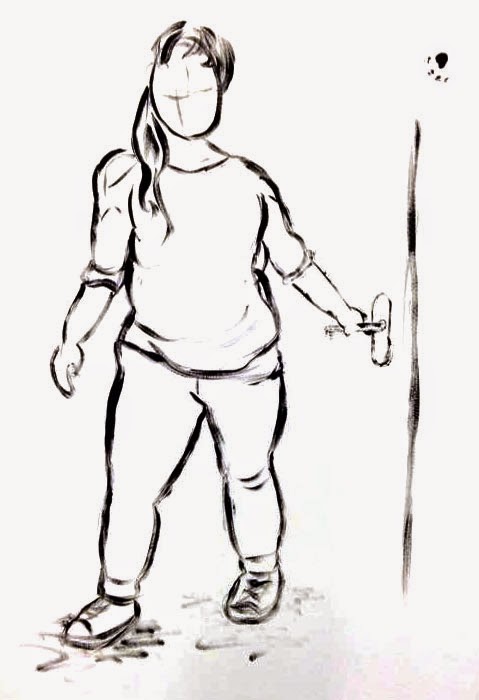
Sequence Four - Maressa

I think I've definitely made an improvement with my last sequence. I decided to draw my sister Maressa in an inky pen so that when I had finished I could make it a little bit more interesting by smearing water in areas to add a shadow. I've worked with ink before but I've never worked straight onto the paper using it, usually I draw out a pencil outline that I work over the top of. I worked quite slow to begin with as I was a little bit uncomfortable with the media, but once I got the hang of it I was completing the sketches much quicker, and by the looks of it more accurately, with the exception of the odd leg and arm.
I'm really pleased with this sequence. Not only do I like the drawings, but I like that the sequence actually squashes and stretches and each pose follows on from the next. This is because I had more control over the model with her being my sister, and she was only modelling for me; I could tell her exactly what I wanted. I also like that I have been able to fit all the poses onto one page, which is something I wish I could have done with my other pieces. It makes it much easier to see how the action progresses and also looks much more presentable. The only thing I really dislike about this sequence is that the scale fluctuates between the odd drawing, and that some limbs aren't accurate/in proportion. Having said this, at a glance you can't really tell, it's only when you pay attention to each drawing and compare it to the rest is it noticeable (in my opinion), which I guess is a plus.

Sequence Five - Emma

Because I can't count, and because I had completely forgot that I had drawn this, I ended up with five squash and stretch sequences, which is great because it some-what makes up for my charcoal sequence. Hopefully. Yes.
The fifth one I completed in both red and blue pencil, and I overlapped the figures to try and fit them all on one page. I was unsuccessful at doing so, (you can't really tell here, because of my ninja photoshop editing) but I still like the look of this piece. The figures are the most simplistic I've done for this section of the brief, but it is one of my favourites. I like how it seems that there is a lot going on because of the way they have been overlapped, but they are in fact very basic. A lot of them aren't even in proportion, and I drew her way too big, but because of the layout you can't really tell. I am willing to over look this as well, as I was good and worked much quicker for this piece in comparison to my other attempts. 

Form, Flow and Force: Ice Age

I wanted to talk about an example of animation where the character struggles to lift a heavy object, considering I have explored this briefly whilst drawing my models in the Ah, Push It section of the brief. The first thing I thought of was Ice Age and the struggles that Scrat has with his Acorn/s.

Ice Age - Scrat Clip

I chose this scene in particular because I think it is a great example, as it really shows that Scrat is struggling to lift the acorn out of the ground. You can tell that it is really stuck because of how much he shakes and straightens his arms when he attempts to lift the acorn, not just this but also how much his spine curves and reverses as he tries to loosen the object. The anticipation of the lifting also implies how stuck the acorn is. Before it was lodged in the ice, Scrat had no problem lifting the acorn and so didn't anticipate the lift, showing that it was a light object. The contrast between this and the actions he performs to get the acorn out of the ice only emphases how stuck it actually is. 

Form, Flow and Force: Beauty and the Beast


Beauty and the Beast is one of my all time favourites by Disney, and I'm mentioning it today because of the ballroom scene. I love the way the movement of the two characters has been captured in this particular scene and it really enhances the beauty of the moment.

Beauty and the Beast - Ballroom Scene

Beauty and the Beast was the second film by Disney (following The Rescuers Down Under) to use CAPS, a Computer Animation Production System that was developed by Pixar. The ballroom scene makes best use of the programme as the two dance in a computer-generated space, beautifully at that. When Belle spins and twirls there is just the right amount of overlapping action in the dress to make it move realistically as well as give the illusion that it is a heavy dress, due to the material and the amount of layers that it has. Her movements are also very fluid, which reflects the delicate nature of the character, where as the Beast's are slightly more uniform, showing that not only is he the supposed lead in the dance, but that this is a concept that he is new to and he is just getting to grips to dancing. Towards the end of the dance his movements become more fluid and natural suggesting he is comfortable with Belle and has picked up on how to be a lead.

Not only are the movements in the scene stunning, but the way the characters have been drawn say a lot about their character. Belle is drawn with smooth, rounded lines, which again highlights her delicate nature. This, along with her slow, "soft", fluid movements, makes her appear very light, where as the Beast is quite the opposite. He is drawn with generally more straighter lines which makes him appear "harsh" reflecting his personality. I like that there is a contrast between this and the fluidity of his movements towards the end of the dance, as it really shows how he has adjusted to trusting Belle and how comfortable he is around her, which greatly impacts this scene.

Still from the Ballroom Scene - Diagram of Pressure and Weight by Richard Williams

The straight lines also help to portray where his weight is shifted to, particularly in the legs. Rather than touching the ground, it seems as though he is pushing against it due to his weight, and this is due to the line work on the character. Richard Williams explained this well in his book as I mentioned before. 

Form, Flow and Force: Richard Williams

Richard Williams' book The Animator's Survival Kit has to be up there in my top ten purchases of all time. This book is so helpful and informative, I don't know where i'd be without it. It goes into detail about the different principles of animation, and talks about terms like "animating on twos" and does so in a way that is easy to understand. It has certainly helped me when I've been animating.

I've decided to talk about it again as it is a great example of how the human form moves throughout a space, and it explains it in an animation context. Even though a good 90% of his drawings are rough and sketchy, he has managed to pick out the most important elements to capture the movement of the character. For example, in the photograph below Williams has demonstrated a skipping cycle and how you could go about animating this, but has done so by drawing the general shape of the character. It's effective for what he is trying to do as it simplistically explains the process, but the proportion of the character is consistent and it is just exaggerated enough to make it look like a "bubbly" skip whilst maintaining a degree of realism.

Skipping Sequence

Further Examples of Characters' Movements - Hip shaking and Jogging


There is also a section of the book that looks at how weight can be portrayed in your drawings and animations, the following diagrams I found to be the most informative/useful. Williams explains that we can show how heavy an object is by how we prepare to pick it up, so it's all about the anticipation of the action. Then there's the actual lifting of the object. In these diagrams it feels as though the rock is actually heavy because of how he has drawn the character struggling and the shape of his spine and arms. Usually if the object is light, the movements of the arms are very fluid as there is no resistance, but as the object gets heavier, the weight can straighten the arms and pulls the shoulders down. 

Considering Weight

I wish I would have remembered about this book before I drew my models lifting, pushing and pulling objects as this would have been extremely useful. Though I was not wanting to exaggerate the character to Richard Williams' extent, this insight would have helped me wrap my head around how the weight can be portrayed, as well as get me thinking about where the weight is, and how the pressure is being applied. I will certainly have to refer to it in the future, to see if I can improve on portraying weight and pressure.

Tuesday 10 March 2015

Form, Flow and Force: Rhythm is a Dancer

For the Rhythm is a Dancer part of this brief, we were to produce a series of 12-18 drawings that explore someone moving through a space, each pose lasting around 10 seconds. I got together with four other students so we could all pose for each other so we would all be able to get our required amount of drawings. We pushed together some tables to act as a catwalk, and we just went crazy. Originally we were planning on doing simple walking sequences, but we figured we'd have four lots of drawings that looked almost alike. So instead we did sequences that were more suited to our personality and over the top. 

Sequence One - James

My first set of drawing is of James. I was unsure how I was going to tackle this task as I had never drawn as quickly as that before, so I started of by drawing James as a collection of shapes and lines. I think this worked to some extent, but I don't like how sketchy they are and how they lack detail. I know this was supposed to be the point, as I'm supposed to be focusing on the movement of the character, but I feel that the addition of a few more details would help capture movement more accurately.


Sequence Two - Matt

For my second sequence I switched from pencil to pen as I thought this would encourage me to work more definitely. This was generally the case, and I very much prefer this sequence to my first. The movement of Matt was captured much more accurately in this set of images. Where as I think this was down to practice predominantly, I also think that the addition of the extra details played a part in this. I feel much more comfortable drawing observationally/accurately than I do abstract, and I think this reflects in my final outcomes. 


Sequence Three - Katy

I took the opportunity to experiment further with media in my third sequence, and looked at using coloured pencil to draw in. This is something that I have never done before, and it always baffled me when I would see people sketching in colour. I didn't understand why you would do this if you could use lead pencil and incorporate colour later on if needs be. Now that I have tried it for myself, I definitely see the appeal. I'm not even fully sure why I enjoyed using them so much, but I do feel that my drawings feel less "sketchy" in colour when compared to pencil. 
I feel I have improved massively in my life drawing sketches, and I feel I have been able to capture Katy's movement and body shape well. Having said this, I have to point out that I did go over my initial sketches to make the drawing more defined, but I did manage to get down the general shape within the approximate 10 seconds, which I am pleased about.


Sequence Four - Emma

For my last sequence I continued using red and blue coloured pencil, considering I had been successful with my third sequence sketches. I think I continued to be successful using them in this last sequence, but similarly to three I did spend a couple of minutes going over the drawings to create a more definite line. 
Where as I think some of the drawings of Emma have been a couple of the strongest I have produced for this brief so far, I didn't really plan it out too well. I had ran out of space come the last image, and rather than waste a whole page to feature just one drawing, I did a large scale sketch instead. It would have been nice to see them all the same size and proportion (this also applies to all the drawings I have done today) but I simply ran out of room. If I had planned this better, I could have put together one long piece of paper and had all the poses in a line.

Overall I'm very pleased with how this part of the brief has gone. I started out a bit sketchy, but you can definitely see an improvement as the day went on, and I have been able to produce some fairly accurate sketches of my models, if I do say so myself. 

Thursday 5 March 2015

Animating with Maya: CV Curve Tool

In this part of the session, I returned to looking at the truck I modeled in my first induction to see if I could make it move. I created a motion path for the truck to follow using the CV Curve Tool, and attached the truck to the path once I had combined all it's components together. Once I had done this I could adjust the speed that the truck moved at by adjusting the curves on the motion graphs. I also made the truck ease in and out by adjusting the tangents on the curve, similar to my previous projects.

Bad Quality Truck

When I came to render the animation as an image sequence, I found that the photographs were really bad quality (as seen above). It took me a while to figure out why it had done this as the settings seemed to be the same as my previous renders, but it turns out the compression quality was too low, hence the quality of the final video. I adjusted this and exported the sequence again to get a much better quality (as seen below). I'm not fully sure why the image has a blue tint to it, but I have a feeling it is to do with the lighting of the composition. I shall have to keep an eye on this one and practice using lighting tools. 

 
*Better* Quality Truck

Animating with Maya: Bouncing Balls

For part of our induction to animating with Maya, we were to animate two balls bouncing. To do this task I had to bear in mind the 12 principles of animation, in particular Squash and Stretch. Where I find this to be an easy concept to wrap my head around, I found this to be the hardest task of the three I have done so far. The key frames were much harder to make/work out, as I had to test the degree to which I squashed/stretched the object as well as adjusting the tangents on the motion graph to create easing. 

Bouncing Balls

Even though I found it a bit of a struggle, I think I have done a good job with this task and I feel as though I have been able to give the balls different weights with the way I have made them bounce.

Wednesday 4 March 2015

Animating with Maya: Segmented Pendulum

After we had finished with our pendulum animations, we went onto creating a segmented pendulum. To start out, I made the pendulum swing in the same way as I had my original one, by selecting the components, adjusting the position of the objects and setting keyframes. This looked fine and the animation was just as smooth as the first, but it didn't look realistic. The objects moved in a way that was too uniform as there was no overlapping action with the balls that were lower down in the line. 

To create the overlapping action I opened up the graphs for the movement of each of the objects, and shifted the motion path along. This meant that they would move at the same speed, but the balls at the bottom of the pendulum would hang a bit later than the ones further up, creating a more realistic pendulum swing. This looked a lot smoother when played back, but because the motion paths were no longer occurring at the same time, if the video was looped it was no longer continuous. Instead it jittered just as the video started again. 

Motion Graph After I Adjusted the Infinity Curves

I could have left the animation as it was, as it played through fine, but it really bothered me that it wasn't smooth when it was looped, and you could clearly see when the video started again. So I looked at the graphs for the motion of the objects, particularly the infinity curves. If a video is going to loop perfectly then the curve will be smooth throughout and the keyframes at the start and the end of the sequence will line up with the infinity curve, which wasn't the case when I'd finished my animation. To adjust this, I added keyframes on the infinity curve and deleted the start keyframe, then altered the tangents of the curve, so that it was smooth, as shown above.

Finished Segmented Pendulum Swing

It took me a while to get my head around this process, but I definitely think it was worth the time, as now my video loops much more perfectly. I shall have to practice this process as my memory of doing it is a little shady, and I want to be able to apply this to future projects, if needs be.

Animating with Maya: Pendulum

Last week we started animating using Maya, and I really enjoyed it. As expected it was quite frustrating to get used to, as I couldn't find the object attributes to animate, but once I got the hang of it I found this first animation quite easy to do. The settings are similar to After Effects in the sense that you can set a small number of keyframes, and the programme will fill out the rest for you.


Even though it's just a simple pendulum, I'm really pleased with my animation and that I have been successful at making it move and loop well. I'm really looking forward to see what else I can do with my acquired knowledge, and I can't wait to learn more in this field. I'd love to be able to get really good at using this programme, so I'm going to continue to practice and learn.

Monday 2 March 2015

Applied Animation: Interim Crit

In today's critique I was pitching my current ideas to the class in hopes to get feedback. My main concern was the plot of the title sequence. I didn't know whether it would be best to focus on the first few chapters of the book, or to look at the story as a whole and just pick out key events. The latter seemed to be generally favoured, and it was mentioned that I don't want to include too much action, as I only have 30 seconds to work with. If I base the title sequence on the first couple of chapters, it may seemed too rushed or jam-packed with action and information, which I don't want. If the film starts with the first few chapters, I also don't want to repeat this footage in the title sequence, or vice versa.

I was asked whether I had considered sound, and to be honest I haven't really put that much thought into it yet. Immediately I had thought of having the title end with a gunshot and having the video cut to black, which could then fade into the rest of the film, but other than that I had no other ideas. Thinking about it now, a dramatic/suspenseful track would be suiting (Pyres of Varanasi springs to mind). I could even have other subtle sound effects over the top of this if needed but I think it would be best to tackle the animation first and tackle that hurdle when I get to it.

As a whole I'm happy with how the crit went as it really made me narrow down some of my ideas. I didn't really receive much criticism either, which indicates to me that I'm good to go. My next step is going to be picking out the events I want to occur in the title sequence, then I can get on with storyboarding, and looking towards gathering video references.