Friday 30 January 2015

Take 5: Animating Sound 042

I'm going to be honest and say that I started with sound 042 (my fifth sound) because it seemed like it was going to be the easiest to do, and I thought this would be a good place to start. From my plan I knew exactly what I was going to do, where as with some of the other sounds I was unsure of how I was going to make them work. 

Planning the Animation

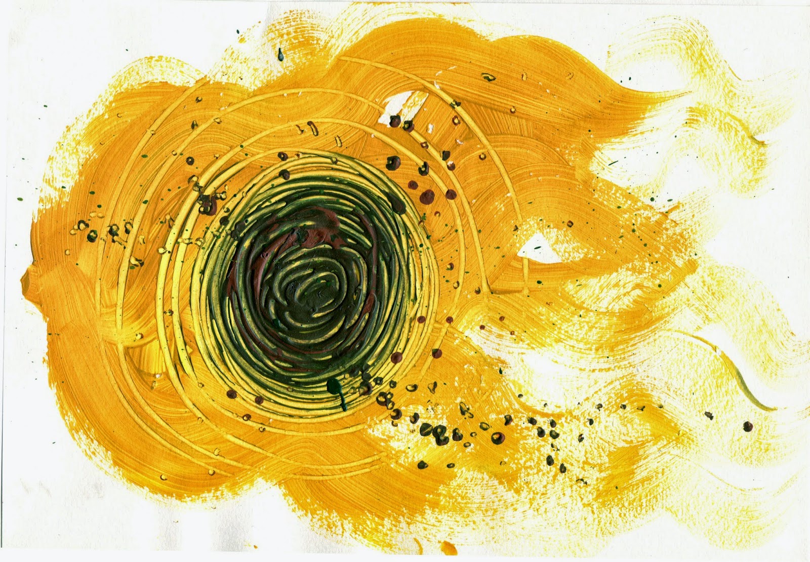
The only thing I had left to decide on with this animation, was the media I was going to use. I was stuck between using pencil and oil pastel. Both of which could give me the fuzzy texture I was going for, and in the end I chose pencil, simply because I prefer these sketches to my original oil pastel ones. 

Planning Timing and Keyframes

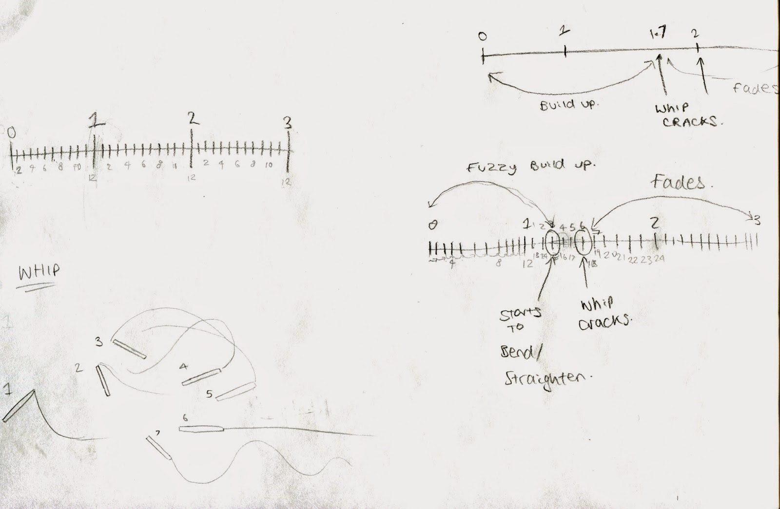
Before I got started, I listened to the sound again, and picked out the times for my key frames, the most important being the "crack of the whip". The sound lasted three seconds, and the whip cracked at around 2 seconds and 7 frames in, so I worked out that I would need a build up of just over a second, with the whip preparing itself at around 2 seconds and 3/4 frames (if working at 12FPS). After the crack whipped the orb of electricity would begin to fade out and get smaller for the rest of the sound. 
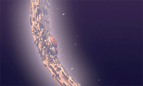
Final Animation 042

It didn't take me long to draw out my frames as I only had 36 to do, and the subject itself wasn't incredibly detailed. It also didn't have to move smoothly, as I wanted it to look quite jagged and energetic to represent the sound. I put the frames together in Photoshop, and then imported the video into Premiere where I added the sound. I don't know what happened but rather than the animation being 3 seconds long, it's now just over 2. This doesn't particularly bother me, as the sound still lines up nicely with the drawings, but I shall have to revise how I put the animation together, as it clearly isn't running at 12FPS. 

I'm really pleased with how the first animation has gone, as I think the subject portrays the sound very well, even better than what it does as a static image. The drawings also line up well with the sound clip which I'm happy about, as I was unsure if my planning was going to be accurate.

Sunday 25 January 2015

Take 5: Gantz Graf

This animation is slightly different to the two I have previously talked about, but is still a great example. Gantz Graf is a track that appears on an EP that was released by Autechre in 2002, and Alex Rutterford - A British director and graphic designer -  digitally created a music video for the song that portrayed the "movements" of the sounds. 

Gantz Graf

The video features an abstract object that accurately synchronizes with the track by morphing. The shape also flickers, dissolves and pulses to represent different elements of the song, such as a change in frequency. This was all done manually and I think Rutterford has done a good job at making the movements accurate, not only this but I like the way the camera changes position as there is a slight pause from the hectic sounds (such as the transition at [0:25-26]). I like how this fits in time to the music and also makes the animation more interesting to watch by allowing us to see the shape at different angles. Similarly I like that the contour lines in the background help to rotate the object in time to the sounds, moving faster when the track is more upbeat and slower when the music calms (example at [2:55]). 

Not only do I think the movements have been synchronized very well, I also like the general aesthetic of the piece. The texture and colour of the shape have obviously be considered, as Rutterford has made it look like metal, which to me ties in nicely with the metal-electro track. I also like that there is just one monochrome object that portrays all the sounds that have been computer generated, unlike the other pieces I mentioned that used different colours and shapes to show different instruments and the lively atmosphere they created. This track is more "rugged" and "harsh" ambiance and I like that this is captured with the dark colours, the sharp edges of the object and the way that it moves. That, and the way that the shape is consistently geometric and uniform perfectly reflects the nature of the song and how it was produced.

Take 5: A Phantasy in Colors

A Phantasy in Colors is an animation by Norman McLaren that also looks at animating sounds. It was produced in 1948 and in comparison to Fischinger's Komposition in Blau it is much more abstract and playful. The experimental animation was produced by drawing images and patterns directly onto film to accompany three different pieces of jazz music. I think the film is very aesthetically pleasing, but for me I don't think the images accurately represent the sounds. They seem to move out of time with the music unlike Komposition in Blau which was very "uniform". Having said this, the animation is just as interesting to watch and I can appreciate the use of colour and different shapes & patterns to represent different sounds.

A Phantasy in Colors

Where as I don't think the movements of the shapes accurately synchronize with the music (with certain exceptions such as [3:07] and [4:07]) I do feel that the general atmosphere that is created with the use of the playful patterns and colours compliments the music nicely as it has the same calming effect as listening to the music.

Take 5: Komposition in Blau

I have looked at a lot of animations that deal with portraying sound, and the Komposition in Blau by Oskar Fischinger seems to be the one of the earliest animations that does so. Not only that but it deals with the subject really well and is beautifully composed.

Video Link

The music starts off calm and Fischinger uses a blue background to accompany this, where red cubes move around the space to represent the sounds of the different instruments. As the video progresses, and the music becomes more upbeat, more shapes and colours are introduced to portray the different sounds and the lively nature of them. I think the colours he has chosen work really well, and he has used them in a way that doesn't make it seem "over-populated" with colour, but instead creates an accurate contrast between the different sounds and instruments. I especially like how the colours of the background and shapes quickly shift when the pitch changes.

Not only do I find the use of colour to be accurate, but the movement of the shapes has obviously been very carefully considered. The motions are in strict synchronization with the music so every movement considers the tempo, pitch and the general "direction" of the music. The shapes will gain altitude or move closer to the viewer as the pitch rises, and the speed at which they do so accurately portrays the tempo. I believe (3:10) to be an excellent example of this, and I particularly like how the colours are used in this part of the animation.

I think this is a great example of a short that animates sound as when I watch it, it actually seems as though the shapes are the cause of the music. This is something that I would love to be able to produce with my own animations, so I will be most definitely referring back to Komposition in Blau.

Saturday 24 January 2015

Take 5: Sound Five

I thought I was really going to enjoy drawing this sound, as the first time I heard it I had a few ideas and I thought it was going to be easy to get the ball rolling considering I had a good place to start. When it came to it, I couldn't really think of anything more than what I got.

The clip sounded very electronic and fuzzy, and it seemed to get "closer" to the audience. Towards the end of the clip there was - what sounded like - the crack of a whip with sparks coming off of it. I started out in pen to jot down my initial thoughts, then brainstormed what colours I thought it could be. Initially I was thinking a mixture of blue and purple tones, but then thought it could potentially be a green.


I started by making some quick responses in water-colour but I felt this wasn't the right texture for the sound. The clip was more "fuzzy", so instead I worked with oil pastels and chalks. I felt these more accurately portrayed the sound, but I have never been a fan of working with coloured pastel/chalk.

Take 5: Sound Four

I definitely had the most fun with this sound. It sounded like it was thick in texture and was very "slurpy" and messy. The sound made me picture someone sticking a straw into a bowl of custard and blowing on it, and it didn't give me a headache when it was looped, which is always a bonus. 
The sound started off slow and "built into chaos", and because it was a fun sound I focused primarily on squiggly lines. The clip sounded quite dirty and messy so I chose to use quite murky colours to try and represent what I heard. 


I felt that my diagrams accurately described the sound, but the media just wasn't right. The pencil and pen lines were too thin, and didn't portray how thick the noise was. I figured the best media to use was Acrylic paint, so I started using that. I didn't water the paint down, but instead used large quantities of paint and pushed it around with brushes and sponges.


Here (bottom right) I tried out different coloured backgrounds. By this point I was working exclusively in these three colours, but hadn't yet considered one of them to be a background colour. I like all of my experiments, especially due to how thick the paint is, so you can feel the grooves where I scraped away at it with the end of my paintbrush. I particularly like the yellow background, as I like how it contrasts with the brown/green mix that sits on top of it. Due to how much I liked this design, I decided to create a similar one but more large scale (bottom left).

Friday 23 January 2015

Take 5: Sound Three

I found the third sound clip particularly harder than the rest simply because I recognized what it was. The clip was of water droplets and because I knew what it was I found it incredibly hard to picture anything other than a faulty tap.  I also found myself drawing tear drop shapes in my experiments too. I guess this isn't too much of a problem, as the sound seems to droop like a tear but I don't like how I seemed to just be drawing water streaming and rippling. 


These scans/edits really don't do the water-colour any justice...

I worked predominately with the colour blue, because this best describes water. I also thought it would be best to use water colours as they weren't as "harsh" as other media, and they also best described the fluidity of water. 


...Especially when it's on top of a tissue.

I started out by drawing the drips in the blue, but then I got the idea to draw these in white instead. I felt that this would help portray the drips more accurately as small bodies of water are transparent, and it's only when they are large that they appear blue. So I draw the drips almost blindly using white crayons/oil pastels, then coated the paper with water colour to reveal the marks I had made. Because I am terribly inpatient and wanted to continue working, instead of waiting for the piece to dry fully I dabbed at it with a tissue. This caused some of the paint to transfer to the tissue, and I really liked that as an idea. It made the piece seem more delicate and fragile. 

Here I have simply combined a number of techniques to create one piece. 

Take 5: Sound Two

I found the second sound much more fun to animate, and I think it's down to the fact that it seemed to be much more "playful". The clip sounded to me that it was broken up into three different sounds, the most obvious being the loudest. This one seemed to be quite bouncy and I imagined it dotting around the page. Within this sound I heard several beeps that sounded like Morse-code and then there was the constant stream of background noise/static.

Much like the first sound clip, I tried to give each sound I heard a different shape and consequently different characteristics. I imagined the background static as a single straight line that ran through or behind the other noises, which I often represented as dots/circles or more playful squiggles. The sound to me had an electronic/techno feel, and I thought the best way to show this was to use either blue or green.


I think the second sound has been more successful than the first, as to me I think they represent the sound much more accurately. I also didn't feel the need to produce any blind responses as I didn't struggle finding new ways to present the sound. I think this is due to the fact that I was able to pick out a number of different sounds within the one clip, and I found it easy to focus on them individually.

Take 5: Sound One

To begin with I thought I was really going to enjoy working with this brief. I thought it would be hard to describe a sound visually with static images, but I was looking forward to experimenting with materials and producing some abstract work. I picked out my five sound clips and began working, and never have I been so wrong. The looped sounds soon gave me a headache, and I was finding it very hard to come up with different ideas once I had drawn the odd couple. However, it was fun to use a range of different media and it made a nice change from trying to draw the perfect character or scene. I really made a mess with the first half of this brief.

I started out by describing the sound, and then basing my drawings on what I heard as well as what I wrote. The clip sounded like it pulsed and it seemed to break into two separate sounds the more I listened to it. The first was a repetitive "whur" and the second sounded more jumpy and seemed to "change direction" a lot. I represented this by using a combination of two different shapes. 


After my quick responses I was finding it really hard to come up with new ways of expressing the sound, so I turned to producing some blind responses to see if I could come up with anything new. I really liked this idea as I was purely focusing on the sound. I was trying to let the noise control the movement of my hands as I held/used different media. I started working with the colour red as the clip was starting to sound like a laser of some sort, and red is just how I pictured it.


To say this was my first attempt I don't think I have done too bad, especially as I was struggling to think of new ideas. I found it hard to visualize anything else once I had a solid picture in my mind of what the sound "looked like". I think the blind responses were a nice way of trying to overcome this problem, but I'm unsure of whether I will continue with this method. I didn't like how I didn't have full control over the work I was producing, and where this did make the final piece more abstract, I feel as though I wasn't able to capture the sound well enough.

Environmental Storytelling: Treasure Planet

It was only a matter of time 'til I talked about this bad boy of an animation again. Treasure Planet is one of my all time favourite films and I've decided to talk about it's setting because it's a lot different to the ones I've already discussed.


The story is set in space, and for a good majority of the film whilst the crew are on the ship, that (and the boat) is all you can see. Even though it is just a blend of different colours, I think it is beautiful and it does an excellent job of portraying space and how vast it is. Disney also use different colours for the space background not only to represent different nebulae they come across, but to help portray different emotions and moods. For example, when the crew are in danger there are hot reds and oranges, but blues and purples are used to create a calm atmosphere. 


Not only is space animated really well, but the designs for the planets are too. I particularly like the design for the Montressor Space Port. I thought it was a very imaginative take on the moon. I like how it is at the center of the galaxy and is a highly populated place that many travel to, much like the actual moon is the thing we are drawn to the most when we look at the night sky. Not only did I think this was a nice touch, but I think the design ties in nicely with the rest of the film. The port is made up of old medieval style houses, but they have been built in a way that makes them look quite futuristic. This makes it stand out from other buildings - such as Jim's family home - as it feels "newer" but still follows the medieval theme. The colour palette also doesn't differentiate much between these two locations, and consists mostly of browns and oranges, creating a warm, friendly atmosphere. This atmosphere is strengthened by the art style. The artists haven't used harsh lines for either the characters or the settings, so the whole film feels "smooth" and welcoming. I think this helps give a more stronger impact on the viewer in the more emotional scenes because you are drawn into the world they have created as everything seems real. 

Montressor Space Port

Environmental Storytelling: Clannad

Clannad was originally a Japanese visual novel developed by Key in 2004, but it was later made into an animated series by Kyoto Animation in 2007.
I watched Clannad a few months back, and I really enjoyed it. The story was beautifully written and parts of it were a little hard to get your head around, but this only enhanced my admiration for the show as I was able to give my own meaning to it. What also struck me about the show was it's settings. A lot of them were incredibly detailed in a way that made them feel very inviting.


The show has a typical anime style, and I like how there is a slight differentiation between the characters & objects in the foreground and the background. The characters are drawn with a definite black outline whereas the background doesn't, making it more realistic. I like how this makes the characters stand out from the background, but at the same time makes it feel as though they belong there. However, this style isn't consistent throughout the episode/series. 

Example of the Difference in Styles

In the show there is a different plane that runs parallel to plane that the main characters live in, and to differentiate between these worlds there is a different art style used. The setting seems much more lifelike and the colour palette is extremely vibrant. In this particular example, I love how the colours help portray that the sun is setting, and how it gives of a warm feel that compliments the mood of story at this time. I really like this shift in styles as I think it helps you to really get lost in the world the artists are creating, as well as feel connected to the characters and the story. I also think that the difference in the art style isn't too drastic so it fits nicely, and it really helps to differentiate between the two worlds, which really helped me understand the story a bit better.

Tuesday 20 January 2015

Environmental Storytelling: 101 Dalmatians

I always liked watching 101 Dalmatians as a child, but I never really appreciated the effort that went into the film, especially the backgrounds. I have watched it again recently and was taken back by the settings, this one in particular.


I really like the art style of 101 Dalmatians. It's relatively basic in terms of shading and detail, but because there's so much thought that's put into it and so much line work, it makes each scene rather intricate. I like how this style contrasts slightly with the style of the characters. They are just as simple as the backgrounds, but their colours are bolder and brighter, making them stand out. Not so much that they feel out of place, but just enough so they don't get buried with the scene.

Example of Contrast Between Character and Background

I also like the colour palette they have used for 101 Dalmatians. There is a wide range of colours but they haven't used any that are particularly bright or dazzling, instead the colours are quite dull and murky which are consistent throughout the film. I like how because of this Roger's room doesn't seem particularly bright, although we can see that the room is lit up from daylight through the windows. It helps give across a "homely" feel, although it isn't very welcoming due to all the clutter. I also appreciate that the clutter isn't just a random assortment of objects, yet each one relates to the character and his personality/occupation, making the scene more believable.

Monday 19 January 2015

Environmental Storytelling: Out and About

I originally decided that my last and familiar place that I would look at would be Leeds, but in the end I drew a mixture of familiar places instead.


I started out at Victoria Square like I said I was going to originally, and it was beautifully decorated and lit up with all their Christmas lights. I also really liked the lamps and wanted to draw them as well, so I sketched them out in pencil. I was tempted to use pen or another media to finish of the drawing, but I decided to push myself and stick with pencil, as it has been a long while since I did any pieces of work predominantly in this media. I'm glad that I did as I think I was able to produce a successful sketch to start the day, although this scan does it no justice.


I didn't get many other drawings finished in Leeds, as the weather was terrible for working outside, and I didn't feel well enough to put up with it, so I headed back to the train station. Obviously I missed my train, so I sat it out and decided to draw the interior of the station. It seemed interesting enough. I stuck to my pencil drawings because I had a bit of time to kill, and really focused on getting the proportions and perspective right in this piece. I think it is one of my favourite drawings of the whole brief, as I think I have been able to capture the space well, and I have been able to incorporate a level of detail that I am happy with.


When it was nearly time for my train, I headed to my platform, and I really liked the view that I got stood there. Again, as I had time to kill, I decided to draw. I chose pen this time around as I didn't have long until my train came, that and the wind was making my hands go numb. I tried to shade and add detail by using cross hatching, something I hadn't covered much in the past, and I think it went well. I'm happy with how the drawing seems fairly accurate considering I was a little rushed for time. 


On the way home the sky looked really pretty, and I thought it would be nice to try something a little different to what I had previously been doing. I created the colours in the background using watercolours, and once it had dried worked over the top of it using a range of different pens. The drawing wasn't as successful as I'd have hoped it to be, as I feel I wasn't able to capture the sky accurately enough and the piece doesn't feel detailed. Having said this, it was hard for me to do much more with this piece as I was moving, so had to improvise slightly with my surroundings. 


The last drawing took place in somewhere completely unrelated to my Leeds trip. On one of the days (I can't remember which) I went with my dad to THE GOOD OLD FRYSTON PUB, and took my sketchbook just in case. Now the Fryston is nothing special, and if you've been there yourself you'll agree with me, but I'm glad I decided to draw there as I really like my final drawing. I think I have got the perspective right with this piece, and I like how the quick addition of the watercolour really strengthened the drawing. 

Tuesday 13 January 2015

The Classical Elements: Evaluation

As a whole, I think this project has gone very well considering this has been my first real attempt at using video layers in Photoshop. I think I have been able to create a smooth running animation, that has demonstrated good use of some of the principles of animation, in particular "squash and stretch" and "exaggeration" in my jump sequence. I also like to think I've done a good job at creating character appeal; my animation certainly got good feedback at my critique session and others commented on how they liked the subtle actions/movements the characters made. I'd definitely consider these aspects to be my strengths, along with time management. Unlike my last project, I was able to complete the pre-production stages fairly quickly, which allowed for me to really focus on my animation. I even found that I finished this in good time, so I had a few weeks to consider the post-production adjustments, which worked massively in my favour as I had a lot to do. This is also the stage where I encountered the majority of my problems, so I had enough time to figure these out and overcome them. For example, the volume of my sound recordings, as well as trying to use Premiere and After Effects.

If I were to redo this animation, I think it would have been beneficial to use a different program, or at least a combination of a number of programs. Towards the end of the animation it was getting incredibly confusing due to how many different layers I had to work with. It all looked great when I played it back, but when I came back after my critique to make improvements that were suggested (make the shoulders rise more as the girl inhaled) I didn't know where to start and ended up not being able to find out how to edit the girl's movements. I don't think this greatly effected my final animation but it would have been nice to see what I could have done, especially as I had a whole week to make changes. I also think it definitely would have been easier to create the transitions (camera zooming out to reveal more characters) on after effects, as I could have simply created two keyframes and adjusted the position of the two frames so it would gradually zoom out. However I found out about this technique after I had scaled each frame individually on Photoshop. At least now I know what I am able to do for the future.

Despite all my issues, I think I have done well and I'm glad I pushed myself to work digitally and out of my comfort zone because now I know what I am capable of with Photoshop and the other programs I have used. I've really enjoyed it too, and I look forward to seeing if i'd be capable of producing more complex sequences digitally, rather than just focusing on facial features and character appeal.

Monday 12 January 2015

The Classical Elements: Making Adjustments (2)

Once I had finished adjusting my video, I returned to the audio as it seemed too quiet when I showed it to the class. I had a few problems when I tried increasing the volume of the clips in Premiere as they were already at the highest volume, yet still were too quiet. At this point I could edit the original recordings to make them louder, or I could record my sound effects. This wouldn't have taken too long as I knew what I was after, but didn't feel remotely up for it. It's not because I'm lazy (well I am, but this time it's not the case) but because I was feeling so ill. So I decided to try and work with what I had. I opened the recordings in Audacity and increased the gain on each clip. I had to make sure I didn't raise it too high as this would have decreased the quality of the clip, so I had to find the right balance.

Finished Animation

I added the edited clips to the Premiere project, played with the audio levels a bit and then played it back to see if it was any better. There was a definite improvement, and I didn't have to have the PC volume at full blast in order to hear it, which was great. However, there were still long silences in-between the sound effects which made the static stand out more in the recordings from the adjustments. I decided to look for a backing track to try and hide this, as well as fill the silence. I looked on SoundCloud for a clip that was subtle and fit the mood of the animation. I had a few options that I was considering, but I was really lucky to stumble across the clip I decided to go with. The clip was actually in the middle of an hour long song, and when I skipped through it to get a general feel of the song, I managed to skip to a part which I thought would compliment the animation well. It was subtle and relaxed which is what I was looking for in a backing track. I downloaded the song as it was free to do so and added it to my project. I then released I would have to give credit to the artist, so had to go back and create a new end credit slide that followed the theme of the other titles. 

Additional End Credit

I'm glad I decided to return to the audio, as I think just by simply adjusting the levels it has greatly improved my animation. Also the addition of the track I found on SoundCloud has filled the silence nicely.

Thursday 8 January 2015

The Classical Elements: Making Adjustments (1)

I wanted to try and add glow around my candles as I thought this was a really good suggestion, and I don't know how I didn't come up with it myself. I wasn't quite sure how I would go about doing it, so I simply opened up the original file and began experimenting on a separate layer (as if I needed any more of them).

Attempt One

I tried using the brush tool to create darkness surrounding the character, and an orange glow around the flames. I then used the eraser tool at different degrees of opacity to make the colour fade and make it stand out less. I don't think my first attempt was too bad, thought I don't like how the black wasn't smooth. I was also unsure of whether it was too dark. Anyway, I tried it again to try and make the black less patchy, and whilst I was at it, I tested the opacity of the layer as a whole to get the correct brightness. 

Attempt Two

I very much prefer the second experiment, as it is cleaner and more consistent with the style I have used. I like how the shadow takes the focus off the background just that bit more, and brings your attention to the girl in the middle. 
I went ahead and tried animating this glow, and making it sync with the rest of the animation, considering that I liked it and thought that it made the situation feel more realistic. 

Glow Test

I really think this small addition has greatly improved my animation and it has made the birthday situation seem much more realistic, as the lights are usually off/down whilst the cake is presented. I was unsure whether the transition of the shadow/darkness worked considering I had only used it in the last couple of seconds, but when I sought out others' opinions on it, they seemed to like it. It looks like I'm keeping it.

The Classical Elements: Final Critique

On Tuesday we got together as a class to watch through the animations everyone had produced for the brief, so we could give and receive feedback. I'm actually very shocked with how well others responded to my animation, I even got a few chuckles out of my audience which felt great.

There weren't many suggested improvements and I think people generally thought I'd done a good job animating digitally for the first time. The main suggestion was to reconsider my audio, as the sounds I had recorded were too quiet. I can easily address this by simply adjusting the audio levels on Premiere.
Another suggestion regarding audio was to add a subtle background track as there is a lot of silence between sound effects. Some of the audience seemed to like the crackle that the lighter made at the beginning of the animation, and one suggestion was to have that play every so often as the backing track. I think this is a nice idea, as I think it will compliment the flames nicely as well as the rest of the animation in comparison to a song for example. This will also be much easier for me to do, as I wouldn't know what sort of song or music would best accompany the animation, and even if I did I wouldn't know how to go about collecting the music, where as I can easily record my own sounds.

A good majority of the audience seemed to agree that I had animated the jump very well as well as the way I had introduced new characters. They also liked the subtly of the interactions between these characters, which was great. The only flaw concerning the animated movements that was pointed out was when the character is breathing in and out. It was recommended that I make her move up and down a bit more, as it seems that her chest just inflates and deflates. I appreciated the feedback, but I wasn't looking to exaggerate the action that much, as I didn't want her to take a deep breath. To me, it makes more sense if she doesn't as the tougher male character doesn't extinguish straight away. I think it would have been nice to see what she would have looked like more exaggerated as this may have increased the girl's appeal, but it's not necessarily the style I was going for with this character. Then again she is a bit static, so it might be worth just giving her a look over, to see if I can make the shoulders move just a touch more when she blows out the candles.

The final consideration was the lighting in the final "scene". It was pointed out that the lights are usually off when a birthday cake is presented, so it might be a nice idea to make the room a bit darker to make the scene more realistic, or at least give the candles a glow, to indicate that they are lit and are the only light source in the room. This didn't even cross my mind when I was creating my animation and I can't believe it is something I didn't pick up on myself. I would like to address this as I think it would enhance my animation just that bit more, and I don't think it will be a greatly time-consuming task.

Overall, I think the critique went really well, and I'm very happy that the animation got such great feedback. I am going to look into my suggested improvements to see if I can actually improve on the areas that were discussed.

Tuesday 6 January 2015

Environmental Storytelling: Nottingham

I had chosen - I say chosen, but I had no other choice - possibly the coldest day to go to Nottingham that there ever has been. Ever. The cold made it incredibly difficult to draw as my fingers were swelling up from the cold so even holding onto my drawing utensil was next to impossible, and I couldn't wear gloves because it's just as awkward to grip things wearing them. Due to this I didn't find today as successful as my trip to York. I didn't use a wide variety of media like I wanted to, as I chose pen for the majority of my drawings so that I could quickly get them finished because the quicker I did so, the sooner I got to warm my hands up again in my pockets. 


I started the day with this drawing. I chose to use a thick black pen as usually I stick to fine liners, and wanted to see if I could get the general structure completed first before I went and added detail with a thinner pen. I was able to do this, but I'm not so happy with the drawing. Granted it does resemble the building I was drawing to an extent, but I don't think it's on par in terms of quality when I compare it to the drawings I completed at York. I also haven't been able to consider space or environment with this drawing, and I haven't been able to set the scene very well. 


The same goes for this drawing. Whereas this drawing is much better than the first in terms of quality and detail, I still haven't been able to draw the space surrounding the church like I wanted to. Maybe if I had drawn in some detail beyond the tree and the church that it would give a greater sense of space, and make it feel more like a scene rather than just an observational drawing. I will cut myself a bit of slack though, because in order for me to draw the church I had to sit very close to it as it was in the centre of the town, due to this I had to practically have my neck at a 90 degree angle to see the steeple. I also think I have done a good job at capturing how old the church was by drawing in some of the brickwork and the detail in the window. 


These two drawings were much harder to draw, but I think they have been a great success. I was trying to redeem myself a little by capturing the scene, so I was really focusing on the environment and how I was going to scale it down in my book. This proved to be quite difficult as the town was very busy, and I didn't fancy drawing in crowds of people. These could always be added in later on if needs be. 
With the drawing on the right this wasn't a massive problem, but it proved itself to be for the one on the left. I was able to draw the buildings accurately, but it was hard to finish it off as there was a huge crowd of people towards the centre-left of the drawing. Despite this I'm really pleased with how these two have turned out. I especially like my use of perspective. I also like how there seems to be different textures in the drawing on the right, and how the quick sketchy lines seem to make the foliage stand out from the buildings and the concrete. 


This drawing is definitely my favourite of the day. Not only is it because it's the only one where I haven't used pen, it's because I have been able to accurately recreate the scene and I think I have done a good job at describing the weather with the use of colour. The colours are very grey and murky, which accurately describes the fact that it was FREEZING that day. I also like the vanishing point I have been able to create, and the accuracy of the perspective makes it feel as though it is an actual place rather than just a drawing.