Thursday 26 February 2015

You Spin Me Right Round: Improvements

I decided to transfer my pencil drawings onto punch paper in fine liner, in an attempt to neaten up the drawing and the general aesthetic of the piece. I found the process of tracing the drawings incredibly difficult as it was hard for me to get the drawings to line up as they weren't lined up originally. It was also very difficult to see the pencil through the punch paper, considering the originals where on cartridge paper, so when I traced the drawings, a lot of them weren't as accurate as what I had originally drawn. Especially the stand which the peanut stands on, and the flowers in the bouquet.

Attempt One

Because I didn't trace the drawings very accurately, I wasn't expecting it to work as well when I put all the frames together, so I was shocked when I saw it ran just as smoothly as my first attempt. Some of the lines are a bit wobbly, and shake slightly between each frame, but I definitely think the definite line has greatly improved my animation, and I quite like that it's not perfect. 
What I didn't like however, was the fact that I'd drawn the details in the hair in some of the frames, and left it as blank space in others. So I decided to remove the details in photoshop and put it together again. 

Attempt Two

So the second video is literally the same as the first, only some details have been removed from the odd frame. Overall I'm happy with the improvements and I'm glad that I decided to go through with it. If I have time I would like to try and incorporate some colour, as I think this would just be the icing on the cake. But we shall see.

Wednesday 25 February 2015

Applied Animation: Plot Summary of The Payback

My final option is The Payback. I don't really remember much about this story, but I do remember considering it to be one of my favourites at the time of reading it. I also really like the colour scheme on the front of the book. I know I will be able to use this in the animation for another book, but I like the touch of taking inspiration from the cover.


Prologue: Nick Penny is working in his office when a man in black walks in, with a briefcase in one hand and a large pistol in the other. The man forces Penny to write three suicide notes; one for his wife, one for his "partner", and one for his two children. He says he will kill his family he if didn't do what was asked of him, and to make him realise he was serious, he showed Nick a live stream of his family home and a man with a knife in a balaclava outside to prove it. He is being forced to do so as Nick was investigating into the Gunman's client, and the prologue ends with Nick beginning to write his letters.

Flicking through the book, there isn't much at all I remember about the story. I've realised that what I thought happened, didn't actually occur. I guess I could choose to base the animation on the prologue and include a few shots of the scene that is set in the first chapter (Hong Kong), but if I wanted more details I would have to read through the whole story again. The prologue also isn't as action packed as the other stories, so the latter is most likely the only option for this book, should I choose it.

It would probably be best to choose one of the other two books and come back to the colour scheme on the cover if needs be. I don't really have time to read the whole book through to get a plot for my storyboard, where as with the other books I have a vague idea of what happens and I will only need to read chapters of the book if I require more details.

Applied Animation: Plot Summary of Ultimatum

My second option for a book is Ultimatum. Ultimatum features a selection of reoccurring characters such as Tina Boyd and Mike Bolt, but is slightly different to the other books that I have read by Kernick, as the plot focuses on terrorism as apposed to the usual kidnapping or murder that is a common plot in his books.


(The book has no prologue)

Chapters One to Five: The book starts of with a character named Akhtar, who arrives home with a small bunch of flowers that he bought from a petrol station. He opens the door and his world collapses as he finds a man stood next to Mika (the woman he's been cheating on his wife with) with a gun pointed at his head. The Gunman orders the man to shut up and sit down, and he begins to threaten and blackmail Akhtar into carrying out a job, by showing him footage he has of the two together. He says if he doesn't carry out the task, not only will he kill Mika, he will also kill his wife and children. Akhtar knows he is serious as he is able to recall his home address.
Akhtar is told that he is to deliver a backpack to a coffee shop near Victoria Station. He is also instructed by the Gunman to sit near a woman named Martha Crossman (it is hinted at that she has information about the potential terrorist plots) and call him when he is in position. It turns out the backpack contains a bomb, and in the phone that Akhtar is provided with can detonate it. There is a huge explosion and immediate news coverage and police on the scene, including Tina Boyd.
In the next chapter there is a shot of the Gunman on the phone to his supposed boss, letting him know that the job is done. The TV is on showing live footage of the explosion and the thick, black clouds rising into the sky, and when the phone call is over he throws his mobile down at Mika's Corpse on the floor.

Brief Overview: From what I can remember and a very quick flick through the book, the rest of the book is about the police and special forces trying to find out about and catch the people behind the terrorist attacks. The terrorists leave clues and messages for the police, and the towards the end of the book there is an attack on The Shard in London, where there is a huge explosion, and many people die/are injured.


I think this story definitely has potential to be an interesting animation, but I shall have to re-read the book if I were to choose it to get more details of the plot as I can barely remember it. I also think that I would have to focus on the entire plot rather than just the first few chapters, as I think they will need more of a dialogue, which will require me to acquire assistance with voice actors, which I might not be able to get a hold of. It would be a nice touch however, and it would also be nice to explore this aspect for the first time.
I also think that if I was to choose this story, I would look at focusing on a number of events similar to Dexter, to not give too much of the plot away. I would also focus on the location, and possibly create some cityscapes, to hint that The Shard will be involved in the story. I think the main concern with this story would be creating an explosion. It may be a little hard to do if I chose to produce the animation in just a selection of colours, but there will definitely be ways of tackling this.

Model Making: Session Three

The third session has definitely been my favourite so far. We had the chance to give our characters clothes (we could also decide to leave them as just a general body shape if we wanted to make clothes out of materials) and other details, and I loved how fiddly my design was. I like anything that is intregately detailed, so I had a lot of fun making the components of the character's jacket. It's probably not the best work I have done with Plasticine, but I have been out of practice for a while. It still looks like my character design, so I can't really complain; I'm happy with it.


Adding Detail

The next stage was absolutely devastating. As we were to make a Plaster cast of our character, I had to remove the hair that I'd spent a good 45 minutes making as it was too fiddly to make a cast of. It's fair to say a few tears were shed (not actually, but still, heartbroken).
In order to make the cast, we had to roll out a thick slab of clay which we then cut into to make our model sit in. We then made sure that only half was covered and made the model lay in place by filling in any gaps, and smoothing the clay up to and around the model. Once this was complete we made thick walls around the model to make a "container" to pour the Plaster into, but before we did this we created "keys" that we placed on the base of the container, so we'd be able to connect the two halves of the Plaster molds.


Making a Plaster Mold

Unfortunately we weren't able to make a mold of the second half as we ran out of time, so we shall be covering this next session, which again, I can't wait for.

Model Making: Session Two

The second session of our model making class involved giving the model more shape. We started by adding tape to the areas of the puppet with Milliput as this would allow the Plasticine to stick to it's surface better. This was a very quick process and once it was done we were to build on the model with Plasticine, completely covering the wire armature. We were focusing on sculpting the main body of the character rather than what it would look like with clothes and once we had finished this, we made eye sockets for the character by creating two Milliput eyes and either pushing them into the face, or using a rounded sculpting tool. I opted for pushing the balls into the face. 


End of Session Two

It's great to finally see the character taking shape, and today has been another enjoyable session. I feel that I am really making progress with the model, and I'm delighted that it stands up by itself. I was worried that I would encounter problems with my character as he is very slender and has a head and upper body that makes him very top heavy.
I can't wait for next week's session (actually can't wait, a week between these sessions is too long) as we will be adding in more details, which has proved to be my favourite part of the process in past projects.

Model Making: Session One

Making puppets for stop motion is something I have been looking forward to for a very long time. I tried to make my own puppets during the foundation course, but they ended up being really flimsy and because of this they wouldn't stand on their own. They also weren't very durable because of the materials I used, so instead I looked at making small Plasticine models for my animations. Since then I have wanted to extend my knowledge in making models but was never presented with the opportunity to, so I'm happy I finally have the chance as I thoroughly enjoy working with my hands.

To get started with our puppets, we twisting wire with a drill and threaded it through connectors to make the head/neck, the arms and the legs/feet, quite like a stick figure combined with Lego bricks. Once we had done this we padded out the puppet where necessary with paper and tape, to make the general body shape. We then had to make sure that the wire of the feet was clamped around the bolts we had screwed into our wooden stands so that the model could be attached to it. Once this was done, we applied Milliput to areas that we didn't want to move; once Milliput has dried, it is rock-solid. So, we covered the head and the limbs with Milliput, leaving the joints untouched so the character would be able to move realistically as well as making sure that the bolts in the feet were secured.

End of Session One

So far I'm really enjoying puppet making, and it's interesting to see where I was going wrong with puppets I have made in the past. I'm loving the fact that I'm working with my hands again, as it has been too long since I did anything like this, and I can't wait to see how successful I can or can't be with this puppet. Stop motion is definitely something I'd be interested in doing so I'd love for the rest of the sessions to go well. 

Monday 23 February 2015

You Spin Me Right Round

For this brief we were to choose an interesting object to create a turn-around (Bright eyes...) for. In other words we were to draw the same object 12 times from different angles (30 degree angles) so that when the frames where put together it would look like the object was spinning.

It took me a while to choose my object, as I didn't want it to be too simple, but I didn't want the object to be hard to draw over and over, as this was going to be my first attempt at a turn around. In the end I went for a peanut ornament that my sisters bought me absolutely years ago, as it seemed interesting enough. 

Photo of the Spinning/Drawing Process

I found this task quite hard to do, but that's mostly because I was doing it at home, on cartridge paper, without a light box, or a turn table. Instead I had drawn out my angles on a piece of paper and stood my ornament in the middle where the lines crossed over. I then had to try my best to keep the drawings at the same height and volume, which proved EXTREMELY DIFFICULT.

Note to self: Never do this again without punch paper and a light box. Ever.

Test Scan

I kept my drawings in pencil rather than going over them in pen or fine-liner. I wanted to scan them in and see if the animation ran smoothly before I edited my original frames. I personally much prefer the finish fine liner gives (most of the time), especially to characters that look "cartoony", like this peanut for example.

I think the test run works surprising well, considering the circumstances. The only criticism I would give it would be the eyes. In one of the frames the eyes widen quite noticeably, where as other little imperfections come from the sketchy drawing, and I think once the drawing is neatened these should be removed. I should also be able to fix the problem with the eyes when I go over the frames too.

As a whole I'm very pleased with my test run. The animation has run smoother than expected and there doesn't seem to be any major flaws. I would like to finish the turn around with fine liner, and even potentially colour as I think this would greatly improve the piece, but I quite like the visual aesthetic of the test as it stands; It reminds me of old television programs the way the background flickers.

Applied Animation: Plot Summary of Target

I've decided that it's time for me to choose a book so I'll be able to start making decisions about the storyline and the art style that it is going to be completed in. In order for me to choose I'm going to have to re-jog my memory on what the books are about, as I only have a vague idea at the minute. Because I have a lot of books by Simon Kernick it will take too long to read them all, so I have narrowed it down to my top three; Target, The Payback and Ultimatum.

I'm starting with Target. Here's the gist of it:


Prologue: Sir Henry Portman has had 347 sexual partners (348 if you include his wife). He hires a prostitute called Nadia, who is stabbed whilst on top of him by masked men. His PVC blindfold is removed and Nadia is revealed to him along with the murderers that have broke into his room. They torture Portman, and leave him strapped to the bed.

Chapters One to Three: Rob Fallon meets up with old friend Jenny at a pub. They end up going back to Jenny's flat where things get a little heated. Rob goes to the bathroom to freshen up and whilst he is in there he hears the muffled screams of Jenny from the bedroom. The one of the two men walks into the bathroom where Rob is hiding behind the shower curtain. When he leaves he takes a peak around the curtain, where he can see the bottom quarter of the bed and the area immediately in front of it, which is taken up by Jenny's bare legs. As the men are about to leave they see Rob's jacket, and search the room to see if there is a man in the apartment. They find him in the bathroom, and Rob manages to escape by distracting them by hitting them with a soap dish. They catch up with him on the way out of the building, there is a struggle, but the chapter ends with Rob running away through a quiet street.

Brief Overview: Book is about Rob escaping from the murderers, as they know who he is from the wallet and phone that he left in his jacket. He has help trying to find out if Jenny is still alive from DS Tina Boyd, and he also consults Jenny's ex-boyfriend Dom, who is also a close friend of his. Dom helps him escape to begin with but ends up being involved with the abduction and the murders, and ends up leading Rob to his bosses, where he ultimately gets killed. Tina continues the investigation with the help of Mike Bolt from the Serious and Organized Crime Agency.


If I decided to base the title sequence on the first couple of chapters, then it will have a definite storyline that acts out the scenes, but if I were to choose the whole story, then the scenes will be vague and only give away minor details and events. Either will be fine to work with, as there is a lot of details that I can pick out and incorporate into a story.

At the moment, Target is looking like a good choice. I have some good visuals that I should be able to work with, but I shall briefly explore my remaining books to see whether this book is the best choice or not.

Wednesday 18 February 2015

Applied Animation: Casino Royale

I've never actually seen Casino Royal - any of the Bond films actually (I know, I'm bad) - but I really enjoyed watching the title sequence. I loved the fluidity of it and the interesting colours and patterns that Daniel Kleinman has used. This isn't why I have chosen to talk about this animation though, as these are aspects that I'm probably not going to use in my own animation as I feel the use of too many colours won't compliment the nature of Kernick's books. 

Casino Royale (2006) - Title Sequence

Instead I wanted to point out the way in which violence was tackled in this animation. There is a lot of violent scenes, but it feels "family friendly" because of the style of the characters. Not only that but because of how some of the deaths have been drawn. For example, when the man falling finally crashes into the ground, rather than showing a graphic thud and blood, he simply bursts into shapes. This ties in nicely to the general aesthetic of the piece, and cuts out the blood and 'gore'. In the scenes where they have found it necessary to include blood, it isn't "in your face", instead it is more subtle and there isn't vasts amount of it. I especially like how the blood pool swirls at [2:14]. I could even do something similar with my own work, and could use this as a transition from one scene to the next. It will all depend on what I decide to do in terms of story and style, but it is definitely something I shall bare in mind.

Applied Animation: Dexter

Even though it isn't an animation, I wanted to briefly talk about Dexter's title sequence, as it could be something I potentially look at in more detail.

Dexter - Title Sequence

This title sequence is made up of a variety of close up shots of Dexter performing different actions in his morning routine. This works incredibly well for the show, as it accurately represents the attention to detail that he has, being a serial killer. The way that these things have been shot also makes watching incredibly mundane actions more interesting, so much so that it is very rare that I skipped the title sequence.

I think something like this would also work well for my own sequence, but instead of looking at events in the morning routine, I could focus on the details of a crime scene or at least something more relevant to the story. I could even focus on main features in the plot of the story I choose, because this way it would give the audience a taste for what the story is about without revealing too much detail.

Even if I don't create the whole title sequence in this way, I think it would definitely be a good idea to show some aspects close up, as the characters in Kernick's stories also have an attention to detail that Dexter possesses, and I think this could be a nice touch. I could even combine this style with the simplistic style of both Saul Bass and Kuntzel+Deygas, should I chose to adapt a similar way of working.

Applied Animation: Saul Bass

Researching further into Saul Bass I've found that a lot of his title sequences have the same style running across them, with the exception of a couple than incorporate more colour and detail (such as Ocean's Eleven). For example, The Man With the Golden Arm is another title sequence that has been produced in monochrome colours. In this animation, there are thick white lines that move around the frame and the text to make it more entertaining that simply reading text. This has nothing to do with the plot (with the exception of the crooked hand at the end, produced the the same style) yet fits nicely as a title sequence.

Ocean's Eleven (1960) - Title Sequence

The Man With the Golden Arm (1955) - Title Sequence

The more I am researching into 2D title sequnces, the more it is appealing to me. I think a simplistic sequence would create a nice contrast from the violent nature of the 'film', and it would be a less graphic way to show some of the scenes. I like the idea that the silhouettes hide the identity of the characters/villains and keep the mystery alive. Having said this, I don't think I would like to work as simplistic as this example (The Man With the Golden Arm), instead look to incorporate the level of detail that is featured in Catch me if you Can. I would like to stay clear of using too many colours like in the Ocean's Eleven sequence, but I do like the way the text isn't stationary and how it emerges from some of the subjects (similarly to Bass' other sequences). This maybe something I look at in more detail when it comes to planning out my storyboard. 

Applied Animation: Anatomy of a Murder

Anatomy of a Murder is a crime drama film directed by Otto Preminger, and the title sequence for the film was produced by Saul Bass. Before I researched Catch Me If You Can, I had never really heard of Saul Bass, most likely because I haven't seen any of the movies that he has produced title sequences for. So I did a bit of research into him, and I can definitely see where Kuntzel and Deygas got their inspiration from. 

Anatomy of a Murder - Title Sequence

The title sequence focuses on the anatomy of the human body, which is obviously very fitting to the nature of the film. The body parts are depicted as silhouettes and they move around in time to the sound track. Despite it being very simplistic, I think the style accompanies the film well however I can't really say this for certain, as I have only seen odd clips and am just aware of the genre. I'm happy that I have looked at this title sequence as it shows that the animation doesn't have to be complex in order to be effective. If I felt it to be necessary I could always adopt a similar approach for my own titles. It would definitely be easy to do digitally, or I could even explore creating a stop motion using paper. I could even make the shapes more detailed/interesting by cutting into them with a crafting knife.

Two Book Covers - Examples of use of Silhouettes and Minimal Colours

Another thing that I like about this animation is the monochrome colours it has been produced in. They are very gloomy and I think this accurately reflects on the touchy themes addressed in the film (such as rape and murder). If I were to use silhouettes my self, I was considering using just a small selection of colours as Simon Kernick's book covers do the same thing; I thought it would be a nice touch to take inspiration from the cover in terms of the colours and textures he has used.

Applied Animation: Catch Me If You Can

Catch Me If You Can (2002) is a crime drama film directed by Steven Spielberg that is based on the life of Frank Abagnale, a man who successfully performed cons worth millions of dollars. I personally haven't seen the film, although I have seen the title sequence. I stumbled across it on Art of the Title, and because I'd heard it was a good film, I gave the video a watch.

Catch Me If You Can - Title Sequence

The title sequence was produced by Olivier Kuntzel and Florence Deygas (Kuntzel+Deygas) and is very "Saul Bass-Esque" as they felt that Speilberg "wanted to have a sequence made by an artist, not a studio, in order to keep the charm of a 'human hand'". They made rubber stamps of the characters and the different body parts so that the movement could be easily captured by hand. They felt that even though Spielberg "made significant use of modern technology in recent times", the film didn't suit high tech.


Photographs of Stamp Components

I like that the artists have clearly put a lot of thought into the style of the animation, and made the style compliment not only the introduction music, but the genre of the film. Even though I haven't seen it myself, I like that the use silhouettes maintains the anonymity of the character in the story, as well as Abagnale himself, as he went undetected/uncaught for many years.
No matter which book I chose to work with, I think working with silhouettes could be a very good idea, as they keep the identity of the character a secret. In the stories you don't find out who has committed the crime (well at least the protagonists don't) until the very end of book, so the use of silhouettes will most definitely portray this mystery. 

Not only do I like the style of the animation, but the content too. The title sequence acts out the plot of the film without giving too much of the story away, instead it is much more subtle. At first you may not even notice that it does this, because your attention is divided between the stamp characters and the interesting titles that they interact with. 
This could be something I consider doing for my own animation. Rather than focusing on the first chapter, I could pick out key scenes and act them out vaguely to give you a taste of what the story/film is about. If I were to do this, I would most likely have to choose a book that I have already read, as I will need to know what happens in order to plan out my storyboard/key frames. 

If this were to be the style I decide to work with, I would most likely produce it digitally as I feel this would be the best way to create the silhouettes. Also animating some 2d objects might be a lot easier by using after effects (Like the car chase in this example) as I can easily make them move without having to redraw them. 

Maya Modelling: Do It Yourself! (Part Two)

Yesterday evening I was able to get Maya on my computer at home because I'm a student, so I thought I'd play around with it, because you know, I could. I thought I'd experiment further with different materials and textures, so I attempted a model of a small glass bottle I had in my room. Sculpting the object didn't take me very long at all, but trying to make the glass took quite a bit of time. I was searching the library to see what materials already existed in Maya, and when there wasn't a Glass texture I experimented with what was there. In the end I used Blinn and set the transparency of the object to around 98%, as well as adjusting a couple of other features.

For the cork in the bottle, I saved an image of the texture from Google and tried to import it as a texture in Maya. This took me quite a while, as I couldn't seem to get it to work. After a few attempts I realised it was just not showing up in the work space, but once I performed a render preview it was there.


My Glass Bottle

I don't think the glass is perfect, but it definitely looks more convincing than simply making a white material transparent (like I did for my windows on my boat). I have found this experiment incredibly useful as it has given me experience in using different textures as well as strengthened my basic skills that little bit more. I will have to practice with lighting though, as I really struggled getting it right with this project. I managed to do an okay job in the end, but I don't think it does the bottle much justice.

Tuesday 17 February 2015

Maya Modelling: Do It Yourself!

For the second half of the brief I was presented with, I was to create another object using Maya. I didn't want to choose a subject that was going to be too complicated, but I did want it to be more complex than the trucks I first created to try and put my new skills to the test. I decided I would make a boat, as this was a more interesting shape and it would allow me to create features such as windows.

I got started by creating the general shape of the boat. I was able to do this much quicker than my truck project, as I already knew what the tools did, and I could easily adjust the anchor point of the object. However, I did struggle with a couple of components, especially the windows. I wanted them to have an extruding edge for the window frame, but I couldn't figure out how to make a circle in the centre of the cylinder to"push in" and act as the glass and leave behind a frame.

Window Attempt

I played around with the tools, and in the end I got pretty close to what I wanted (above). This would have been fine, but it had edges pointing to the centre, and I couldn't seem to remove them all. I messed around with this for a good half an hour before I realised I could just create a polygon pipe. which I created in about a second, if that. The problem with the pipe was that there was no "glass" as it was hollow, but this was easily fixed by placing a smaller cylinder inside it. This worked great and took me a couple of minutes tops; if only I had thought about this to begin with.


Experimenting with Shot Framing and Lighting

Similarly to my induction, once I had finished making the shape of the object, I started to experiment with different colours and materials for the boat. I went for a general theme of blues and whites as I thought this was most aesthetically pleasing. This time I also adjusted the material of the plane that the boat sat on, and gave it an ocean texture, so when the composition was rendered, it actually looked as though the boat was floating, which I thought was a nice touch. 
I experimented a bit more with the lighting this time around, and changed the sun direction as well as it's intensity to create different atmospheres. I thought the lighting was great, but I didn't like how there was black strips in the background, where the sky didn't quite reach the water. In an attempt to fix this, I exported my shots as PNGs so this part of the background was transparent. I then opened them in photoshop in an attempt to add a different skyline to the image. 


I think the addition of the skylines greatly improved my image, and overall I'm really pleased with how much I have improved with Maya. I'm looking forward to see how much I can develop these skills, and hopefully I will get the chance to learn how to animate using the programme. 


Maya Modelling: Keep on Truckin'

Last week we had an induction for Maya and I really enjoyed it. I've wanted to explore with this programme for a very long time, but I've never had the access to it.

To get to grips with the programme, we were given the task of modelling a truck. To do this we used a variety of different polygons, and used different tools such as bevel to alter the shape. Creating and resizing the shape was straightforward, but I struggled to get some of the objects the shape I wanted them to be. I don't think I did a bad job though, considering it was my first time, and I soon learnt what most of the basic tools did. Sort of.


In the tutorial we were also shown how to change the material of the objects as well as the colour. I experimented slightly with these features and made a shiny blue and a red truck (as above). We were also shown how to adjust the lighting of the composition, and ultimately the rendered image. In the examples above, I have simply placed the light source above the trucks to simulate mid-day, but you can also adjust the angle to create more interesting shadows and portray different times of the day. 

Despite my struggles, I've thoroughly enjoyed using Maya, and I want to continue using it so I can improve my skill. I'm proud of the trucks I have created, but want to see what other things I can create; hopefully more complex and interesting pieces.

Tuesday 10 February 2015

Take 5: Presenting my Animations

In today's Visual Language class, we all had to present our final animations and give each other feedback on what we saw. There were some really great animations shown, and not only this but I received some really great feedback, which I am thankful for.


[Sound 036] The majority of the class seemed to like this one the most as it is the one that got the greatest reaction when I played it, and not many people had criticisms to give. Instead, many just complimented the texture and my choice of colour which was nice. A lovely way to start the day. (I think my favourite comment was "SO FREAKING COOL!!")
What surprised me was that people preferred my first attempt to the second, as they thought it suited the sound better. This shocked me as I very much preferred the second attempt, and thought that the harsh splatter was more suiting. When I told people about how I created the second animation they thought it was an "effective and creative" use of paint.

[Sound 013] Again, I didn't get much criticism for this animation, instead I got a very mixed view about the ball that bounces through the middle. Some said that they liked the way it accurately portrayed the beat, but others just couldn't see it. I guess it's down to whether they were able to pick out the beat that i was talking about. Other than that I didn't really receive any other comments, other than compliments about the style/technique. "Very smooth and professionally made" and "like the techno' look maaan"; as much as I am very flattered by the first comment, I especially like the second, as this is what I was aiming for when I made the animation, so it's nice that this was picked up on.

[Sound 018] The line that ran through the centre of the animation seemed to be praised, but the circles were questioned by a few members of the class. The people that didn't like the circles were expecting a much sharper and harsh shape to represent the sound. Those that thought the circles were fitting thought they built up well, and it was suggested that I could have add more of them to make the sound seem more "busy" and all over the place. I think this divide is down to personal interpretation, but personally I think they fit fine. I appreciate that the sound does sound more rough and maybe I could replace the dots with a different, more jagged shape.

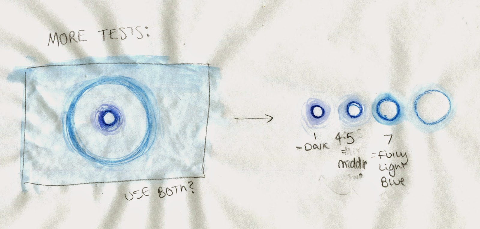
[Sound 032] I think the main problem that the class had with this, is that I hadn't captured the second more high pitched droplet, which I only noticed once they had pointed it out. They liked the way that I had got the timing accurate with my water rings, but they felt it needed the addition of these extra droplets. I think it would have been nice to have these as smaller rings, within the big circles. Maybe in a different colour to represent the higher pitch.
Pitch was also another issue that people had with the animation. They thought that the droplets were too uniform and linear, and thought that it might have been a nice idea to move them further up or down the frame depending it's pitch. This was a really good suggestion in my opinion, and it wasn't even something that I had even considered.
If I had the chance to redo this, I would definitely incorporate the suggestions that have been given to me, as I feel they would have greatly improved the animation and the accuracy of the representation of the sound. I think I would have kept the media the same, as that seemed to be a hit. Then again, it would be nice to have another attempt at using watercolour.

[Sound 042] This animation also received good feedback. People were pleased with my choice of colour and media, and they seemed to appreciate that the sound looked "fuzzy" from the coloured pencil. People also seemed to think that the "whip" was animated well, and that it was in time to the sound clip.
I think the only criticism I got was the background. The general opinion seemed to be that the background should have been a colour other than white, simply because white is boring and that this would make the subject stand out more.


All in all I'm really happy with the feedback I got, both the compliments and suggestions. I can definitely see where people are coming from when they have criticised my work, and I think it would be great if I could find the time to incorporate these improvements.

Monday 9 February 2015

Applied Animation: Ideas Continued.

Having talked to Matt about my ideas, I think I am going to go with study task B, and create a title sequence for a book that is being made into a film. To me, it sounds like the most interesting brief, and I'm really hooked on the idea of work with one of Simon Kernick's books.

Initial Planning

I started off by listing the books I have by Simon. All of which are thriller/crime fiction books, and are very gripping from start to finish. Most of the books get straight to the action from page one, so it could be a good idea to base my animation on the first chapter of the book I choose. The best thing to do from here would be to re-read the chapters again. There are also a couple of books that I haven't read before, so it could be a good idea to start reading one for the brief. This way I won't be influenced by the end of the story. Then again, by doing this I may not get the character descriptions that I want/need to design the characters from.

In order to progress, I am going to do some research into existing title sequences from films of a similar genre. Not only this but films that are aimed at an older audience, as Simon Kernick's books are definitely not suitable for children due to some of the scenes being very graphic and inappropriate for kids. This research will hopefully influence my decision of which kind of art style I want to use, and ultimately what animation technique I use. I need the art style to be appropriate for the storyline and the audience, so I may have to work out of my comfort zone and use something I haven't explored before.

Thursday 5 February 2015

Take 5: Animating Sound 036

I purposefully left this sound until the very end, because I thought it was going to be the hardest to animate as I wasn't really sure how I was going to do it. I know I really liked by static images that I had created using paint, and didn't want to venture too far away from them as I thought the colours and the thick texture worked really well for the sound. 
I sketched out a few examples of what the frames would/could look like, and I thought the singular circle would work best. I really didn't like the look of it in pencil though. I knew I HAD to continue to use acrylics, but didn't want to paint each individual frame as it would use too much paint, and it would be incredibly hard to "onion skin" with the paint being so thick. I thought the best way to go was to create a stop motion animation of the paint being swirled around, almost in the same way I created my original images.

Planning

I had only ever had the one Dragon Frame induction, and a lot of what I had been taught I couldn't remember. The tutorial had simply been watching how to use the tools where as I learn best and retain more information when I actually do things for myself. So I did a little stop motion test to mess around with the settings and get to grips with how to use the program before I did any real animating. 

Dragon Frame Test

Planning the Timing

Once I had gotten to grips with Dragon Frame and planned out the timing for the animation, I began animating my sound. There weren't too many keyframes, other than the start of the "splodge" and the end of it, so I winged it and hoped for the best. 
My first attempt was okay. It didn't really seem to line up with the sound, but I think I was on the right tracks. I like how the paint spread, but it felt too smooth. I didn't really feel "ripply" and messy.

Attempt One: Sound 036

For my second attempt, rather than primarily using a paint brush to push the paint around, this time I got a straw and blew on the paint (I say straw but in reality it was rolled up paper because I couldn't find anything else to use). I really like the effect this gave, and it seemed a much harsher movement that was more fitting. It actually seemed that the paint was rippling and exploding like the sound seemed to suggest.

Attempt Two: Sound 036

Again, I am pleased with how this animation turned out, and I had a great time producing it. I loved how abstract and messy the subject was; I managed to get paint EVERYWHERE. Even in my eyebrows. I would love to learn how to use Dragon Frame better as I struggled a bit with the tools, and I exported the images incorrectly. They were huge files.  Where as this isn't too much of a problem this time as the animation was only 2 seconds long, if I was working on a larger project the post-production program may not be able to handle it. The dimensions of the animation also doesn't meet the requirements of the brief, and I'm not sure how I could go about changing that. This will definitely have to be an area that I revise for next time around, as I am still not 100% certain on these aspects. 

Wednesday 4 February 2015

Take 5: Animating Sound 013

I was really happy with how my planning turned out, and it looked as though it was going to be a really nice animation that accurately represented the sound. I wanted to produce it digitally as this way it would be easier to replicate the rings, as well as give them a glowing effect, not only this but like the previous animation, it would represent the texture of the sound more accurately. 

Planning

Similarly to sound 018, there wasn't much planning I could do in terms of timing. The rings were to move from one side of the shot to the other over the course of 5 seconds, and the line was going to do the same. Due to how well sound 018 went, I decided that I was going to try and use After Effects for this animation too, and after I had drawn out my components in photoshop I got to work.

Adding a Glow in After Effects

Firstly I tried to give the rings a glow. I managed to do this in photoshop, but couldn't work out how to import the effects along with the layer. So I tried creating a glow in After Effects instead. This was much easier, and the glow was actually much stronger using this program. 

When it came to drawing the line, I actually decided to represent this sound as a bouncing ball instead and I did this for a number of reasons. The first was because I found the ball easier to work with in After Effects, as I could just adjust the anchor point and rotate the ball to make it bounce. The next is because I didn't want the line to look too much like my previous animation, and the last reason being that I thought it looked nicer than the line. I still made the ball bounce in the same way as the line was going to move as I had first initially planned though. 

When it came to making my rings move, I struggled greatly. To begin with animating was going well, but then I started to become confused with my keyframes as there was quite a lot of them, and then I began to struggle at getting the program do what I wanted it to. In the end, I ended up deleting the keyframes and starting over as they were just too complex. Thinking back, I should have at least saved my first attempt, so I could have potentially worked on it or at least referenced the work I had been doing. I just got too stressed and didn't think about it, as I just wanted to correct my mistakes.

Sound 013

In the end I didn't get the rings to move how I wanted them to, but I think I much prefer how they pulse along in groups of four. Where as this is completely different to my initial plan, I still think this accurately represents and lines up with the sound clip, and I'm really happy that I was able to conquer my issues. Even though I really struggled with using After Effects this time around, it hasn't put me off using the program. I still want to learn to use it more effectively, as I think it will be a very handy program. 

Edit: When I was showing my sound animations to Matt, he said he didn't see why I had the bouncing dot running through the middle of the rings, as he felt it didn't portray the sound accurately. Looking at it again, I can see where he is coming from, but at the time of planning the animation when I had the sound on repeat for about 2 hours, the sound seemed to break up into separate ones. One of which was a beat that ran separately to the pulsing "rings". At a first glance/listen, you may not be able to hear it, but when you have listened to the clip a few times like I had, you can distinguish between the two sounds that blend together. Only then does the dot seem accurate (hopefully). 

Take 5: Animating Sound 018

Once I knew what I was doing with this animation, there wasn't much that needed to be planned out. I had to decide on my colour scheme (I went with black and white as I felt the monochrome theme represented the dull, electronic sound better) and then how I was going to produce the animation. Digitally seemed to be the way forward with this one as, again, this method seemed like it was going to create the right texture for the sound, as well as the easiest technique for this particular sequence.

Planning 

I opened up the sound clip in Premiere just like before to find out the length of the sound, but this time around I didn't really need to plan the keyframes. The static line was to move across from one side of the frame to the other over the course of 5 seconds (the length of the clip) and After Effects would create the in-betweens for me. The black dots were to appear in random locations as the line progressed, which didn't really need planning. Where they would appear would depend on the position of the line on that frame.

Sound 018

I managed to get this animation finished in about 1-2 hours, making it the quickest animation I have *ever* done. Even though it's very simple and it took me next to no time to complete, I'm really pleased with it. It's strengthened my knowledge on After Effects and the things I can do with it, so all-in-all producing this animation has been a good experience. 

Monday 2 February 2015

Applied Animation: Initial Ideas

I really like the sound of this brief. I usually like briefs that have an initial guide line which you can then make into your own, so this sounds to be right up my street. For part of the brief we have to select one of three study tasks;


A) Create two 10 second animations for two different TV channels that they can use as an ident. Each one must promote the channel and meet the requirements they have given.

B) Create a 30 second animated title sequence for a book that has been adapted to film, only the book can't already have been adapted.

C) Produce a 30 second animation for either "Amnesty International" or "Childline" that is sympathetic and advertises the organisation/raises awareness.


All of the three tasks can be completed in any medium/technique I desire, but it must be suitable for my subject topic. At this moment I'm leaning towards the first two, as the third sounds to me like it could be quite depressing. Yes it might have been nice to do something a little more serious for a change, but I'm really not in the mood to be thinking about neglected children and such. So it looks like it's A or B for me, and at the moment I'm swaying more for B.

Whilst on holiday two years back, A couple that sat next to me and my family around the pool were leaving and asked if I would be interested in a book they had brought to read whilst on their trip. They really enjoyed it but weren't too bothered about taking it home with them. I read the blurb and it sounded like quite a good read, so I kindly took them up on their offer. I read it and I was instantly hooked. The book was called Target by Simon Kernick, and it was crime/mystery/thriller type of book and I loved it. After I read it, I went out and bought other titles that he had written, and I was just blown away by the stories. His books are the first things I thought of when this brief was presented to me. The stories are extremely interesting and full of twists, and they have great character development and descriptions so I could easily generate enough ideas and visuals for the brief, and they haven't been made into a film, so his books would definitely met requirements.

But before I just go ahead with this idea, I want to brainstorm ideas for study task A too, as it does sound like it could be quite interesting. I shall compare both lots of ideas, and see which I think I will be able to get the best story from and go from there. 

Take 5: Animating Sound 032

My initial idea for this animation was to have a background of watercolour, that rippled in time to the sound of the water droplets. On top of this I wanted to have a bold, blue line that grew longer as the drips increased so it wasn't purely water ripples, and it was more abstract.

Planning the Animation

I decided to test the media before I got started. I knew I was going to have problems with my watercolours if I didn't stretch the paper, so I wanted to test to what extent the paper would crinkle. I didn't even use that much water when creating my tests and the paper became unbearablly wrinkled. I tested out a frame of the animation to see if it would be worth putting up with the condition of the paper, and decided that it wasn't. I thought the frame seemed too busy with both the ripples of the background and the extending line. I did like my other two tests though, the one's with just the ripples. I wanted to go with the watercolour as I felt this was a nice touch considering it was the sound of water, but I just preferred the pencil. It didn't make the paper unbearable to work with, and it was much easier to control, so I decided to go for that.
This time around, I planned out the timings of the sound/animation by opening the clip up in Premiere. I cut down the sound to the length I wanted, and adjusted the frame rate so I could see the exact frame that the drops appeared on. This was a lot more accurate than my first method of timing it with a stop watch, and I'm surprised I didn't think of this sooner.
As I had finally decided on a medium, and with my timings all planned out, I got started.

Further Planning and Experimentation

The animation didn't take too long to draw out as it only consisted of circles that progressively got larger. The sketches took about ten minutes, and then it took a couple of hours to go over them with pencil. I didn't even find the scanning to be too tedious this time around (30 Seconds to Mars helped with that though), it was just exporting the video that seemed to be the problem. Similarly to last time, I had put the animation together in Photoshop and was going to sync the sound to the video using Premiere. I found that when I had exported from Photoshop that the video was only 3 seconds (or so) long, when it SHOULD have been just over 4, like I had planned. This was obviously due to the frame rate being too high, and I tried to adjust this by changing the delay on each of the frames. Still no luck. I then tried changing the document's frame rate when exporting it, and I still had no luck. In the end I couldn't figure it out, and opened every image up in Premiere and exported it that way. It might not have been the most ideal thing to do, but it needed to be exact as the sound needed to line up, and as I had already pre-determined the clip there wasn't much else I could do, unlike the first sound clip where I just trimmed it down at the beginning to make the "whip" line up. 

Sound 032

Despite all my problems I really enjoyed animating this sound, and I think it has turned out really good. The sound lines up well, and I think it accurately represents it. I am a little disappointed that I couldn't make the piece more abstract, and I really wanted to try and steer away from making water ripples as it seemed too obvious, but I think the way I have gone about it isn't realistic, so I guess that's okay.