For this brief, we were asked to go out and draw three different environments, two of which had to be unfamiliar to us (well, that's the brief in a nutshell). I had no idea where I wanted to go, so got a few suggestions:
- Harrogate
- Seaside/the coast
- Tropical World (my sister has been pestering me for MONTHS to take her there, but no).
- Brimham rocks
The coast really stood out to me, as there would be a nice combination of nice views and towns/buildings, and I could even look at fairground rides if there were any. Despite this, I was still unsure of whether I wanted to go. I had been to a lot of the main places along the coast anyway (eg. Blackpool, Scarborough, etc), and wanted to stay true to the brief and not cheat. That, and it was going to be FREEZING at the coast.
I decided I wanted to go to a town or city, and ruled out looking at rural environments, simply because I thought urban places would allow for more interesting drawings, and I could look in depth at the architecture of the buildings, and really consider the space surrounding them.
After a few days of thinking, I finally decided on my locations. York and Nottingham. I chose York because I had heard that it was a beautiful city and wanted to check it out for myself. I would be able to look at the Shambles, York Minster, Clifford's Tower, and the medieval walls that enclose the city.
The reason for Nottingham isn't as good though I'm affraid. Two of my dearest friends moved to Nottingham back in July, and I haven't seen them since then. I was invited to stay over with a couple of other friends, and thought it would be a good opportunity to walk into the city center to do some drawings while I am there. Granted, the reasoning behind choosing Nottingham isn't ideal, but it is still a popular tourist destination and It would be nice to find out why. I do know that Nottingham is home to the largest city square in the UK, which is dominated by the Council House, which would be nice to draw.
For my final familiar place I think I'm going to stick to Leeds. In particular, I'm going to look at the city center, and the different shopping quarters as I think the architecture in those buildings are beautiful.
Tuesday, 30 December 2014
The Classical Elements: What's That?! Another Update?!
Yes it is.
I've done LOADS since my last blog post, and I am very pleased with how it's looking. I am very near completion now and I couldn't be happier.
I have managed to get the colour in the animation completely finished. This includes the hand and the lighter at the beginning of the animation, as well as the flames. When this was done I went on to design and animate the facial features of the girl character. As you can see the idea of keeping the girl relatively realistic went completely out of the window. When I came to facial features I tried a number of different possibilities and designed everything on different layers on top of the girl's face so I could easily hide features to see which one I preferred. I went with the eyes that were featured in the video (obviously) as I felt they looked the best, but I was unsure of the mouth. Nothing that I drew seemed to complement the rest of the character, so I just drew in the movements of the mouth with a basic line and thought I'd come back to it by drawing in lips around the initial shape. I found that when I completed this I didn't want to add any more to it, as I thought the simplicity of the mouth suited the character. Looking at it now though, I should add colour to her mouth in the frames where it is open, so it actually looks like she has a hole in her face (for lack of a better phrase).
I actually thought that once I had considered the colour in the mouth I would be finished, but then I realised that I had the facial features of the flames to do. I drew the eyes as just black circles, that I erased where appropriate to create different facial expressions. This took me a fair few hours to do, and when I had finally finished I went to save it and the computer crashed, and I lost the work I had done. It was fair to say that I was DEVASTATED, especially because I couldn't retrieve the work I had lost. So I am going to have to do it all again. Fabulous.
I've done LOADS since my last blog post, and I am very pleased with how it's looking. I am very near completion now and I couldn't be happier.
Almost Finished!
I have managed to get the colour in the animation completely finished. This includes the hand and the lighter at the beginning of the animation, as well as the flames. When this was done I went on to design and animate the facial features of the girl character. As you can see the idea of keeping the girl relatively realistic went completely out of the window. When I came to facial features I tried a number of different possibilities and designed everything on different layers on top of the girl's face so I could easily hide features to see which one I preferred. I went with the eyes that were featured in the video (obviously) as I felt they looked the best, but I was unsure of the mouth. Nothing that I drew seemed to complement the rest of the character, so I just drew in the movements of the mouth with a basic line and thought I'd come back to it by drawing in lips around the initial shape. I found that when I completed this I didn't want to add any more to it, as I thought the simplicity of the mouth suited the character. Looking at it now though, I should add colour to her mouth in the frames where it is open, so it actually looks like she has a hole in her face (for lack of a better phrase).
I actually thought that once I had considered the colour in the mouth I would be finished, but then I realised that I had the facial features of the flames to do. I drew the eyes as just black circles, that I erased where appropriate to create different facial expressions. This took me a fair few hours to do, and when I had finally finished I went to save it and the computer crashed, and I lost the work I had done. It was fair to say that I was DEVASTATED, especially because I couldn't retrieve the work I had lost. So I am going to have to do it all again. Fabulous.
The Classical Elements: That's Right, Another Update.
Green Background Test
I went ahead and tested the background to make sure that this is what I wanted to do for definite and I think it works fine. I think it would have been nice to see the girl's arm/side so that there would be a change of background which would make it more interesting to watch, but I didn't like how this would change the impact, as I said previously.
Another element that I was unsure of was the cake.
To create the cake background that you can see when the camera is zoomed in on the candles, I simply took the original cake drawing and scaled it, making it bigger. Because the original drawing was quite small, when I did this it meant that it looked pixelated. At first I didn't like how this looked and was going to paint over it again so that it would look smooth, just like the rest of the drawings/characters. The more I watched my animation through the more this pixelated look grew on me, as it looked as though it was out of focus, drawing more attention to the characters, which I thought was great. It also meant that when the cake was scaled back to it's original size it came "back into focus", which I thought was fitting, as this is where I wanted the focus to be in that scene, along with the female character.
For the time being I am going to leave the cake as it is, as I like this out of focus feel it gives. It is possible that I shall ask others for their opinions later, and if needs be I can always draw over it.
Friday, 12 December 2014
The Classical Elements: Yet Another Animation Update
I have recently designed the human character, like I said I would in my previous post. When I was doing so, I came across a slight problem. Because I had drawn the cake and the background all on one layer it meant I would have to draw around the cake as I couldn't move the girl to sit behind it as the background would cover her. I didn't really fancy doing this, as it seemed I was making things harder for myself than what they needed to be. So instead I copied the cake onto a separate layer so I could rearrange the layout to create depth in my scene. It also meant I didn't have to be precise with my colouring around the cake, as I could be messy and the cake would hide it all. This also meant I could confidently colour right up to the edge of the cake without accidentally drawing over it or leaving white gaps around it.

I wanted to try and make her quite realistic in comparison to the candles so that there would be a contrast between the two types of characters. This would also put emphasis on the fact that the girl is intact human and alive, whereas the candles usually aren't. I reckon I have done a good job at doing this. Hopefully when I draw her face on a separate video layer, I will be able to keep this realism consistent.
The Classical Elements: Another Animation Update
After I completed my initial candle sequence, I thought it would be best if i designed the background next, so I did just that. I started with the room rather than the backdrop behind the candles as this would just be the human character's shirt and I am yet to design her/him. I didn't really plan this out and just drew what came to mind. Despite this lack of planning I really like what I have created. I especially like the texture I have given the door and the table. Originally it was just going to be a solid colour with just a bit of shading, much like the rest of the elements of the background, but I didn't really like the way it looked. It was too simple. So I played around with different brushes and managed to give the wood a grainy look.
I did a similar thing with my cake. Again, it was originally just a solid colour like everything else in the animation so far, but just like my door, I experimented with brushes to see what I could create and I think I was successfully able to give the cake a texture that made it look like sponge.

Background and Cake Design
Update Three
I'm really pleased with my progress, and I can't wait to see what it will look like when it's all finished, especially now I feel I don't have that much more to do. My plan of attack is to draw the human character in colour, then add the backgrounds into the beginning scenes.
The Classical Elements: Animation Update
I managed to get my sequence plan finished pretty quickly, though I am missing a few details and I shall have to get this sorted. I was able to create enough content to meet the requirement of the brief, and at this stage it looks like it's going to run smoothly. I can't say for certain as I haven't yet drawn out the flames and backgrounds.
So it looks like that's what I'm going to do now.
Update Two
Thursday, 11 December 2014
The Classical Elements: Animating at Last
Due to how much planning I had carried out, and because my camera zoom tests went well, I decided to start animating. I just jumped straight in, using my tests and my storyboard as a guide.
What I have so far
I started off by marking out where the characters were going to stand, as I believe the candles to be the most important element of the animation. The backgrounds and other features shall be drawn around them, rather than trying to fit the candles into a predetermined space.
To get started I copied the candles over from my original drawing, and pasted them onto each frame in the video layer I created in photoshop. As there wasn't a lot of movement from my characters, I was able to progress very quickly by simply copying frames. I haven't yet drawn the flames in detail, but I have sketched the key frames out on a separate layer, so I will be able to return to this at the end after I have drawn out my backgrounds, so I can work with transparency levels to create different effects/textures for the flame.
To say this is going to be my first complex animation using Photoshop and video layers, I think I'm doing well, and have actually surprised myself at how much I have managed to get done in such a short amount of time. I might have been able to get more done if I had realised sooner that you can't paste more than one element onto one frame within the video layer, and that I would have to create separate layers to work with.
So, to summarise, I think it's going well so far. I am going to continue working the way I am to get my candles finished, then I shall begin to consider backgrounds if I have no amendments to make.
Friday, 5 December 2014
After Effects: Induction Two
We started of the induction by briefly recapping on what we did last week. Then were then taught how we can edit our keyframes if we feel the sequence is too slow or too fast in the RAM preview.
Recap of Last Week and Editing Keyframes
We were also shown how we can edit the INTERPOLATION (I know, fancy). So again, I experimented with tools I already knew how to use, but this time I changed how the solid layer moved by using the Convert Vertex Tool.
Experimenting With Convert Vertex Tool and Auto-Orient
(I'm not sure why the light blue box twitches half way through. Shall have to look into this)
In the second half of the tutorial we were shown how to import files from photoshop, and the different ways we could do this. Once we had seen the difference between the different file settings, we imported some images to play around with, to test the potential of the programme.
Using Position and Rotation Keyframes
In my first test, I wanted the balloon to fly from one side of the screen to the other, stopping to perform a loop in the middle. I did this by adjusting the position and rotation keyframes of the object. I think it went pretty well, and I was able to make it move at a decent speed and the loop seems to run smoothly. Michael then pointed out to me that I could have made the balloon loop easier by adjusting the Anchor Point of the image.
Rotating Around an Adjusted Anchor Point
I took Michael's advice, and tried to make the image rotate around an anchor point that wasn't positioned in the middle. It was a lot easier to do, and it also made the loop much smoother. The advantage of doing it this way as well, is that there are fewer key frames, so it makes editing the sequence much easier.
I'm not even sure.
Finally, I created another sequence, that combined pretty much everything we have been taught in these sessions. I'm going to stop talking now because this post is too long. So there we have it.
Premiere Induction
Earlier in the week I had a Premiere induction. I had used Premiere before at Art Foundation, but I had only done so briefly and I also had to self teach using YouTube videos, so it was nice for me to find out if I had actually been using the programme correctly. Which I had been to some extent.
In the induction we were shown how to load and edit videos and image sequences, as well as how to export the videos once we were finished. We had a couple of example clips and photographs that we could play around with, and I personally chose to experiment with the opacity of the layers, as well as different effects such as Black and White and other video effects. In this case I used Twirl.
We were also shown how to work with sound. This is something I had done before, but it was nice to be shown what it was exactly I had to do, because I'm pretty sure I went wrong a couple of times before. In my test, I experimented with slowing the sound clip to distort the way it sounded, and I think it nicely (some what) complimented the video.
I'm happy with the result even if it was just a play, and it was nice to learn how to exactly use the programme effectively, especially when it came to keyframes and fading in and out.
After Effects: Induction One
I really enjoyed last week's After Effects tutorial, one reason being that the tutor was MINT and made a joke that made me cry, the second being that it went a LOT better than the induction I had in Flash. My god, I really didn't enjoy that.
I found After Effects a lot easier to use than flash, as I actually understood what was going on and how to use the different tools we were shown. I felt that I had much more control over the program as I was able to get it to do what I wanted it to.
I found After Effects a lot easier to use than flash, as I actually understood what was going on and how to use the different tools we were shown. I felt that I had much more control over the program as I was able to get it to do what I wanted it to.
Testing the Basic Features of After Effects
We were shown all the basic features of the programme and what each panel in the window did. We were then shown how to create solid layers, and we had a play around with making them move, rotate, increase in size, etc, similarly to what we were trying to do in the Flash induction. I felt like it went a lot better than the flash tutorial, as I was actually able to get the shapes to move in the way that I want them to, so it is likely that if needs be I shall choose AE over Flash.
Tuesday, 2 December 2014
The Classical Elements: For The Birds
For The Birds is an excellent animation short by Pixar. I first saw it when I was a young child, and it still amuses me today, but I have chose to look at in now because of the camera angles it uses.
For The Birds by Pixar
This animation short uses the same sort of camera angles that I am wanting to use in my own animation. Other than the one exception when the small birds turn to look at the bigger bird, the entire animation is shot facing the same direction, and just uses a variety of different shots. I was a bit cautious about not using a variety of angles, as this can help portray a sense of space and the scene that the characters are acting/living in, but after seeing this short again, it has made me realise that you don't necessarily need to do this to make the animation interesting. I think that because I'm not doing using a variety, I will need to focus on using a range of different shots however like what Pixar have done here. I really like how they have used close ups to show the emotion of the birds, and how they have used medium shots to show how many of them there are on the line. I think the type of shot has been carefully considered, which is something I shall do with my own animation to make it more visually pleasing.
The way the camera pans out to reveal more birds sitting on the line, is more or less what I wanted to try and achieve with my line candles, so if needs be I could use For The Birds as a guide to try and make the camera pan in the same way.
I also like the way how the camera quickly zooms out to show how close to the ground the birds are because of the big bird weighing them down. It makes the scene feel more dramatic and this is something I would like to incorporate into my own short. I want the camera to quickly zoom out to reveal that they are sat on a cake in front of a human character, to help represent the shock that the candles are in. Hopefully I will be able to create a similar kind of effect to what Pixar have, as I think it has worked really well for them.
The Classical Elements: What is a Flame?
I don't really know how I got onto watching this animation, because its an educational video about science and what a flame is and in that sense it isn't useful to me at all. I did however like the way one of the candles had been animated, so I guess it's relevant.
What is a Flame by Benjamin J. Ames
I almost didn't watch this animation all the way through, as I wasn't a fan of the style of the flames at the beginning of the video. I think the art style works well for this animation, and it helps to explain the science behind fire and flames, but this wasn't something I wanted to work into my own animation. I'm glad I sat through it though, as there is a slight variance in style, and I really like the way the candle's flame has been animated at around 0:42 and 0:57. It's quite basic, but still has a certain degree of realism, and I think that style would compliment the candle characters I have drawn quite nicely. I also think it would be very easy to animate, which is always nice, especially if there's no reason to over complicate things.
Also, not relevant at all, but that song at the end. Wow. Just wow.
The Classical Elements: Once Upon a Candle
Once Upon a Candle is an animation short produced by Animation Workshop, and I think it is fantastic. Not only do I think its visually stunning, I also think it would be a great reference for my own animation.
Once Upon a Candle by Animation Workshop
I feel like I am repeating myself when I say this, but I really like the way that the candle burns and how the flame moves and flickers. I also think it has been produced to a very high standard, and the flame, as well as pretty much every other element in this animation, has a high degree of realism. As much as I would like to be able to create something this realistic, I highly doubt I'm going to be able to at this early stage, however I can look at it as inspiration for the movement of my flames.
Another thing I like about this animation is the way the candle moves about the desk. It moves as though it is very flexible, and rocks back and forth to gain momentum to jump along with the stand he is kept in. I also like how this changes when he melts down to half his height. He still moves in a similar way, but because he is much shorter he can't gain as much momentum and his movements become much shorter. He also looses the ability to jump because of this. I think this is a great animation to look at because of this range of different styles of movement, which have been executed very well. I definitely think I will return to this animation for these movement sequences as an inspiration for my own animation.
Not only do I like how he "walks", I also like the way he moves his whole body/head to help express his emotions. I hadn't even considered doing something like this, and when I thought about my animation I just imagined them being quite stationary and having all their emotion being portrayed in their facial expressions. I would very much like to try and give this a go and incorporate it into my own animation, as I think it could really help explain the narrative, as well as enhance emotion.
The Classical Elements: Candle Animation by "Mo the Half"
I was looking on YouTube for candle references, and this particular animation really stood out to me. It was produced by someone with the username Mo the Half, and I think it's a really good sequence of a candle burning and being blown out.
Even though it is a basic animation that isn't really well known, I think it accurately captures the movement of the flame, both as it is slowly burning and as it is blown out by the wind. I also like the addition of the smoke rising after the flame is extinguished, and is something I didn't even think about when I was storyboarding. I think I could definitely consider this to be a source that I potentially work from, as the sequence is beautifully drawn, and I think it deserves more recognition than what it has received.
Even though it is a basic animation that isn't really well known, I think it accurately captures the movement of the flame, both as it is slowly burning and as it is blown out by the wind. I also like the addition of the smoke rising after the flame is extinguished, and is something I didn't even think about when I was storyboarding. I think I could definitely consider this to be a source that I potentially work from, as the sequence is beautifully drawn, and I think it deserves more recognition than what it has received.
The Classical Elements: Lightheaded by Mike Dacko
Before I got started with animating, I wanted to do a little bit of research into work that other animators have produced to help me with my own. In particular I wanted to look at how flames flicker as well as how candles burn, and how other artists have animated this. I could just light a candle myself and draw from it (which I'm probably going to do), but I wanted to see how other people have tackled it, so I have a range of options for when it comes to animating my own flames.
Lightheaded by Mike Dacko
Whilst browsing the internet, I stumbled across this animation by Mike Dacko and I'm glad that I did because it's a great example of what I was looking for. The flame looks realistic and gives off a warm glow, and I like the way that the flame is transparent towards the wick. It actually seems as though it is burning. I also like the way that the flames sway slowly/slightly from side to side, to show that the atmosphere is calm. This is what I want to initially create in my own animation, but then I shall have the flame under distress as the child blows out the candles. I could then look at when the characters in the animation are running as another reference for this.
Even though it is not necessarily relevant this time around, I also really like the way that the characters walk in this animation. The running and walking cycles are very realistic and they give the character more personality and life, which I think really enhances the character's appeal, especially as their limbs squish slightly as they run. I would like to incorporate this aspect into my own animation, and have my candle seem "squishy" as it curls up and extends to try and jump closer to the female candle in my story.
Another thing that stood out to me about this animation, was the sounds that the characters make when they are emerging from the hot wax. I think it compliments the movement/action well, and I would like to experiment making a similar sort of sound for when my candles are places on the cake. This maybe another subtle giveaway to the ending that I give, but then again it could just be a noise that makes the animation more bubbly and quirky.
The Classical Elements: Testing the Camera Zoom
Before I made a decision to animate using Photoshop, I wanted to test the characters and more importantly how I would make the camera zoom out. This is a big thing for this particular animation as the characters don't move that much, and the whole story is about more candles being revealed and the interaction between them.
I opened up my original drawing of my candles in Photoshop, and tried resizing and repositioning them so that there would only be so many candles on display. I started of by trying to get just the first two candles in the shot. I resized them to the height I wanted them to be, and placed them in the centre to try and create the shot that I had planned in my storyboard/animatic. The problem was that the other candles are too close together, and so they don't move out of the frame. In order for me to do this, I would have to move the image to the right of the frame to push the other candles out of the shot, but this would just look odd as there would be too much white space on the right. So that wasn't really an option.

A Diagram I Produced to Explain What I Mean. (Clearly, I am a Diagram God).
I then had to consider what I could do to overcome my problem. Here's what I came up with:
- Alter the storyline: I could have the candles placed into shot one by one. This would be slightly more effort to animate, but a perfectly good way to introduce the new characters.
- Adjust the storyboard: I could change the shots that I use. By using close ups I can focus on just the two characters and not have any others in the shot.
Quick Camera Zoom Test
I decided to test my second plan very quickly. I knew it would work in the sense that I'd be able to get the characters I wanted in the shot, but I was unsure how this would look visually, hence why I tested it out. I think it works quite well. Granted it seems to move a little quick, but it is just a test, and I shall be able to neaten this up when I come to produce the actual animation.
Watching this back though, I realised there is a problem with this method when it comes to my opening scene. I wanted the male candle to be placed next to the female at the beginning of the line, but I didn't want you to be able to see the rest of the candles, which you would be able to do if I used this method, as in order for it to work I have to start off with a close up of the first two characters.

I was unsure how to put my thoughts into words, so here's a diagram incase I didn't make it clear.
I could just roll with it, and start off this way, but I really want the viewer to see that he gets placed on the cake and then lit. I like that is a subtle giveaway to the ending, but you only really realise (maybe) at the end of the animation.
To overcome THIS problem, I could have the first male candle placed next to the female character, that has already been placed, BUT none of the other characters are there yet, as they have yet to be placed. I can let the candles do their thing, and then zoom in on the characters faces/flames. At this point the other candles can be placed without the viewer knowing, and I can commence with my original idea.
Sounds good to me.
Monday, 1 December 2014
The Classical Elements: Preparing to Animate, Part Two.
Here I have returned to my candle drawings. To begin with I didn't draw the flames as I was wanting to animate them separately, so I have drawn them in on a different layer to the original drawings.

No Colour
I started off by simply sketching the flames, and did this with just the original candle sketch showing to see what it would be like in full black and white. I think it looks okay. I used a different type of brush to draw the flames, and also made it quite opaque so the flame would appear to have a different texture to the rest of the candle.

Flames in Colour
Then on a different layer to the flame sketch, I added in colour. Similarly to the first one, I used an opaque brush to make the drawing look more like fire, and used unorganised strokes to make it look like it was flickering. I started off by testing the colour against the original candle outline, and I quite like how this makes the flames stand out. Having said this...

Full Colour
... I think my final test is my favourite. For this one, I just made the colour layer visible to see the characters in full colour. Up to now, I am considering producing the animation in this way as I have not yet explored with using colour, but I shall have to see if I have the same views once I have included a background.
The Classical Elements: Preparing to Animate
I had asked a few people about what Matt had suggested in the critique, and the responses I got were pretty varied. A few people preferred the novelty number candle, where others liked the idea of having a more abrupt and tragic ending, so in the end it was entirely down to which I preferred and which I wanted to work with. As much as I like Matt's idea, I still think I'm going to go with my own, simply because I like that particular character design. Also, the addition of this character allows me to get more varied camera angles, which will be more pleasing for the viewer.
The next thing I had to think about was the way in which I was going to produce the animation. I wanted to try and produce this one digitally, as I have not yet done much digital drawing and I want to gain experience doing so, but as I don't have photoshop at home this would mean I would have to get my animation finished before I break up for Christmas, which is in two weeks. Which was not going to happen in any way, shape or form. Not when I have other projects to juggle.
So with digital animation ruled out as an option, I was fully prepared to start animating traditionally. That was until I had a discussion with Mat (teacher Mat) about where I was up to. I explained my idea and my plans for having the camera zoom out to reveal more characters as the animation progressed. He pointed out that it would be much easier to digitally produce my characters, I could easily move and scale the characters, which would be very time consuming if I were to hand draw the transitions. I then realised that my characters barely move, so if I were to draw the animation digitally I could have the bodies on a background layer, or simply copy them over to a new frame. Then I would only have to draw the flames on each layer to make them flicker. Matt also pointed out to me that I could buy Photoshop for £8 a month. Which I can afford. So lets go digital.
Well, at least try it.
That's what I've done here.
Candle Characters - Outline and in Colour
I drew my candles in Photoshop to see what they would look like. I started off with the basic outline, and then remembered that I could quickly add colour by using the paint bucket tool and brush. So I did that, and as much as I like it in black and white, I think the addition of colour greatly improves the aesthetic of the piece. So it looks like I'm going to go for digital. It's going to be much quicker than traditional and it will give me more experience in a field I am interested in. It also means that I will be able to add colour, as I think I maybe rushed for time if I try this by hand.
Friday, 28 November 2014
Set, Series, Sequence: Part Three
For the final part of the brief, I was produce a sequence of 12 images to tell a short narrative about the 8 images I had developed. Obviously the story was going to be about bees, or at least involve some, so I quickly brainstormed what the narrative could be about. I thought about the different things that I took into consideration when I was designing my bees and worked from there, I.e The type of bee (Queen, Worker, Bumble).
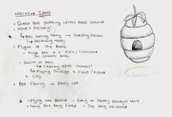


My Ideas
I really liked the idea of a bee hive being a factory where bees work to mass produce honey, and thought it was the idea with the greatest potential. Well, one I could get 12 images out of. So I went with it. I quickly jotted down what I wanted to happen in the story, then just rolled with it. Like always, I tried to include a variety of shots and angles, and I think I have done alright.
Storyboard of 12 Images - Bees in a Honey Factory
I went against the idea of adding colour to my storyboard, as I wanted to produce quick fine-liner drawings to explain my narrative, and ended up adding details with them too. I think it would have been nice to see some colour as the addition of colour has improved my storyboards in the past, but I am happy with how the storyboard stands.
I've really enjoyed working with this brief, and think I have been able to do a good job of responding quickly to the words given to me, as well as exploring with different media, which is something I haven't done for a long while. I shall have to continue with this experimentation as I have thoroughly enjoyed it and think i have been able to create some good work, which should only get better the more I practice.
Wednesday, 26 November 2014
Set, Series, Sequence: Part Two
For my second part of my brief, I was asked to choose one of my most successful drawings and develop it, producing a series of 8 images that consider line, mark, media, tone, etc. I was unsure which to choose as there were a few drawings that I was fond of, so to help make my decision I thought about which would be the easiest to create a narrative with. This ruled out my flights of stairs, so I was really just focusing on the creatures I had drawn. I.E. my bees and birds.
I went with the bees, because bees.

I went with the bees, because bees.
My Bees
For this part of the task, I wanted to draw a combination of "cartoon" bees and realistic ones, and use a range of photographs to draw from, so I could capture the subject from different angles. Whilst doing this I wanted to use a variety of different media, not just because the brief had told me to, but because I'm getting too comfortable with using pens to complete my drawings, and nine times out of ten I will go to use the pen without even considering other media, which is a mindset I want to snap out of.
(1) I started out with fine-liners as I wanted to focus on the size of the bee, and breakout of sticking to small scales. I wanted to try and take up as much of the A4 space as I could, as the first part of the brief had been limiting me to A5, and it has been a while since I have worked on larger scale than this. Granted A4 isn't that big, but it definitely makes a change from creating small, "delicate" drawings.
(2) In my second drawing, I have used a variety of different thickness of fine-liner, to see what this does for the design of my character. It definitely makes the character bolder, but the thicker pen seems to give the bee more of a "fuzzy" texture, which I quite like for the character.
(3) I then moved on to using coloured pencil. It has been a LONG time since I have used them so I wasn't really expecting anything good to be produced, but I have pleasantly surprised myself. I really like how the colour and the strokes I have used has made the bee look quite lifelike, especially in the fur of the bee. I actually prefer this fuzzy texture over the one I was able to produce with the fine-liner, which is a bonus. Maybe this will make me using coloured pencil more often.
(4)&(5) Considering I was successful with my coloured pencil, I decided to continue using colour but this time I took to watercolours. Other than some of the birds I drew in the first half of the brief, it has been a while since I have used watercolours, so yet again I wasn't expecting anything great, and once again I have surprised myself. I really like these bees. Granted not as much as the coloured pencil, but I like how I was able to create a different texture using them, and it was much quicker for me to do. I also really like the wings I have produced in (5), to me they actually make the bee look like it is flying/hovering, and I like the delicacy of them.
(6) I returned to using fine-liner as I was getting slight withdrawal symptoms, but this time I was focusing on the different types of bees. Here I have drawn a Queen bee and have represented this by giving her a crown. So original, I know.
I also wanted to take a break from drawing realistic bees, and so I exaggerated the shape of the bee's body, similarly to what I did in the first half of the brief, and also gave the bee human characteristics by making it stand upright on two legs, and have its arms waving in the air as if the character was angry. I really like the result, and think this bee would be a great subject to animate, or introduce a narrative to.
(7)&(8) I returned to using colour one last time, but this time used Oil Pastel. I really like how the bees are bold and seem to be quite furry from the texture of the Oil Pastels, but I don't like how I felt that I didn't really have control over the media due to the pastels being quite thick. This made it incredibly awkward for me to include minor details, so the design looks quite basic. Maybe if I was working on a larger scale this media would be more suitable to use, but not for a small sketchbook like this.
To conclude, I've really enjoyed this part of the brief and how I have been able to explore different media. I'm thinking of developing (6) further and creating a narrative using this character, but I think it would be nice to introduce some colour to it, as I feel I have been quite successful with using it.
Monday, 24 November 2014
The Classical Elements: Presenting my Ideas/Interim Crit.
Today I presented my ideas and visuals to a group of three other students. I was expecting to get to college and present to the whole class, and even though I don't particularly like speaking in front of large audiences, I was quite disappointed. I had prepared myself to talk to the whole class and was looking forward to trying to get used to the idea of public speaking, and to become more confident, both with presenting and speaking about my own work. I have only ever done this once on my Art Foundation course, and I spent most of the presentation staring at the floor and shaking, and this is something I want to get over.
I was also disappointed because I didn't get as much feedback as I was expecting to get, due to the small group. I feel this is partially my fault, as I didn't go into much detail when explaining my ideas because I was presenting to a much smaller group than what I was expecting, and the way we were doing so was very informal. I decided to skip a lot of my slides at the beginning of the presentation as I wanted to keep the discussion quite casual and to the point, as I no longer felt comfortable waffling on about my ideas in detail. Because of this, I would have liked to have presented to a larger audience, as I could have talked about my work in the way that I initially set out to and could have received better feedback. Having said this, I do appreciate the group listening to what I had to say, and the comments that they did give.
Matt raised a very good point at the end of my presentation. He asked if there was actually any point to the novelty number candle at the end. Not wanting to sound mean or bash my idea/character, he was simply pointing out that without that character the ending would be much more unexpected, as you would only find out that they are birthday candles right at the very end when the human character blows them out. It is definitely something that I am going to have to consider, as this will completely change the impact on the audience. The addition of the novelty number candle eases the viewer into the candles being extinguished, whereas without it the audience will be much more taken back. If I do decide to leave this character out of my animation, I'm going to have to think about what will take it's place. I could involve other candles with different personalities, or I could make the conflict between the existing characters last longer. Personally, I quite like the contrast between the normal and novelty candles, and think that the '5' is a nice addition to the storyline, as it also gives you insight to the human character's personality. I think it will be a good idea if I ask around and see which ending would be more desirable and go from there.
Other than that, there wasn't really anymore constructive feedback. My group seemed to like my character design, and they didn't have anything bad to say about my storyboard or animatic, so I guess that will do for me.
Friday, 21 November 2014
Set, Series, Sequence: Part One
For the "Set, Series, Sequence" brief, we were to choose one of the following words to respond to; dance, tank, science, flight, envelope, fork, bug, skip and plant. I thought about each word individually before I got started, to see which one I thought i'd be able to produce the best work for. For a very long time I couldn't get the idea of "A fork in the road" out of my head, and all I could picture was a literal fork laid in the road. I wasn't happy. It wasn't even that funny.
Anyway.
I decided to go with flight in the end, and started off by thinking of things that travelled through the air. For some reason the first thing I thought of was a hot air balloon so I started with that. That led me to think of balloons, and so on. I was pretty much just drawing things that had wings or could float.
Here is a gif of all my drawings (Actually been scanned too. Thank you, no need for applause)
This part of the task actually didn't take me that long, which has surprised me a little. I was rather quick with my drawings, and the ideas came to me fairly quickly, some of them clearly better than others. Now I need to pick out my most successful one to develop further, which to me sounds harder than drawing 32 different images.
I really like my bees, I think they're cute, and I think my spiral staircase is the best flight of stairs I have ever drawn (not that I've drawn many though), but I don't really see myself creating a narrative out of stairs. For this reason I think I'm going to have to look at something that has the capability to move, and I think it's going to be a choice between my Bees, Helicopter Seeds, Kites, Paper Airplanes, Butterflies and Darts. Hmm.
Visual Language Sketchbook: Update One
For this brief, we literally just have to draw what we see. Things that interest us, what we think is important or is relevant, so we can use the sketchbook as a source of inspiration and ideas. It is also an opportunity to practice my drawing skills, as I may fall out of the routine of drawing if I am working with computers a lot. Which I am.

Here is my sketchbook so far. Up to now I have been drawing in it whilst I have been commuting to the college, so majority of my sketches are of people. I've never really done observational drawings of people before, usually I just draw from memory/imagination or use photographs as a source, so it has been nice to step out of my comfort zone and draw in this way. I have found it quite frustrating at times as I haven't always been able to finish my drawings as people have got up and left, but I think this is a great way to encourage me to work quicker. It also means the quicker I get the sketch finished the sooner I can stop staring at strangers and being the creepy girl on the train who draws everybody.
I'm really enjoying this brief and think it's a great way to generate ideas and keep me practicing my drawing skills. I'm going to continue to work in my book, and update my blog with my work every so often.
The Classical Elements: Creating an Animatic

I wanted to create an animatic so I could test the length of my animation, and see whether I had enough content to meet the requirements of my brief. I was unsure on how much of a delay to put on each of the frames, as I have never made an animatic before, so I just gave each one a 0.3 second delay and this made the animatic last for 19 seconds or so. I think that sounds like a good length at this stage, as obviously some of the sequences are going to last longer than what I have made them in the animatic, and some will be much shorter, so I don't think I'm going to have a problem in terms of length.
I don't think it looks bad visually either. Well, my final piece will obviously be much more detailed and it will run smoother than my animatic, but I think there is a good range of shots to make it interesting to watch. Granted there isn't a wide variety of different camera angles, but the focus is on the characters anyway rather than the setting. So I think what I have chose to include is fitting for the animation.
Tuesday, 18 November 2014
The Classical Elements: Storyboarding

Drawing of potential characters/shot.
On to storyboarding.


Once again, I'm back to not using the scanner.
I didn't take too much time on this, as it isn't my final version. I just wanted to quickly consider the different angles and shots that I could use, and get down some of the actions in the order I wanted them to happen. I briefly considered some sounds I could use in my animation, such as a wolf whistle. The addition of these sounds will make the story make more sense, as it gives the characters a reason to turn around.
I think my selection of characters is good. There is a range of different personalities, and I like the narrative I have been able to come up with using this selection and now that I have briefly sketched out a storyboard I am going to make an animatic based on these drawings, so I can test timings, and really focus on the camera angles that I am going to use.
The Classical Elements: Planning Cont. and Development
After long consideration, I have decided to go with the birthday candle idea. I really loved all the ideas that I was able to come up with, and it's a shame I can't work with all of them (although, it is likely that I shall return to some of them if I get the chance), but the birthday candle one seemed to be the most popular with those whom I shared my ideas with. It also didn't sound overly ambitious and figured it would be the best option considering my skills are fairly limited at this stage. So I began developing.


Just when you think I've learnt to scan in my sketchbook, BOOM, a wild photograph appears.
Similiarly to my last project (my giraffe animation), I knew what the main storyline was going to be, but I was unsure of what was going to make the animation last 20 seconds. So to start with, I came up with ideas for what the candles could do to make it an interesting animation. My main ideas were either to have a love story between two candles on the cake, and have the male try to get closer to the female and when he finally gets close enough to introduce himself and try and win her over, she gets blown out, followed by himself. My other idea was to have a long line of candles that get introduced one by one, the last to be shown to the audience is a novelty number candle which gives away that they are sat on cake, and then they are blown out.
I was leaning more towards the second idea. It seems more comical and entertaining, and it was also an opportunity for me to explore facial features and emotion without using sound or speech. Granted it wouldn't allow me to consider many principles of animation, but this way I would be able focus on creating lovable characters, as well as including a range of different camera angles, which I wasn't able to do on my last animation.
Because I had a more solid idea in mind in terms of a narative, I began to design my candles.
When I started drawing, I was actually thinking about my first idea, and designed a simple male and female character, and how they could be represented and distinguished between, colour being a very stereotypical way to do this. It was then that I thought that the animation could have portrayed a homosexual relationship, and based my fifth candle on the gay pride flag (very stereotypical I know, my apologies). It was only then that I came up with the idea of having a long line of candles with different personalities.
I tried to alter the shape and the facial expressions of the character to portray different types of character. I also considered the part that colour and pattern could play in creating different personalities.
Designing different candles gave me the idea to give each candle in the line a different personality. I really, really like this idea, and think it will add to the comedy value of the animation. I also think it will be more entertaining to watch, as well as animate, and this way it will allow me to explore more facial expressions.
Due to there being a range of characters, I could also try to impliment my first idea. The first two candles in the line could be an ordinary male and female, and for a few frames the male could try to jump towards the female. This will allow me to consider how the character will move, and it is also an opportunity for me to consider a wider range of principles of animation. Not to mention it being a way to fill more time.
Now that I have an idea of what I what my characters to look like, I shall start to plan and develop a storyboard. This will allow me to put my idea into perspective and to see whether it will work. This also means that I can finalise my characters and decide on how many I want, and what I want their personalities to be.
Edit: I randomly got the idea to draw a "gothic" or "emo" candle, so I went with it and started to consider other stereotypes or personalities.
Tuesday, 11 November 2014
The Classical Elements: Planning
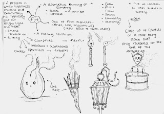
Like most of my other briefs, I started out by defining the words given in the brief, in this case the classical elements, and began brainstorming ideas that were generated from the descriptions. I started off with Earth.

I couldn't really come up with many ideas for Earth. To me, Earth seemed more of a setting than a potential narrative. The only idea I got in terms of narrative would be to portray the planets in the solar system as each having a different personality. I thought the idea was okay, but it would mean spending a lot of time of creating 9 (or 8 if you don't consider pluto to be a planet) characters to represent each planet, and having to assign them with 9 different personalities. I also couldn't really think of a storyline, and because I was beginning to get ideas for other elements I just decided to move on, and potentially return to it.

I then moved on to looking at Air/Wind. As you can see I was able to come up with a lot more ideas for this element, along with a few visuals. I really like the idea of portraying wind as a character - I also like the floaty, ghost-like sketch I have produced which I think would be nice to work with - and I think this has potential to be incorporated into a number of different story lines. For instance, my initial idea is to have the character be quite helpful, and help leaves fall to the floor, or have them pushing the blades of a turbine around to generate energy.


Oh my days, it's actually been scanned in.
I couldn't really come up with many ideas for Earth. To me, Earth seemed more of a setting than a potential narrative. The only idea I got in terms of narrative would be to portray the planets in the solar system as each having a different personality. I thought the idea was okay, but it would mean spending a lot of time of creating 9 (or 8 if you don't consider pluto to be a planet) characters to represent each planet, and having to assign them with 9 different personalities. I also couldn't really think of a storyline, and because I was beginning to get ideas for other elements I just decided to move on, and potentially return to it.

Getting good at this scanning business
I then moved on to looking at Air/Wind. As you can see I was able to come up with a lot more ideas for this element, along with a few visuals. I really like the idea of portraying wind as a character - I also like the floaty, ghost-like sketch I have produced which I think would be nice to work with - and I think this has potential to be incorporated into a number of different story lines. For instance, my initial idea is to have the character be quite helpful, and help leaves fall to the floor, or have them pushing the blades of a turbine around to generate energy.
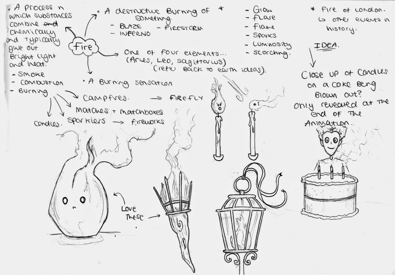
I really liked my wind idea, and I was beginning to generate some interesting images in my mind, but I didn't want to just roll with the first idea that I came into mind, so I began to briefly look at Fire. To begin with I wasn't really able to come up with any ideas, and didn't really see this element going anywhere, but then I started doodling flames and torches and came up with the idea of candles sitting on a birthday cake, but being unaware of what's going on and being caught up in their amazement of their new life and surroundings. Which left me feeling confused. I really liked both of the ideas, and didn't know which one to choose. I was getting really wound up about it so to take my mind of it, I decided to brain storm the final element, Water.
Which was potentially the worst thing I could have done in this situation.

Again, to begin with I didn't really see this going anywhere, but then I just had to go and remember that water has the ability to freeze and evaporate, throwing yet another idea into the equation. My idea for water was to have a character prepare a cup of tea, and fill the kettle and turn it on. I could then either have the water droplets try to escape the kettle, because it is the equivalent of torture for them, or just boil and be unhappy about it, resulting in the character enjoying a nice cuppa.
So here are my main/refined ideas:

I really don't know which one I am going to choose, because I think all of them have potential to be quite interesting animations, and there are elements of each idea that I really like. For instance, I like the character designs of both Fire and Wind, and I like the potential little screams I could give the water droplets when they are being boiled. I am going to have to explore further into character design for each of these ideas as well as come up with a quick initial storyboard. I can then see which one I think has the greatest potential, and which I can fit into a 20 second animation.
Monday, 10 November 2014
Module OUAN403 Evaluation
Well, the past few weeks have been challenging to say
the least, and despite being close to having a mental breakdown on numerous
occasions I have thoroughly enjoyed it. I have also learnt a lot in these
first few months, the most useful to me being the 12 principles of animation. I
feel as though I have been able to apply this knowledge well in the animations
I have produced, in particular Squash and Stretch in my flipbooks and Follow
Through action in my Pose-to-Pose Teddy animation.
I don’t feel that there has been any work that I have produced so far that I’m not happy with, which is quite surprising to say it’s early stages. Granted my animations are only basic and I favour some over others, which is expected, but considering the majority of my animations have been a first attempt at using some techniques I think I’ve done very well. I think I have been particularly successful with Pose-to-Pose and Frame-by-Frame animation. I think the sequences I have drawn are quite realistic and they flow nicely. I also believe that I have been able to incorporate the 12 principles of animation well. Another area in which I think I have been successful is Pixilation, and I think this is down to the amount of planning I put in before I started production. I really thought about what was going to happen in the animation, and put these ideas into storyboard where I was able to consider shot framing, something that I was taught about at the beginning of the module, and again, something I found very useful. To be honest, I think I have been quite good at documenting my ideas and planning out my animations, it has been my time management that has been lacking, particularly over the past week.
I felt very pushed for time this past week, and I thought that I wouldn’t be able to get my “Apply” animation finished. I did pull through though, and ended up having enough time to spare to get my work sorted out before it needed to be submitted, but if I had planned my time better I wouldn’t have felt so stressed. I left a lot of my research blogging until last minute and it almost got on top of me, so in the future it might be wise to force myself to do at least one or two research blog posts a day, on top of blogging about what I have been able to produce In that day. With that being said, I am now aware that I can push myself to meet deadlines and even though it has been hard, I can juggle more than one project at a time.
I also feel that I need to improve on some aspects of the 12 principles of animation, in particular Timing and Spacing. I don’t feel like my first attempts have gone bad, however I do feel that I could improve in this area.
Overall I think this module has been rather successful, and I am looking forward to proceeding with this course. I also can’t wait to practice using Photoshop and other animation programs, as well as practicing my drawing skills within visual language.
Subscribe to:
Comments (Atom)