Friday 28 November 2014

Set, Series, Sequence: Part Three

For the final part of the brief, I was produce a sequence of 12 images to tell a short narrative about the 8 images I had developed. Obviously the story was going to be about bees, or at least involve some, so I quickly brainstormed what the narrative could be about. I thought about the different things that I took into consideration when I was designing my bees and worked from there, I.e The type of bee (Queen, Worker, Bumble).

My Ideas
I really liked the idea of a bee hive being a factory where bees work to mass produce honey, and thought it was the idea with the greatest potential. Well, one I could get 12 images out of. So I went with it. I quickly jotted down what I wanted to happen in the story, then just rolled with it. Like always, I tried to include a variety of shots and angles, and I think I have done alright.

Storyboard of 12 Images - Bees in a Honey Factory

I went against the idea of adding colour to my storyboard, as I wanted to produce quick fine-liner drawings to explain my narrative, and ended up adding details with them too. I think it would have been nice to see some colour as the addition of colour has improved my storyboards in the past, but I am happy with how the storyboard stands. 

I've really enjoyed working with this brief, and think I have been able to do a good job of responding quickly to the words given to me, as well as exploring with different media, which is something I haven't done for a long while. I shall have to continue with this experimentation as I have thoroughly enjoyed it and think i have been able to create some good work, which should only get better the more I practice.

Wednesday 26 November 2014

Set, Series, Sequence: Part Two

For my second part of my brief, I was asked to choose one of my most successful drawings and develop it, producing a series of 8 images that consider line, mark, media, tone, etc. I was unsure which to choose as there were a few drawings that I was fond of, so to help make my decision I thought about which would be the easiest to create a narrative with. This ruled out my flights of stairs, so I was really just focusing on the creatures I had drawn. I.E. my bees and birds.

I went with the bees, because bees.

My Bees

For this part of the task, I wanted to draw a combination of "cartoon" bees and realistic ones, and use a range of photographs to draw from, so I could capture the subject from different angles. Whilst doing this I wanted to use a variety of different media, not just because the brief had told me to, but because I'm getting too comfortable with using pens to complete my drawings, and nine times out of ten I will go to use the pen without even considering other media, which is a mindset I want to snap out of. 

(1) I started out with fine-liners as I wanted to focus on the size of the bee, and breakout of sticking to small scales. I wanted to try and take up as much of the A4 space as I could, as the first part of the brief had been limiting me to A5, and it has been a while since I have worked on larger scale than this. Granted A4 isn't that big, but it definitely makes a change from creating small, "delicate" drawings. 

(2) In my second drawing, I have used a variety of different thickness of fine-liner, to see what this does for the design of my character. It definitely makes the character bolder, but the thicker pen seems to give the bee more of a "fuzzy" texture, which I quite like for the character. 

(3) I then moved on to using coloured pencil. It has been a LONG time since I have used them so I wasn't really expecting anything good to be produced, but I have pleasantly surprised myself. I really like how the colour and the strokes I have used has made the bee look quite lifelike, especially in the fur of the bee. I actually prefer this fuzzy texture over the one I was able to produce with the fine-liner, which is a bonus. Maybe this will make me using coloured pencil more often. 

(4)&(5) Considering I was successful with my coloured pencil, I decided to continue using colour but this time I took to watercolours. Other than some of the birds I drew in the first half of the brief, it has been a while since I have used watercolours, so yet again I wasn't expecting anything great, and once again I have surprised myself. I really like these bees. Granted not as much as the coloured pencil, but I like how I was able to create a different texture using them, and it was much quicker for me to do. I also really like the wings I have produced in (5), to me they actually make the bee look like it is flying/hovering, and I like the delicacy of them. 

(6) I returned to using fine-liner as I was getting slight withdrawal symptoms, but this time I was focusing on the different types of bees. Here I have drawn a Queen bee and have represented this by giving her a crown. So original, I know. 
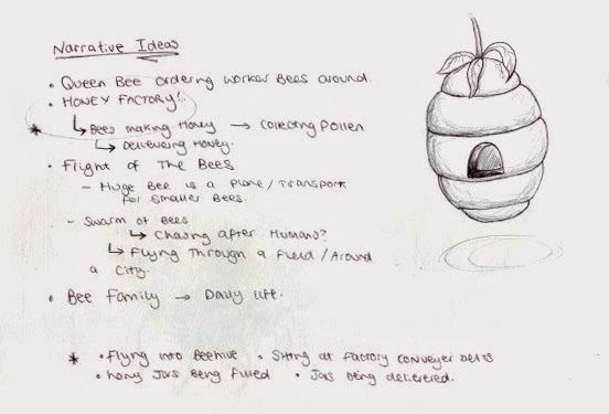
I also wanted to take a break from drawing realistic bees, and so I exaggerated the shape of the bee's body, similarly to what I did in the first half of the brief, and also gave the bee human characteristics by making it stand upright on two legs, and have its arms waving in the air as if the character was angry. I really like the result, and think this bee would be a great subject to animate, or introduce a narrative to.

(7)&(8) I returned to using colour one last time, but this time used Oil Pastel. I really like how the bees are bold and seem to be quite furry from the texture of the Oil Pastels, but I don't like how I felt that I didn't really have control over the media due to the pastels being quite thick. This made it incredibly awkward for me to include minor details, so the design looks quite basic. Maybe if I was working on a larger scale this media would be more suitable to use, but not for a small sketchbook like this. 


To conclude, I've really enjoyed this part of the brief and how I have been able to explore different media. I'm thinking of developing (6) further and creating a narrative using this character, but I think it would be nice to introduce some colour to it, as I feel I have been quite successful with using it. 


Monday 24 November 2014

The Classical Elements: Presenting my Ideas/Interim Crit.

Today I presented my ideas and visuals to a group of three other students. I was expecting to get to college and present to the whole class, and even though I don't particularly like speaking in front of large audiences, I was quite disappointed. I had prepared myself to talk to the whole class and was looking forward to trying to get used to the idea of public speaking, and to become more confident, both with presenting and speaking about my own work. I have only ever done this once on my Art Foundation course, and I spent most of the presentation staring at the floor and shaking, and this is something I want to get over.

I was also disappointed because I didn't get as much feedback as I was expecting to get, due to the small group. I feel this is partially my fault, as I didn't go into much detail when explaining my ideas because I was presenting to a much smaller group than what I was expecting, and the way we were doing so was very informal. I decided to skip a lot of my slides at the beginning of the presentation as I wanted to keep the discussion quite casual and to the point, as I no longer felt comfortable waffling on about my ideas in detail. Because of this, I would have liked to have presented to a larger audience, as I could have talked about my work in the way that I initially set out to and could have received better feedback. Having said this, I do appreciate the group listening to what I had to say, and the comments that they did give.

Matt raised a very good point at the end of my presentation. He asked if there was actually any point to the novelty number candle at the end. Not wanting to sound mean or bash my idea/character, he was simply pointing out that without that character the ending would be much more unexpected, as you would only find out that they are birthday candles right at the very end when the human character blows them out. It is definitely something that I am going to have to consider, as this will completely change the impact on the audience. The addition of the novelty number candle eases the viewer into the candles being extinguished, whereas without it the audience will be much more taken back. If I do decide to leave this character out of my animation, I'm going to have to think about what will take it's place. I could involve other candles with different personalities, or I could make the conflict between the existing characters last longer. Personally, I quite like the contrast between the normal and novelty candles, and think that the '5' is a nice addition to the storyline, as it also gives you insight to the human character's personality. I think it will be a good idea if I ask around and see which ending would be more desirable and go from there.

Other than that, there wasn't really anymore constructive feedback. My group seemed to like my character design, and they didn't have anything bad to say about my storyboard or animatic, so I guess that will do for me.

Friday 21 November 2014

Set, Series, Sequence: Part One

For the "Set, Series, Sequence" brief, we were to choose one of the following words to respond to; dance, tank, science, flight, envelope, fork, bug, skip and plant. I thought about each word individually before I got started, to see which one I thought i'd be able to produce the best work for. For a very long time I couldn't get the idea of "A fork in the road" out of my head, and all I could picture was a literal fork laid in the road. I wasn't happy. It wasn't even that funny.

Anyway.

I decided to go with flight in the end, and started off by thinking of things that travelled through the air. For some reason the first thing I thought of was a hot air balloon so I started with that. That led me to think of balloons, and so on. I was pretty much just drawing things that had wings or could float.

Here is a gif of all my drawings (Actually been scanned too. Thank you, no need for applause)

This part of the task actually didn't take me that long, which has surprised me a little. I was rather quick with my drawings, and the ideas came to me fairly quickly, some of them clearly better than others. Now I need to pick out my most successful one to develop further, which to me sounds harder than drawing 32 different images. 

I really like my bees, I think they're cute, and I think my spiral staircase is the best flight of stairs I have ever drawn (not that I've drawn many though), but I don't really see myself creating a narrative out of stairs. For this reason I think I'm going to have to look at something that has the capability to move, and I think it's going to be a choice between my Bees, Helicopter Seeds, Kites, Paper Airplanes, Butterflies and Darts. Hmm.

Visual Language Sketchbook: Update One

For this brief, we literally just have to draw what we see. Things that interest us, what we think is important or is relevant, so we can use the sketchbook as a source of inspiration and ideas. It is also an opportunity to practice my drawing skills, as I may fall out of the routine of drawing if I am working with computers a lot. Which I am.


Here is my sketchbook so far. Up to now I have been drawing in it whilst I have been commuting to the college, so majority of my sketches are of people. I've never really done observational drawings of people before, usually I just draw from memory/imagination or use photographs as a source, so it has been nice to step out of my comfort zone and draw in this way. I have found it quite frustrating at times as I haven't always been able to finish my drawings as people have got up and left, but I think this is a great way to encourage me to work quicker. It also means the quicker I get the sketch finished the sooner I can stop staring at strangers and being the creepy girl on the train who draws everybody. 

I'm really enjoying this brief and think it's a great way to generate ideas and keep me practicing my drawing skills. I'm going to continue to work in my book, and update my blog with my work every so often. 

The Classical Elements: Creating an Animatic


I wanted to create an animatic so I could test the length of my animation, and see whether I had enough content to meet the requirements of my brief. I was unsure on how much of a delay to put on each of the frames, as I have never made an animatic before, so I just gave each one a 0.3 second delay and this made the animatic last for 19 seconds or so. I think that sounds like a good length at this stage, as obviously some of the sequences are going to last longer than what I have made them in the animatic, and some will be much shorter, so I don't think I'm going to have a problem in terms of length. 

I don't think it looks bad visually either. Well, my final piece will obviously be much more detailed and it will run smoother than my animatic, but I think there is a good range of shots to make it interesting to watch. Granted there isn't a wide variety of different camera angles, but the focus is on the characters anyway rather than the setting. So I think what I have chose to include is fitting for the animation. 

Tuesday 18 November 2014

The Classical Elements: Storyboarding

 Drawing of potential characters/shot.

Before I came to storyboard, I did a quick sketch of a potential shot including some potential characters, as I realised if I wanted to include more candles in the row this would effect what the novelty candle would look like. I really like my sketch, and I think there is a nice variety of people, but I don't think I'm going to persue the 5th character. I think he's great but he just doesn't really fit into the storyline very well.

On to storyboarding.

 
Once again, I'm back to not using the scanner.

 I didn't take too much time on this, as it isn't my final version. I just wanted to quickly consider the different angles and shots that I could use, and get down some of the actions in the order I wanted them to happen. I briefly considered some sounds I could use in my animation, such as a wolf whistle. The addition of these sounds will make the story make more sense, as it gives the characters a reason to turn around. 

I think my selection of characters is good. There is a range of different personalities, and I like the narrative I have been able to come up with using this selection and now that I have briefly sketched out a storyboard I am going to make an animatic based on these drawings, so I can test timings, and really focus on the camera angles that I am going to use. 

The Classical Elements: Planning Cont. and Development

After long consideration, I have decided to go with the birthday candle idea. I really loved all the ideas that I was able to come up with, and it's a shame I can't work with all of them (although, it is likely that I shall return to some of them if I get the chance), but the birthday candle one seemed to be the most popular with those whom I shared my ideas with. It also didn't sound overly ambitious and figured it would be the best option considering my skills are fairly limited at this stage. So I began developing.

Just when you think I've learnt to scan in my sketchbook, BOOM, a wild photograph appears.

Similiarly to my last project (my giraffe animation), I knew what the main storyline was going to be, but I was unsure of what was going to make the animation last 20 seconds. So to start with, I came up with ideas for what the candles could do to make it an interesting animation. My main ideas were either to have a love story between two candles on the cake, and have the male try to get closer to the female and when he finally gets close enough to introduce himself and try and win her over, she gets blown out, followed by himself. My other idea was to have a long line of candles that get introduced one by one, the last to be shown to the audience is a novelty number candle which gives away that they are sat on cake, and then they are blown out. 

I was leaning more towards the second idea. It seems more comical and entertaining, and it was also an opportunity for me to explore facial features and emotion without using sound or speech. Granted it wouldn't allow me to consider many principles of animation, but this way I would be able focus on creating lovable characters, as well as including a range of different camera angles, which I wasn't able to do on my last animation. 

Because I had a more solid idea in mind in terms of a narative, I began to design my candles.


When I started drawing, I was actually thinking about my first idea, and designed a simple male and female character, and how they could be represented and distinguished between, colour being a very stereotypical way to do this. It was then that I thought that the animation could have portrayed a homosexual relationship, and based my fifth candle on the gay pride flag (very stereotypical I know, my apologies). It was only then that I came up with the idea of having a long line of candles with different personalities. 


I tried to alter the shape and the facial expressions of the character to portray different types of character. I also considered the part that colour and pattern could play in creating different personalities. 


Designing different candles gave me the idea to give each candle in the line a different personality. I really, really like this idea, and think it will add to the comedy value of the animation. I also think it will be more entertaining to watch, as well as animate, and this way it will allow me to explore more facial expressions.
Due to there being a range of characters, I could also try to impliment my first idea. The first two candles in the line could be an ordinary male and female, and for a few frames the male could try to jump towards the female. This will allow me to consider how the character will move, and it is also an opportunity for me to consider a wider range of principles of animation. Not to mention it being a way to fill more time.

Now that I have an idea of what I what my characters to look like, I shall start to plan and develop a storyboard. This will allow me to put my idea into perspective and to see whether it will work. This also means that I can finalise my characters and decide on how many I want, and what I want their personalities to be.

Edit: I randomly got the idea to draw a "gothic" or "emo" candle, so I went with it and started to consider other stereotypes or personalities.

Tuesday 11 November 2014

The Classical Elements: Planning

Like most of my other briefs, I started out by defining the words given in the brief, in this case the classical elements, and began brainstorming ideas that were generated from the descriptions. I started off with Earth.

Oh my days, it's actually been scanned in.

I couldn't really come up with many ideas for Earth. To me, Earth seemed more of a setting than a potential narrative. The only idea I got in terms of narrative would be to portray the planets in the solar system as each having a different personality. I thought the idea was okay, but it would mean spending a lot of time of creating 9 (or 8 if you don't consider pluto to be a planet) characters to represent each planet, and having to assign them with 9 different personalities. I also couldn't really think of a storyline, and because I was beginning to get ideas for other elements I just decided to move on, and potentially return to it.

Getting good at this scanning business

I then moved on to looking at Air/Wind. As you can see I was able to come up with a lot more ideas for this element, along with a few visuals. I really like the idea of portraying wind as a character - I also like the floaty, ghost-like sketch I have produced which I think would be nice to work with - and I think this has potential to be incorporated into a number of different story lines. For instance, my initial idea is to have the character be quite helpful, and help leaves fall to the floor, or have them pushing the blades of a turbine around to generate energy.


I really liked my wind idea, and I was beginning to generate some interesting images in my mind, but I didn't want to just roll with the first idea that I came into mind, so I began to briefly look at Fire. To begin with I wasn't really able to come up with any ideas, and didn't really see this element going anywhere, but then I started doodling flames and torches and came up with the idea of candles sitting on a birthday cake, but being unaware of what's going on and being caught up in their amazement of their new life and surroundings. Which left me feeling confused. I really liked both of the ideas, and didn't know which one to choose. I was getting really wound up about it so to take my mind of it, I decided to brain storm the final element, Water.

Which was potentially the worst thing I could have done in this situation.


Again, to begin with I didn't really see this going anywhere, but then I just had to go and remember that water has the ability to freeze and evaporate, throwing yet another idea into the equation. My idea for water was to have a character prepare a cup of tea, and fill the kettle and turn it on. I could then either have the water droplets try to escape the kettle, because it is the equivalent of torture for them, or just boil and be unhappy about it, resulting in the character enjoying a nice cuppa.

So here are my main/refined ideas:


I really don't know which one I am going to choose, because I think all of them have potential to be quite interesting animations, and there are elements of each idea that I really like. For instance, I like the character designs of both Fire and Wind, and I like the potential little screams I could give the water droplets when they are being boiled. I am going to have to explore further into character design for each of these ideas as well as come up with a quick initial storyboard. I can then see which one I think has the greatest potential, and which I can fit into a 20 second animation. 


Monday 10 November 2014

Module OUAN403 Evaluation

Well, the past few weeks have been challenging to say the least, and despite being close to having a mental breakdown on numerous occasions I have thoroughly enjoyed it. I have also learnt a lot in these first few months, the most useful to me being the 12 principles of animation. I feel as though I have been able to apply this knowledge well in the animations I have produced, in particular Squash and Stretch in my flipbooks and Follow Through action in my Pose-to-Pose Teddy animation.

I don’t feel that there has been any work that I have produced so far that I’m not happy with, which is quite surprising to say it’s early stages. Granted my animations are only basic and I favour some over others, which is expected, but considering the majority of my animations have been a first attempt at using some techniques I think I’ve done very well. I think I have been particularly successful with Pose-to-Pose and Frame-by-Frame animation. I think the sequences I have drawn are quite realistic and they flow nicely. I also believe that I have been able to incorporate the 12 principles of animation well. Another area in which I think I have been successful is Pixilation, and I think this is down to the amount of planning I put in before I started production. I really thought about what was going to happen in the animation, and put these ideas into storyboard where I was able to consider shot framing, something that I was taught about at the beginning of the module, and again, something I found very useful. To be honest, I think I have been quite good at documenting my ideas and planning out my animations, it has been my time management that has been lacking, particularly over the past week.

I felt very pushed for time this past week, and I thought that I wouldn’t be able to get my “Apply” animation finished. I did pull through though, and ended up having enough time to spare to get my work sorted out before it needed to be submitted, but if I had planned my time better I wouldn’t have felt so stressed. I left a lot of my research blogging until last minute and it almost got on top of me, so in the future it might be wise to force myself to do at least one or two research blog posts a day, on top of blogging about what I have been able to produce In that day. With that being said, I am now aware that I can push myself to meet deadlines and even though it has been hard, I can juggle more than one project at a time.

I also feel that I need to improve on some aspects of the 12 principles of animation, in particular Timing and Spacing. I don’t feel like my first attempts have gone bad, however I do feel that I could improve in this area.

Overall I think this module has been rather successful, and I am looking forward to proceeding with this course. I also can’t wait to practice using Photoshop and other animation programs, as well as practicing my drawing skills within visual language. 

Sunday 9 November 2014

Warlords of Draenor


Now, I don't play World of Warcraft (or WoW as some may call it) but this cinematic has seriously made me consider playing it. This animation was stunning, and I can't find fault with it. I like the character and landscape design (like I do with the majority of things I watch it would seem) and I like how well they have used shot framing. I think this cinematic really has sold the expansion pack well. Granted it hasn't come out yet so I can't comment on how successful this animation has been, but seen as though the Youtube video has over 14 million views I can give you a good estimate on how well it will do. A majority of these views will have come from the fans of the game and those who actually play it (which is who the animation will have been aimed at), but there will be a good few who, like me, will be tempted to play the game after watching this video, and maybe even buy the expansion pack it is promoting.

Compare the Meerkat

Compare the Meerkat is a great example of an animated commercial that has actually been successful.


The campaign was launched in 2009 and promotes the website Comparethemarket.com, a website where you can compare car insurance. The sole reason this animation has been successful is because of the characters that have been created. Clearly people went crazy over the meerkats and the play on words as the website is now ranked the 4th most popular for car insurance, rising from 16th in 2008. The advert even convinced me to use the website for my own car insurance once I passed my test, just because of how memorable it was. The animation is also pretty good, and I think the meerkats have been animated really well, and I like the thought behind the whole idea of the campaign and the lengths they went with it, I.e. they actually made the website Comparethemeerkat.com so you can compare photographs of meerkats.

Experian CreditExpert


I think the Experian CreditExpert advert is a great example of an animated advert. It was produced to advertise the company's new CreditExpert tool, and was likely to be aimed at it's existing customers/consumers, but because it was explained so well it is likely that it reached out to people who hadn't tried it before. Not only is the product explained well, the animation is actually really nice too. It was actually drawn on a whiteboard, and I love how there is a hand that interacts with the drawings to help transition the animation. Because it is engaging, and because it has applied bright colours and created a diverse range of  cute characters, it is likely it grabbed the attention of many people, so in turn, was likely to have been a successful advert for the company. Obviously I can't say for certain, but it definitely grabbed my attention, and it's Youtube video has received over a hundred-thousand views so it's probably fair to assume it has done well.

Clash of Clans

Clash of Clans is a game you can download for free from the appstore, and the game producers recently (I say recently, it was last year) released a tv advertisement for the game.


I knew quite a few people who played this game, and I was tempted to give it a go but never seemed to get around to it. Then I saw this ad. I thought it was very well made, and gave a good insight to what the game is about. It didn't make me download the game though, but it did make me consider downloading it again, so I guess it was ALMOST successful. I reckon it will have worked on other people, but I just couldn't be bothered getting into another game of this style. I did like the animation though, and I liked the range of different characters and personalities that were featured in the advert, just not enough to download the game. Sorry.

How Do I Get You A Loan?

This. Advert. Though.


I was CREASED the first time I watched this advert. It was such a simple pun yet worked so well for the loan company. Whether it worked to get people to take out loans with them I don't know, but I reckon it has done a good job at getting their name out there at least. I know I probably won't forget about Satsuma for a while just because I can't get over how wonderful that pun is. This and the combination of the digitally produced singing orange (Well, I'm guessing it's been digitally produced, it looks too perfect to be stop motion) has made for an entertaining advert, and one that I will happily sit through. So even if they haven't been successful at providing people with loans through this ad, at least they've done a good job at making something I won't turn off when it comes on.

"Apply": The Final Product.

Well, that was a very stressful couple of days, but I've finally got it finished. And here it is.


I am so happy it's over.

I'm also really happy with the end result. I was really unsure of how it was going to look, as I found it really hard to flip my frames to get a taster, and some of the sequences were really awkward to draw, the part where the giraffe licks the girl's hair in particular. I really didn't know how the hair would fall and how the tongue would move, and it's quite hard to get a reference for these things. So I just went along with it and drew it how I thought it would look. I wasn't too bothered about getting it to look lifelike (I didn't want my characters to be 100% realistic, I wanted them to possess 'cartoon-like' features), I was more concerned about the fluidity (is this a word?) of the animation, and whether the actions were believeable. Looking back at it now, i'd say they were. The sequences seem to flow quite nicely, but the animation runs a lot quicker than what I was expecting. I think it's quite a nice touch though as it emphasies how bizarre the situation actually is.

There weren't really too many principles of animation for me to consider in this animation, in comparison to my bouncing ball sequences anyway. The only things I have really looked at with this piece is Arcs (arm movements and the giraffe leaving the shot), Follow-through action (when the girl's hair is licked), and I'd like to think I have used staging as well, as I have used a small variety of different shots. I would also like to think that I have been able to create character appeal. I know when I showed my sister my animation she said she loved my giraffe, so I guess that's a plus.

I think I could have looked at easing in and out more closely. It could have been nice to have the girl's hand trembling a bit more when she went to stroke the giraffe's face, and there could have been a greater impact on the audience if the giraffe would have eased into licking the girl's hair. Oh well. At least I know for next time. I still think I've done a good job with this task, and I'm pleased to see that the volume of the characters didn't increase too dramatically like I thought it was going to when I was drawing. It's also reasurring that it's not THAT obvious that the girl grows and shrinks in the animation, but enough on that, and don't go trying to look for it now that I've pointed it out.

I would have loved to have more than a week on this project. Whereas it has been enough time for me to get this far, I would have liked to have been able to try and incorparate some colour or maybe even sound effects. I like it as it is, don't get me wrong, but I am yet to experiment with these things, and I think it would have increased the character's appeal by including these things. I guess I could always come back to it and try it out, and I've still got many more projects to try work with these elements.

To conclude, I've really enjoyed working with this brief (about 80% of the time) and I'm really pleased with what I've been able to produce. I can't wait to get started with something new.


"Apply": Planning Continues.

Before I get started with animating this bad boy, I have decided to look at the events of the animation in more detail. I thought that because I only have 5-10 seconds to work with, some of the actions that I want to include might be unneccessary and therefore taking up frames that I don't really have to spare.

 
 Planning

I decided on the key events, and which ones where essential for the story. I need to let the audience know that she really likes giraffes, so attention needs to be drawn to her shirt. Then a giraffe will appear, and she will interact with the giraffe, before it licks her hair and leaves. These are the things that definitely need to happen, and I shall draw these out first and see how many frames they take up. If I don't have enough frames to meet the minimum requirement I shall draw out some "Filler Scenes" that I have come up with, for example, the girl could walk into the shot at the beginning.

 Refined sketch of characters

After long consideration, I have decided that I am going to hand draw my frames. As much as I would have liked to return to drawing the frames in Photoshop and using the video timeline feature, I feel that hand drawing them is the more sensible option this time around. I don't have long to get my animation finished, and I have more practice with hand drawing frames. It also means that if I don't get them all drawn out while I'm in the studio, I can take them home and work on them over the weekend, where-as I won't be able to do this with the Photoshop frames as I don't have the programme at home.

With planning all finished, lets get started.

The Bear and The Hare - John Lewis.

John Lewis' Christmas adverts are just the sweetest things and never fail to give me goosebumps. I have just seen this year's and it reminded me how great 2013's was, so I'm going to talk about that for a bit.


The Bear and the hare is a beautiful combination of stop motion and 2d animation, about a bear that always misses out on Christmas because he is hibernating. The hare wants to give the bear the gift of allowing him to see Christmas for the first time, so he gives him an alarm clock to wake him up so he can join everybody.
I think everything about this animation is brilliant. The characters are lovable, and move so realistically to say they are drawn cut outs. The set is crafted so beautifully and the attention to detail in the props is stunning. It makes me feel as though it's an actual place how realistic they have made the set, especially when it is accompanied by lighting. I love the warm glow of the light to mimic the sun rising. Just everything about this animation is perfection, and I'm sure I don't stand alone when I say this. The animation team who worked on this have certainly done a fine job at creating an advert that all the family can enjoy and love, and it's not the first time they have done so either. They've made so many great Christmas adverts that people now know when it's getting closer to Christmas when they see the new John Lewis ad, that and the Coca Cola ad, so they've clearly been successful at advertising their company. Well, that and Christmas.

THESE CHALUPAS I DEFEND!

I remember watching this animation back in high school and thinking it was the greatest thing ever. I was crying with laughter even though I didn't really understand what was going on. It still makes me laugh today, but now I understand what is being said a bit more.


The cloak is an animation short produced by Filmcow, and was uploaded to Youtube about 6 years ago. It's basically about communism and mormons and whatnot. Basically, lots of things I still don't understand 6 years later. But I think that's the beauty of this animation, you don't really need to understand much about these things to find it entertaining. Yes, it will probably help, but the knowledge isn't essential. I can't really put into words why either, it's just so weird and random, and that's why I love it. Even though the animation is very, very basic, the characters have great appeal just because of the strange yet wonderful things they come out with.

The animation is most likely to have been produced with teenagers and young adults in mind. Yes it mentions communism, but there is no way I could see adults watching this. Unless they had a very strange sense of humour similar to that of a high school student, I doubt they're going to enjoy it. It's very 'random' for a lack of a better word to use, and some of the scenes can be quite disturbing.

The animation is nothing outstanding visually, infact it is one of the most basic animations I have watched in a long time, but I think it works wonders for the characters and makes them even more bizarre gives them more appeal. Especially Robert. God I love this character.

Thursday 6 November 2014

Fallin' Floyd

I discovered the animation short "Fallin' Floyd" back on my Foundation Course on a website called ShortOfTheWeek.com and it is an absolute belter of an animation. I fell in love with it the minute I watched it.


Fallin' Floyd is a short by Anikey Studios, about a street musician who is dumped by his girlfriend and spirals into depression. This is represented by a creature that feeds on his misfortune and sadness that continues to weigh him down and manifest as the animation progresses. The topic is dealt with with care and the final presentation is beautiful, the art style really enhancing the impact it has on the viewer.

It starts off being a bright and cheery animation, everything about it screams happy. His walk, the music he plays, the choice of colour in the scenery, even the opening titles and credits are bouncing around. Once the bad news hits the atmosphere completely changes, and this is shown not only by the way the character moves and drags himself around, but by the change in music and colour. They are the exact opposite to the start of the video. They become dark and bleak, as if all the life has been drained from it. This is a very simple techique to help portray mood, but I think it has been executed very well in this animation and makes it all the more powerful.

I think the short has been very well animated, and I especially like the creative transitions from one scene to the next. It makes it very interesting to watch, along with the wide range of camera angles.
They have certainly been successful in entertaining the viewer. Well, if you can call it entertaining. The story is very upsetting, as you develop an attachment to the character and it's hard to see him spiral out of control. Because of the nature of this short it is likely that it is aimed at an older audience. Children may like the music he plays or think that the creature/demon is quite cute looking, but they aren't going to understand what is going on and appreciate the animation in the way that it was intended. An older audience may also find that they could relate to the character as well, and if so the impact on them will be even greater.

Fallin' Floyd is definitely one of my favourite animated shorts at the moment, as I think it is beautifully drawn, and deals with a dark subject in a way that is very touching and enlightening.

Adventure Time, C'mon Grab Your Friends.

                       http://img2.wikia.nocookie.net/__cb20140120194056/maditsmadfunny/images/b/b1/Adventure_Time_Logo.jpg


First things first, Adventure Time is amazing.

Adventure Time is an animated series that was created for Cartoon Network by Pendleton Ward, but that doesn't mean in anyway that it is for children. The show has an increasing fan base built up of chilren, teenagers and even adults, and I'm not surprised, the show is top notch. The show has a range of characters with different, lovable personalities, and the settings and backgrounds are stunning. The art style is your typical cartoon kind-of style, but there is a lot of thought and detail put into each and every episode, which I think compliments the show and it's intentions nicely. There isn't one I've seen yet that I have disliked or not enjoyed watching. The storylines are imaginative and can even be quite educational, in the sense that they can teach the audience about good morals and respect for others, as well as other things like conquering fears, etc.

It is a combination of all the things mentioned above, as well as the way it has been animated that has made the show incredibly popular, and successful in entertaining it's audience.

Lloyds TSB

I think the Lloyds TSB advert that aired in 2007 (wow, was it really that long ago?) is a lovely little animation that helps to promote the bank. It's clearly aimed at an older generation because of the message they are trying to get across, and because younger people don't tend to have bank accounts. However they can still enjoy the advert as it is bright and friendly, and the characters seem to be cheery and lovable.


The advert tells the story of how a couple met and how they go on to spend their lives together. They meet on a Lloyd's TSB train, and this is what gets them around the city, and from scene to scene. This helps give the audience the impression/message that they can rely on the bank and that they will get them where they need to be which is very fitting considering their slogan is "for the journey", which was most likely where the idea came from, or what the animation was based around.

I think they have done a good job with trying to promote their bank and get their message across. The character design is definitely memorable, along with the choice of song they have used. Whenever it comes on it's in my head 24/7, and it always reminds me of the bank when I hear it. It still reminds me of it to this day and it's been 8 years or so (oh god) since it first aired.


Wednesday 5 November 2014

Riot Games and Imagine Dragons

Riot Games have recently paired up with Imagine Dragons and produced a collaborative piece called Warriors. The video is actually based on the League of Legends Championships, and there are clips of the stadium in which they are hosting the annual tournament.


The main purpose of the music video was to promote the World Championships of League of Legends but can also entertain it's audience, and I think they have been successful in doing both promoting and entertaining. The video is very well made, and I especially like the beams of light/sparks (or whatever you would like to call them) and how they move through the air. They're quite relaxing actually, and I like how they break up the different scenes in video. I also like how you can still appreciate and enjoy the music video even if you have no prior knowledge to the game. Granted somethings maybe a little confusing, and you may question what the purpose of the action was (for instance, if you don't play the game you might wonder why the camera zooms in on the letter R on the keyboard), but I think this just makes this more exciting for the viewers that don't play, as there is room for their own interpretations. For this reason, the targeted audience is not just those who appreciate the game, and not just for those who appreciate the music, but rather a wide range of people.

The video was also promotes or advertises the band and the game. There maybe Imagine Dragon fans that watch the video who don't play the game, and after watching it may feel tempted to give it a try because they might be interested in the game play that has been briefly presented or because it has been associated with the band. Then on the other hand, League fans might have watched the video having never heard of the band, but like the sound of them and continue to listen to them or again, because it has been associated with something they enjoy playing.

Riot Games

Riot Games is an American-based video game company that have released a grand total of one game which was released in October 2009. League of Legends. Now. There are very mixed views on League. Personally I think it's great and I love the character designs, but more on that later.

IGN initially gave the game a rating of 8 out of 10 and it dropped marks due to the player's impatience with new comers. I couldn't agree more with this statement. The LoL community is the most "toxic" of any game I've ever played. Having said this, there is a matchmaking system that will pair you with players of a similar skill level, which, if you're new to the game, it will most likely be bronze players that you're matched with and they will still rage at you for being bad/new despite them being bad themselves. So prepare yourself for that, or alternatively just mute them. They don't know what they're talking about anyway.

Anyway, going off on a tangent. I'm not here to rant or bash bronze players.

Another reason I love (most of the time) League, or to be more precise Riot Games, is because of the cinematics they produce. They have produced quite a number of them in the past but I'm going to talk about one of their latest videos, A New Dawn.


A New Dawn is based on the game play of League of Legends, but they have made it so you get the view of Summoner's Rift (the map in which you play 5v5 games) from the Champion's perspective. The purpose of the cinematic is predominantly to entertain, and is likely to be aimed at the fan base of League, so consequently range of ages. Each character has a different Lore, personality and abilities, and the cinematic can help you understand these a bit better, which is why it is likely to be aimed at the fan base, as people who don't play the game might not be aware that the characters have a background and that there's actually a story behind the game. 
The video is also most likely to be used to promote Riot Games and League. The video shows the viewer what the game is about in an interesting and entertaining approach. It gives you a feel for what the game is like and gives you a preview of a couple of the champions and what they can do. The cinematic then ends with the logo of the game, so it will leave those who enjoyed the video curious about it, and will most likely try it out. 

Tuesday 4 November 2014

Flash (Aaaaaah) Induction

I don't think I've ever got so frustrated using a programme in my entire life. I was trying to follow the principles of animation, by making the ball ease in and out along the path that it was moving along, but I just couldn't do it. I couldn't make it ease in without changing the path I wanted it to follow, the same goes for making it ease out. I was watching what other people were doing, and trying to follow to their example but I just couldn't seem to make it do what I wanted, and the thing is I don't know what I was doing differently.

I've had a play with it and my experience was not enjoyable in the slightest, I even found drawing eyes on my ball awkward as hell. I can appreciate those who use the programme, and that it has features that can be quite useful in animation and game production etc, but I can't see myself returning to this programme. Ever. I may give it a couple more shots but other than that...


Here is what I did produce. It's not at all what I wanted to achieve, but I guess it will do as an basic example of what I can (or more accurately can't) do with the features of flash. 

Monday 3 November 2014

"Apply": Planning.

Well today has been interesting to say the least. I started planning for my new brief "Apply" where I have to create either a 5-10 second animation or a 20-30 second animation based on one of seven words; love, hate, surprise, fear, longing, lateness, happiness.

I started of by brainstorming ideas for just three words as they stood out to me the most, which were surprise, lateness and love. I managed to find the definitions of each of these words, and from these definitions I got quite a few ideas for an animation or storyline. And by quite a few, I mean a lot. I was just so overwhelmed with my ideas, and just the task in general. It may seem relatively straight-forward because we just have to come up with an idea based on a word, but I had to make the idea either short enough to meet the requirements of the drawn animation option, or be long enough to become a pixilation, and I didn't think any of my ideas met these requirements and I wanted to cry. I almost did.

 One day I shall scan in my sketchbooks, but today is not that day.

I didn't though, and I eventually calmed down and pulled myself together. I figured I didn't want to look any further into any of the other words, as I couldn't think of anything initially, and I had way too many balls in the air as it was, so I took note of main ideas to get myself back on track. These were:

- Surprise: Either create a short animation about a Jack-in-the-Box or create a pixiliation where the character in the story finds out they have super powers of some sort.

- Lateness: The character keeps snoozing an alarm that is persistant, and then realises they are late for an event, or the character is seen stuck in traffic. Both ideas could be linked.

- Love: For this category, I started to list the things that I "love" to see if there was anything I could base an animation on. My initial thought was music, and ultimately Thirty Seconds to Mars and Jared Leto (Ooft by the way). I thought I could base it on the band somehow, and maybe have myself daydreaming about meeting them, or reliving the concert I went to see in November. I could even incorporate the bouncing ball sequences, and have draw big balls bouncing on top of a croud, just like they did in concert. As much as I liked this idea, and the little sketch I came up with, I think what I was wanting to produce was way too adventurous. However, I may return to this idea and try to use the character I drew because I really like it.
My next idea for this cateogory was to portray a character's love for an animal or a person. Maybe have a baby playing with a puppy or someone cuddling a cat or another animal.


I was still stuck on what idea to go with, so I quickly drew some visuals in hopes that it made me decide on what I wanted to use. After about an hour of debating and getting worked up I finally thought, y'know what, i'm just going to go for the giraffe idea.

 Quick Storyboard to Test Idea's Potential

I put together a quick storyboard to see whether the ideas/events in my head would be sufficient for an animation, and I ended up really liking it. It looks really basic but I quite like the design of the characters, and the simplisty of it all means that I can really focus on putting my knowledge of the principles of animation to use. For instance, the anticipation of the giraffe licking her hair, the arcs in the movement of the girl's arms, follow through action when the girl lets go of her shirt, and so on. 

I definitely think I'm going to produce a drawn/digital animation rather than a pixilation as I don't have enough content for a pixiliation - That, and where would I get a giraffe from? - but I am still undecided whether I want to draw it by hand using punched paper, or create it digitally using photoshop. I'm going to plan out my keyframes, and start to think about timing and spacing, and then I shall just go from there.   

Wish me luck.